Hi Everyone!
Here are my current designs for each layer, blue and black are vector engraves and red is vector cuts.


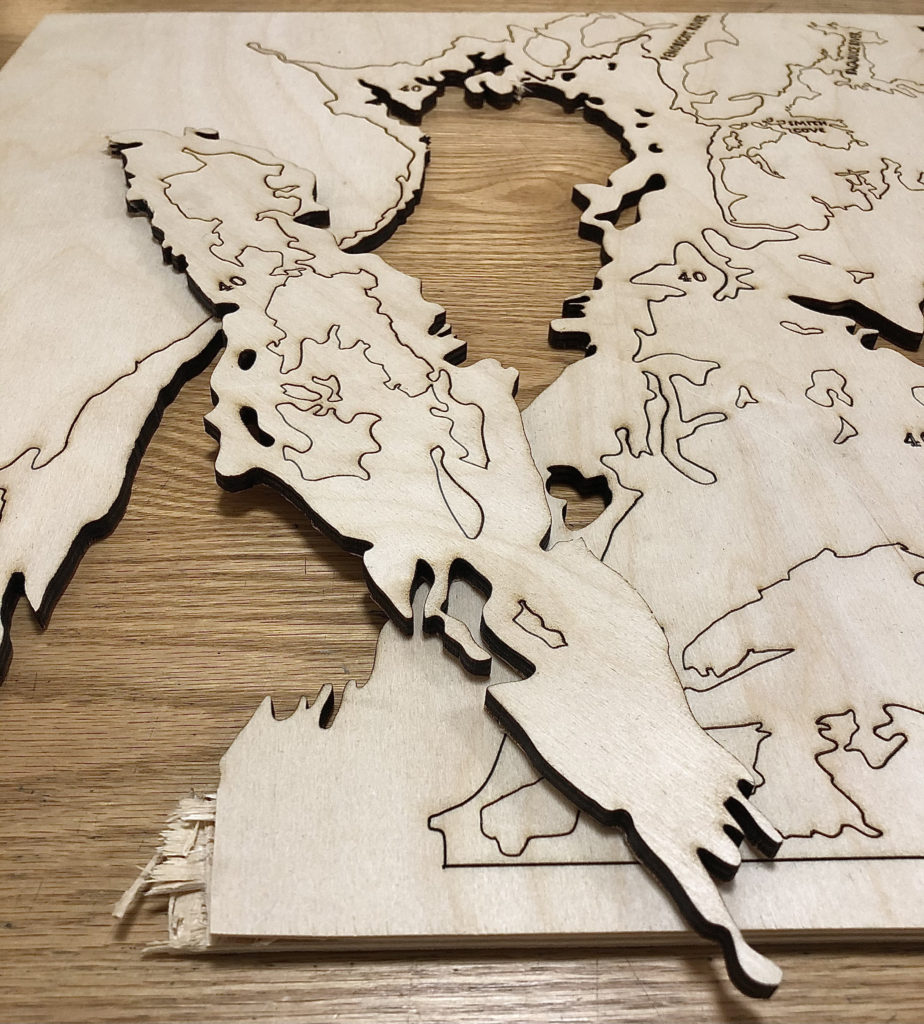
For my first cuts on this project I ran into many more issues than I anticipated and was only able to cut out layer 40 and 80.
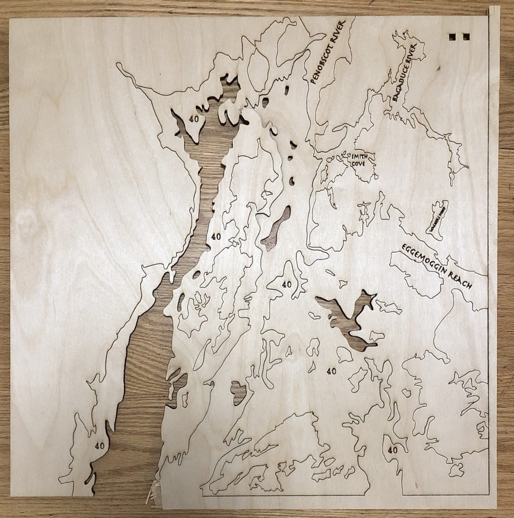
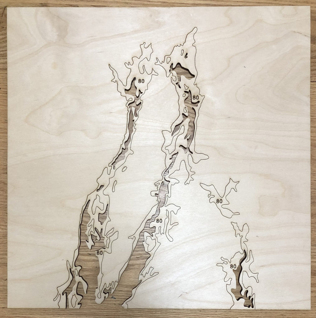
As you can see layer 40 is broken and a mess. I had made my test cuts and thought that power 35 with 5 passes would work to vector cut my 1/4 inch birch plywood all around. Id had for the test and for maybe 50% of the vector cuts in Layer 40 but the rest were not completely cut through. I ran the laser agin to do all the vector cuts again at 35 power and one more pass (now 6 total) and still not everything was cut. I now know I should have upped the poser to 40 and cuts to maybe 8, but I has just waited 40 mins on this single layer and had nothing else done and my appointment was running out. So, with the suggestion of the person on duty in the Prototyping Lab I thought I would be able to use a box cutter to get the stuck pieces out successfully. I was very wrong, it took my the whole next 30 mins (while layer 80 cut on poser 37 with 7 passes) to get about half the uncut pieces to separate, and I broke a whole section off! I will obviously be redoing this layer whe I do the others. The lesson I learned is, no matter the time continue to laser cut until every piece is absolutely separated from the material, LET THE LASER DO THE WORK!
Because I cannot show you yet how I hope all the layers will look in the end, here is my final design where each color represents one layer to be stacked in this order.
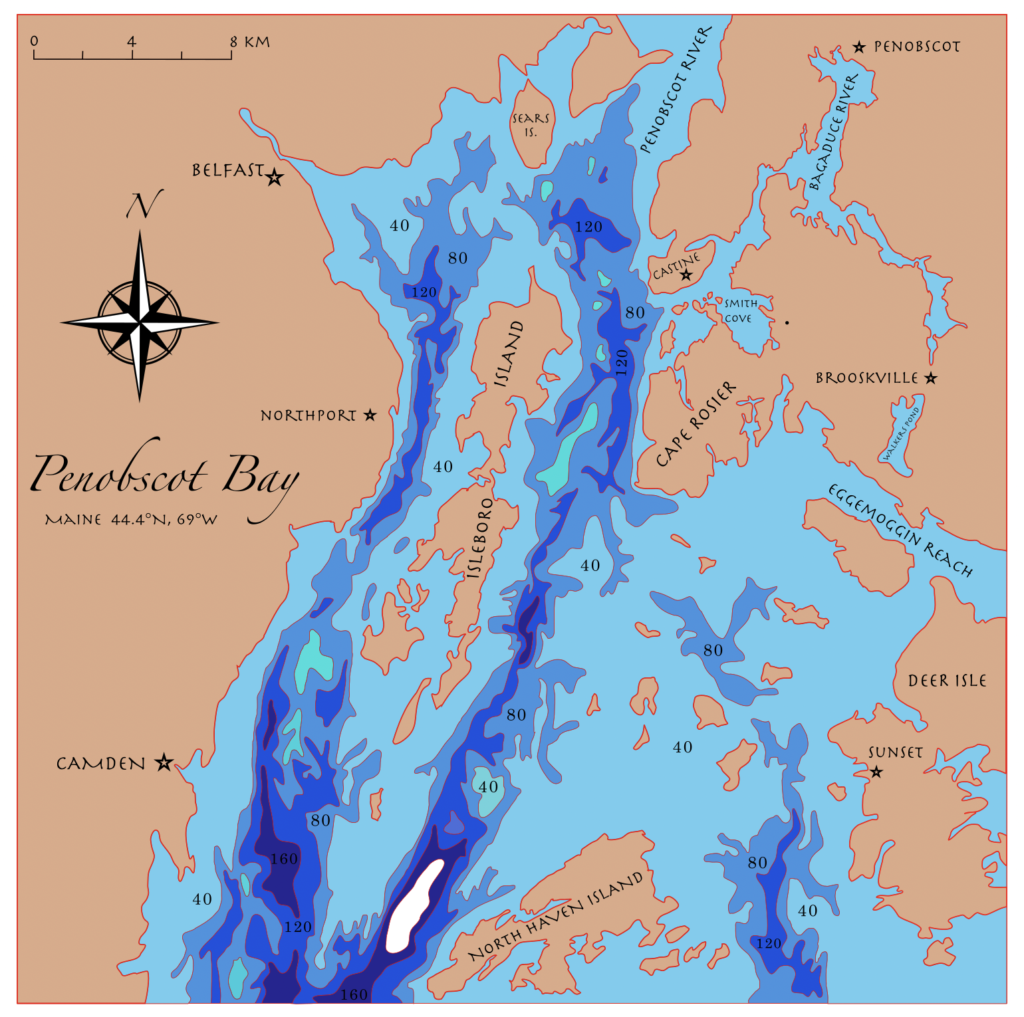
Question: In my original Layer design post I was planning to add topographic lines to the surrounding land to add a 2D representation of height to contrast the 3D physical depth in the water. Unfortunately, I ended up spending much more time hand drawing each of the layers you see here and was not able to add these lines as of yet.
My question is, do you think not including the topographic lines and instead having the map labels and details included now works well enough to give the sense of land vs deep ocean? Also, are there any other map details you think I could include anywhere?
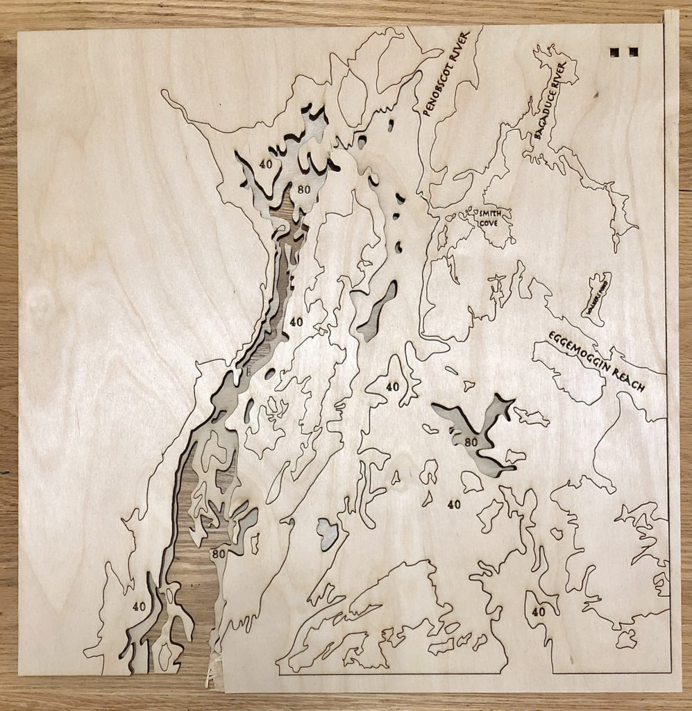
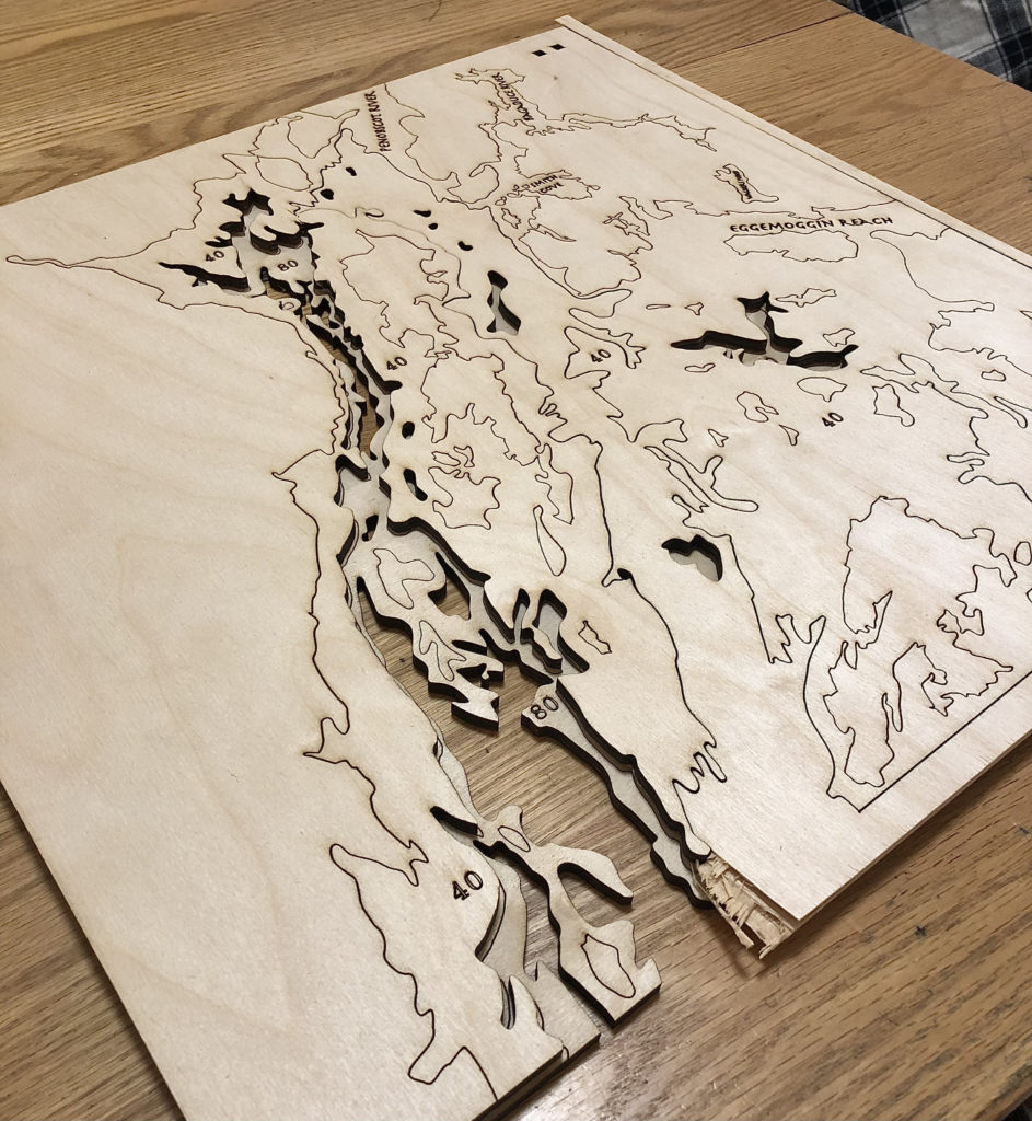
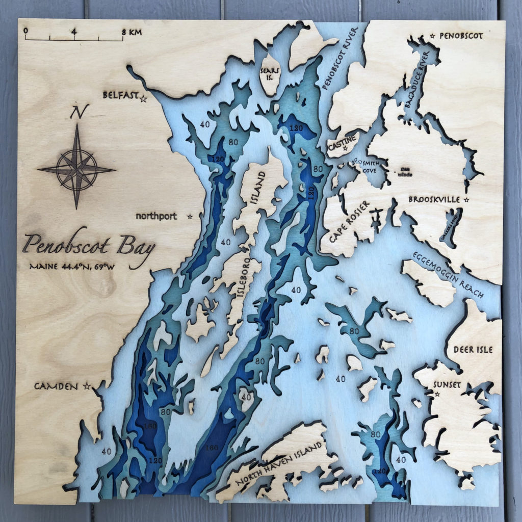
UPDATE: 4/10/21
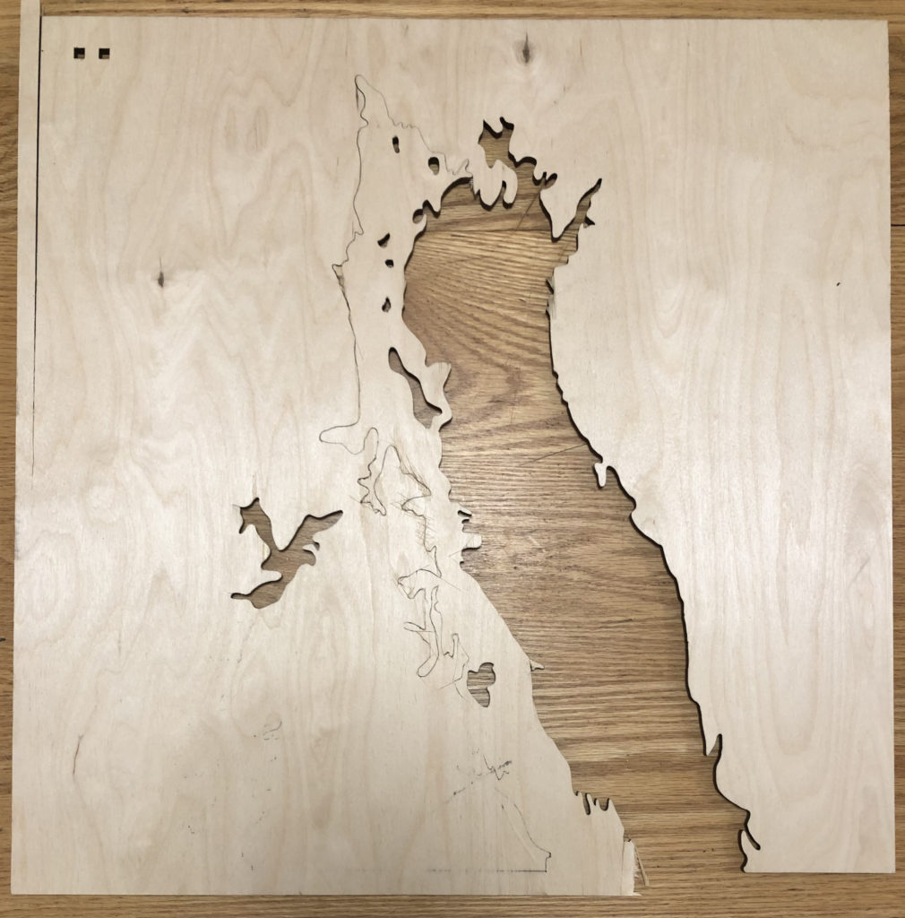
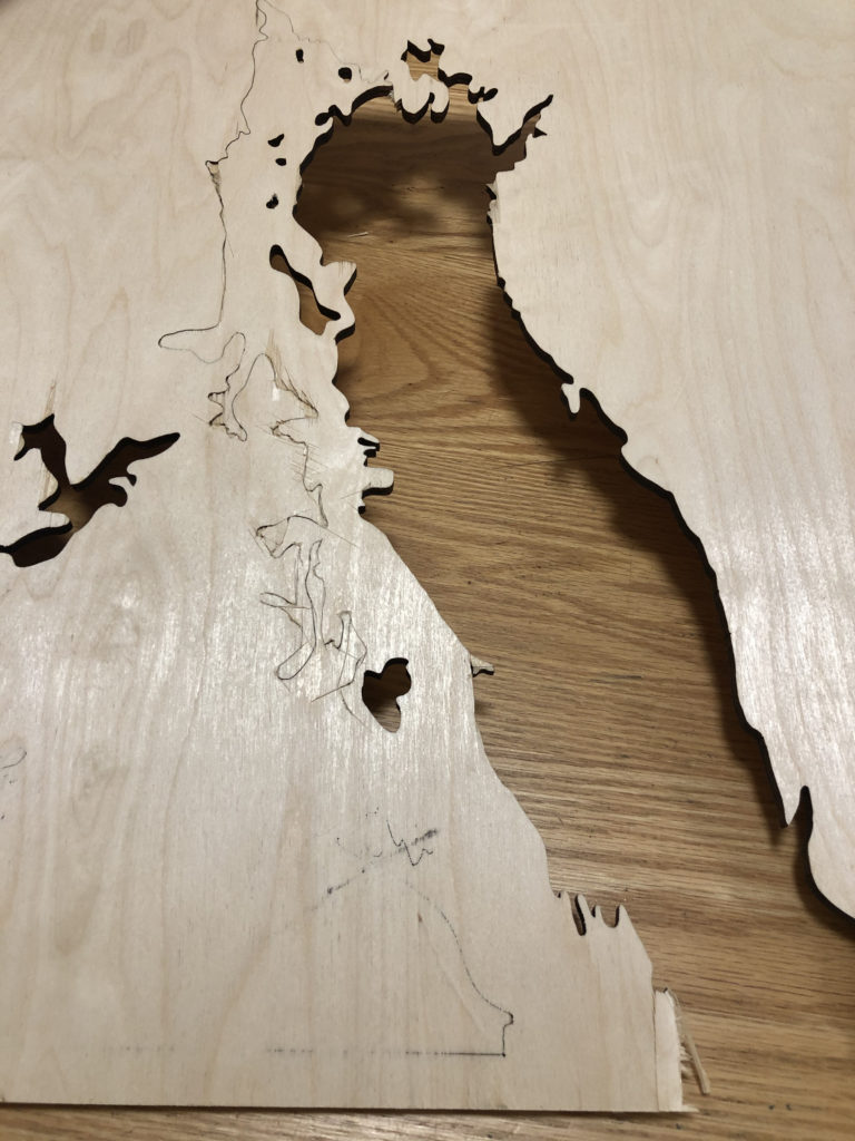
I believe I have finished! Its 5 layers, 4 gradient blue water layers and the sealed natural wood land layer!
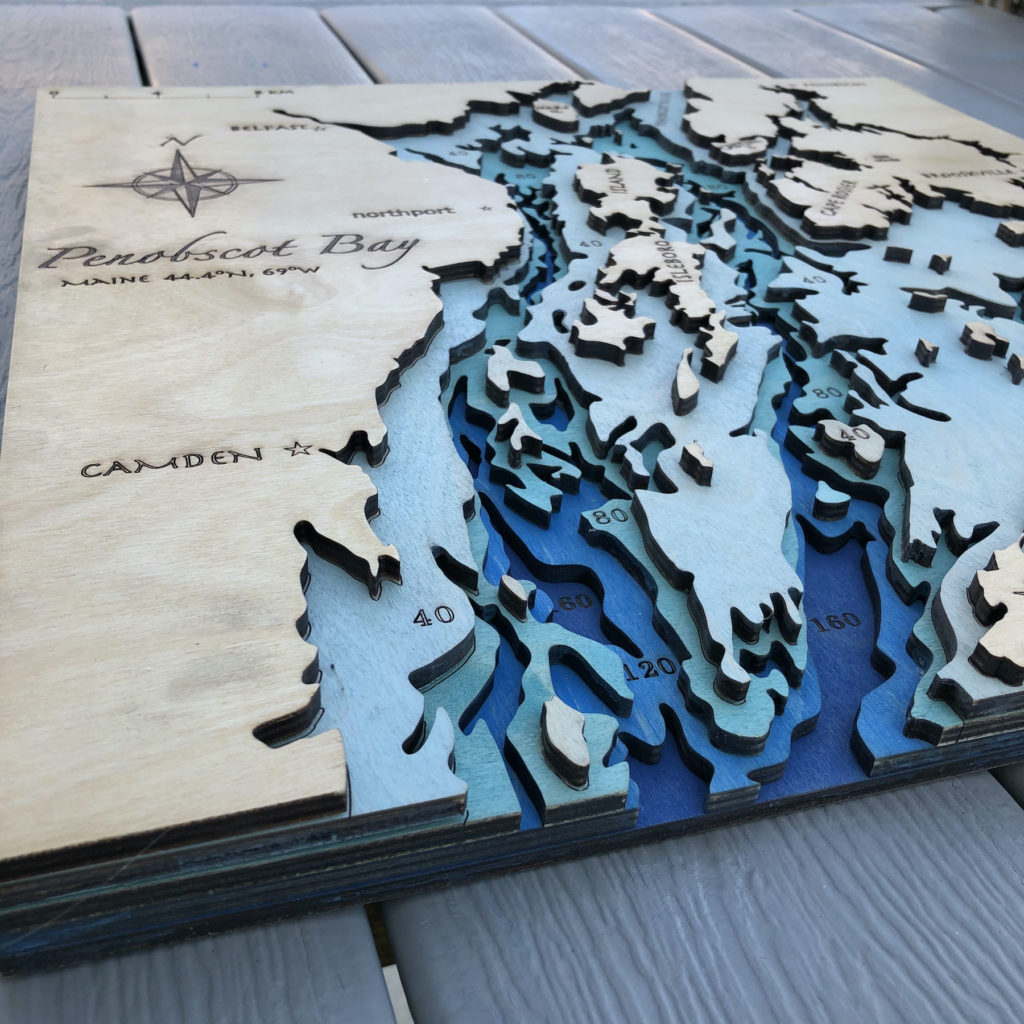
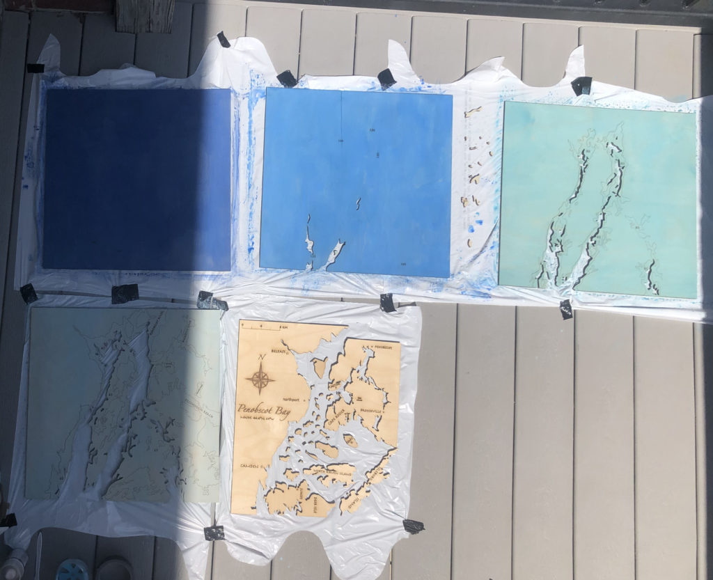
Here are the five layers before I assembled them!
Hi Iris,
I think the labels and mostly seeing the difference in layers nicely shows the depth difference between land and ocean.
I think it shows the difference between ocean and land. I don’t think this is necessarily a map detail but if you wanted to maybe have a specific detail on the map of the place that inspired the piece?
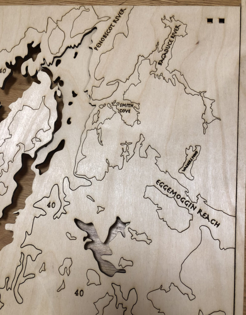
Ok I love that you asked about this! Especially because I thought the same thing and it’s on there! The tiny little dot to the right of “Smith Cove” is my families property Sea Winds 🙂 but honestly now I think I am going to add the name too because of your comment! Truth is I want this piece to end up there and hang on the walls for as long as the property stays in the family, so why not label it?
Hi Iris! I think its easy to tell what’s going on without adding land details. I had the same idea of marking the inspiration place and then I noticed you said it’s family property. Have you thought about adding your family name to the piece or frame, or even a place to sign your names?
hello, I think instead of having etched lines, using thinner material and having every depth a different layer would give a better sense of depth.
The labelling is a great addition I think you should keep! I enjoy being able to identify the areas with them.