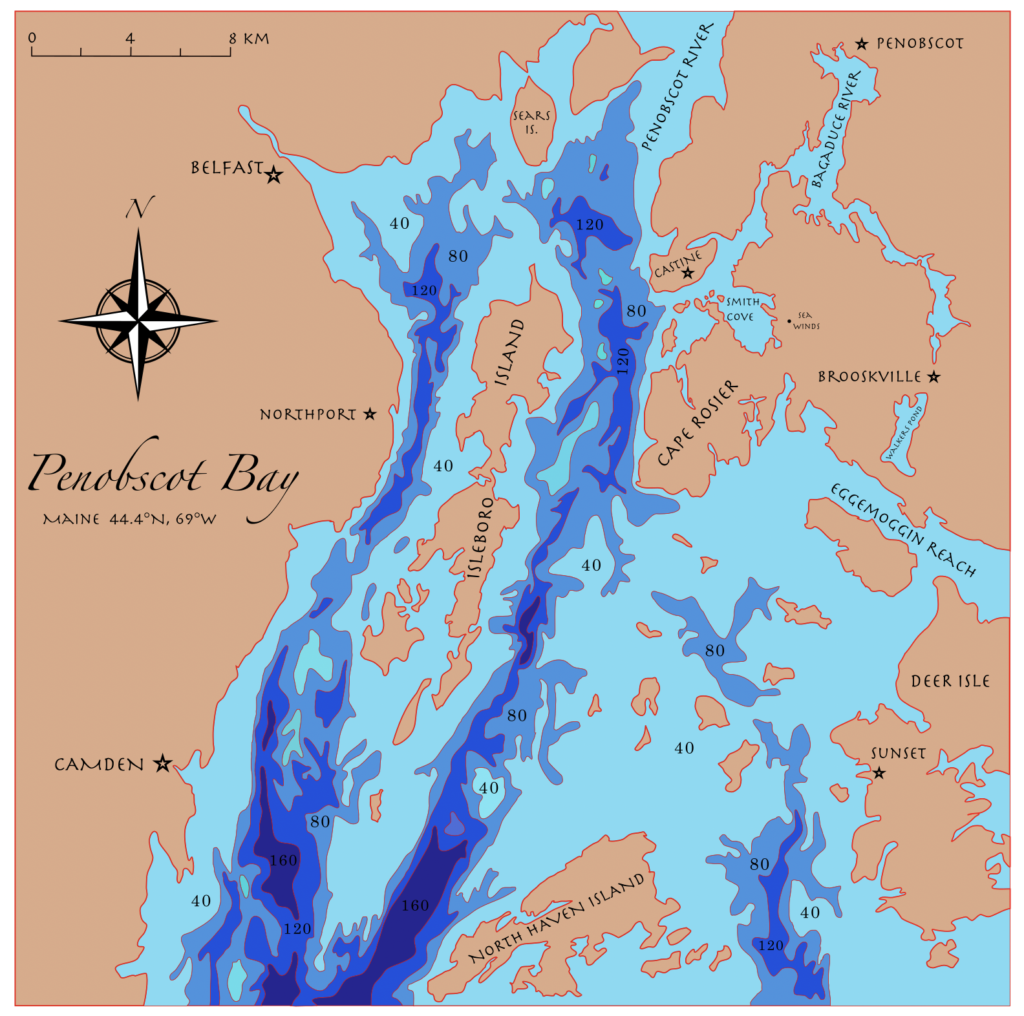
Here is my final design of my layers project, where each color represents one layer to be stacked from darkest blue to the tan wood color representing the land.
UPDATE: 4/10/21
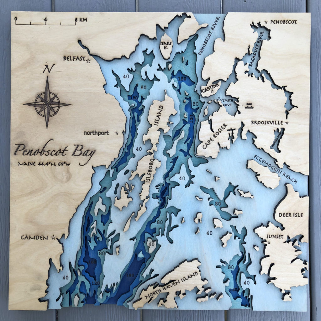
I believe I have finished! Its 5 layers, 4 gradient blue water layers and the sealed natural wood land layer!
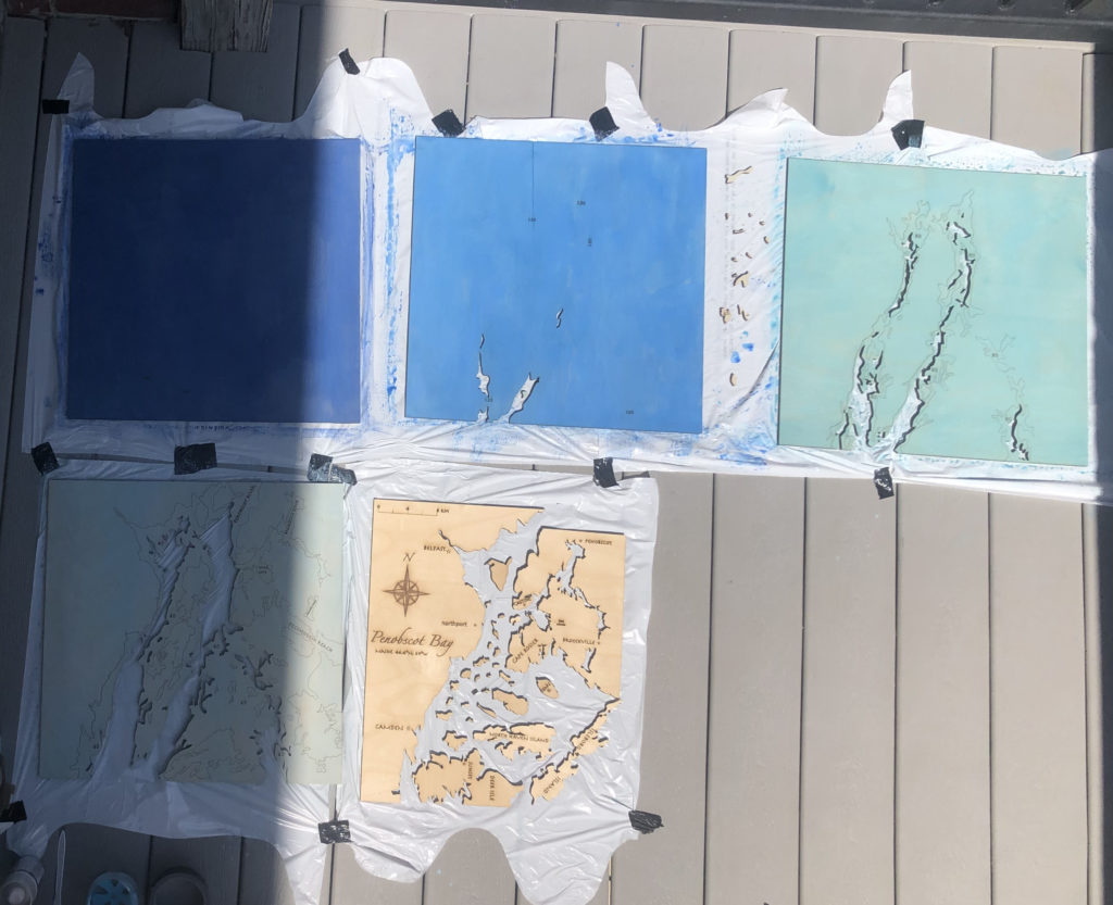
Here are the five layers before I assembled them and after I did the acrylic paint + water wash.
Hi Iris,
I appreciate you color choices, the shades of blue work really well together. How did you decide what thickness of wood to use?
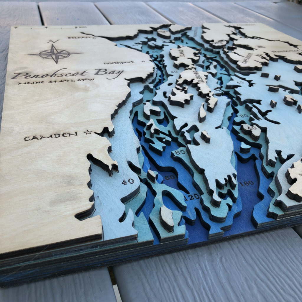
Thank you Sameer, I guess I knew I wanted it to be thicker than 1/8″ to add more depth and mass to the piece, and 1/2″ would be huge and a lot for the laser to cut so I ended on 1/4″
Hi! I appreciate that the land layer was kept as the natural wood as it adds more contrast between it and the water. How did you apply the paint to the water layers?
Great question! I Had made a acrylic paint water wash, maybe 1:2 ratio with more water than paint then used a 1″ flat brush to paint the watery paint onto the layers trying to keep it evenly distributed.
Hi! I appreciate all of the details and the way the burnt wood look in the lettering and some of the layers contrast with the blue colors. What was your strategy for keeping track of all the small pieces and making sure they went on the proper layer in the correct location?
Haha yes that’s the question! Well I used small ziplock bags labeled for each layer in which I put everything cut out from that layer (that could fit). You might see in the last picture that I had engraved the cut lines of the layer above one onto the next layer down, these lines were great guides for where all the pieces, large or tiny, were meant to go. For the land layer with all the really tiny islands I actually did a numbering system. After the laser cut the layer I removed all the large pieces first and then slowly piece my piece moved the little pieces into the table trying to keep them in roughly the same placement relative to each other. Then I went through and wrote a number in the outline for each island on the highest water layer and also on the corresponding island before putting them in the bag. Then it was easy to match the numbers after I painted everything and I knew how to place them thanks to the outlines.
Hi Iris! I appreciate the engraving of the different fonted names and also the compass on the left. The piece turned out beautiful! I am considering making something similar as a side project for my dad’s birthday and I was wondering if you figured out the best settings for cutting this wood (I know you had some trial and error and I applaud you for how great it turned out in the end!) Looking forward to seeing what you make in our future projects!
Aw thank you!! Yes it took a while but If you have the time for it go with extra passes (I found that even with 9 some parts of the imperfect wood was not fully cut. I ended up using 45% power and 9 passes for cuts on this 1/4″ birth plywood. I will say that I had smaller shapes set to a different color and only set them to 7 passes wih 35% (sometimes 5 would cut them out but not always so 7 was more reliable)
Hey Iris! I can appreciate that you kept the layering visible on the side of the piece. Did the wood glue adhere well even with the acrylic on the wood? It would be helpful for me to know for future pieces! This came out truly beautiful and I am thoroughly impressed.
Yes the wood glue worked great onto the acrylic painted surface! of course my paint was watered down, but I didn’t notice any issue at all on the paint.
Hi Iris! I love how your project came out! I really appreciate that you can still see the wood grain even on the colored layers. The only thing I would add would be a stain or coating on the unpainted layer to help protect the wood.
Thank you Lauren! I can see how it is impossible to see through these pictures but I do have a clear gloss coating for wood and acrylic paint already applied to each layer with many coats on the land layer. It is not the most protective thing I could have used but its something and I think its ok for now, but I might consider strengthening up the coat at some point.
I noticed the numbers you had inscribed on the piece that show the depth of the water. Did you look up the ocean depths and add in the layers/numbers manually or did you use a tool to do that? In my opinion the geography that you chose to represent in this map is very interesting.
Great question about the numbers! It was actually much simpler than you guessed because the reference map I was using (that had all the bedrock depths) had the labels included, so as I drew I always knew wich depth I was working with.
Hi Iris! I appreciate how detailed you made this! I can’t imagine how long it must have taken you to free hand the layers outlining the bay. I forget if you mentioned this in class but what software did you use (if any)?
Aw thank you! I think it ended up being around 10 hours of drawing and I only used a reference photo in inkscape! I tried using some other softwares showed in class but had no luck with my large area and had already started the free hand method so I just stuck with it.
Hi there, Iris, I would like to say that your piece was really IMPRESSIVE and I was really hyped for it when I first saw it. Your blue gradient mixture is really good and the layer assembling, I mean, how long was it to take you to assemble the pieces together? Again, an awesome project of yours.
Thank you so much Leona! It took my a little over 3 hours to paint, let dry, glue/ press as I glued the next layer, sand the land and edges, and then spray with the clear protective coating. It was sunny out the day I did this too and I worked outside in the sun which helped quicken the drying time and was great for the smelly spray coat.
I really appreciate the gradient of blues in the water. I wonder what you will do with your finished piece? I want to let you know how freaking gorgeous this art is! It looks so prefessional, like something you would pay hundreds of dollars for at an art festival. I’m jealous of how easy you made this look, as I know first hand from my project the many aspects and time it takes to fit together perfectly.
I love how large you chose to make your piece, it seems genuinely professional. The font choices, colors, and overall design come together really well and this seems like something that would be hanging up in a house on the beach.