Update: 4/15
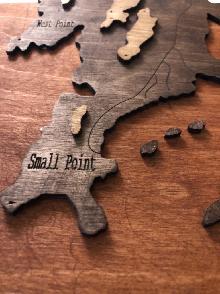
So I have successfully put together another version of my project and I am happy with the progress I have made. There are definitely some areas that I am planning on fixing and I would like to make another final version of it. I am going to add some more detail by adding locations to the map and also potentially some more roads. As you can see I have labeled general areas but think it might be cool spice it up. I also accidentally used the wrong stain on my top layer (was planning on using the darkest stain but used the second darkest) so I will be doing that in the final as well. Lastly, I used sand paper that seems to be a bit too rough on the plywood which ended up leaving some scratch marks.
My question for you all is this, should I try and generate more layers (Slicer for Fusion gave me problems originally)?
Also, do we like how the three different wood stains look together or should I experiment with a blue stain for the water?
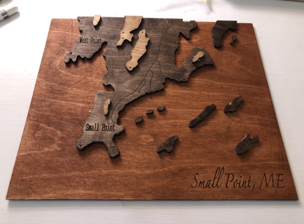
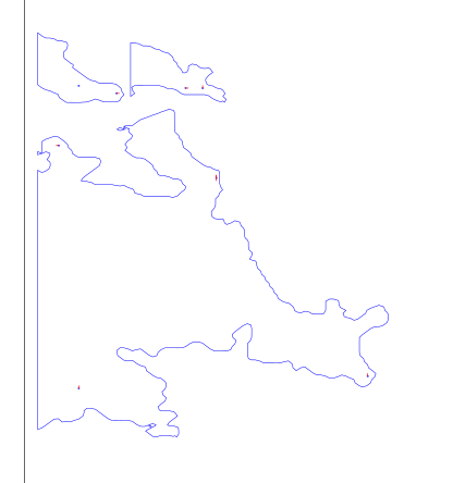
Due to scheduling conflicts on LibCal I couldn’t print my project at the time I planned. I will be continuously updating this post throughout the day as the lab opens. Currently I have changed my project a bit and have decided to print three layers- one being a base layer with “Small Point, ME” engraved on it, one being the bulk of the area of Maine I am printing, and the rest being smaller surrounding islands and mountains.
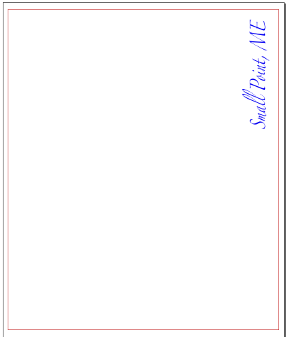
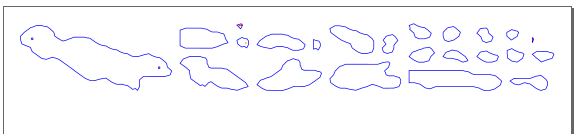
Here are screenshots of the SVG files for my layers:
Hi Amanda! Will you be painting the layers with natural colors or bright colors? Also what is the material for your piece? i think it would be interesting to make the bottom layer acrylic and top layers wood.
Hey! I used plywood and will be using three different color stains to represent the different elevation.
I did consider using acrylic and honestly might make another version with the acrylic to represent the ocean. Thanks for your input!
Hi Hannah! I appreciate the roads and land labels you added to the mainland layer as well as the Small Point, ME title. these details really make the map real. The stains look awesome,if you changed the water to a blue of some kind which two stains do you think you would use on the land layers? Personally, I think using something to distinguish the water from land would add something. IDK if it has to be blue paint, maybe the darkest stain so that the warmer browns are for land, but I also like your idea to try using acrylics. I don’t think you can make a wrong choice, just depends on which arrangement you like best.
Hi Hannah, I notice the use of different stains on each layer. What made you chose the amount of detail you put in? what do the engraved lines represent?
Hi Amanda! I noticed the different shades of the wood. How did you choose which color/shade to use for each layer?