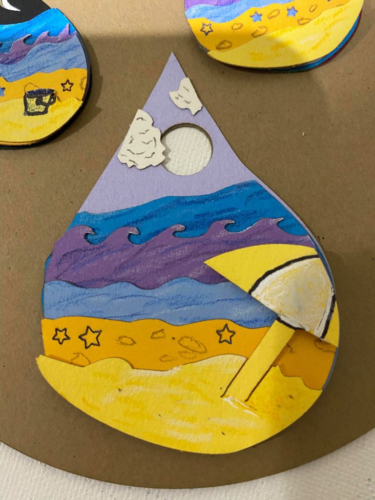
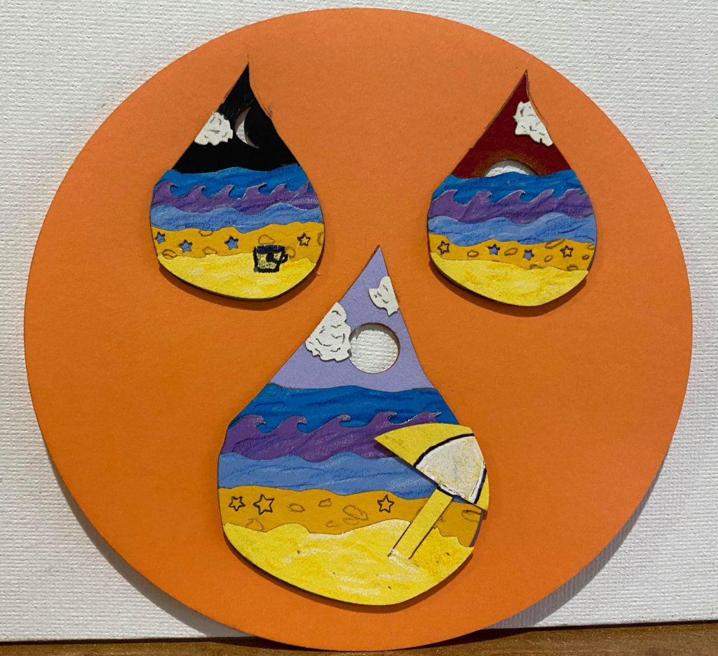
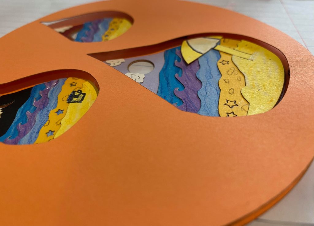
(4/12/21) As of right now, for my initial design the only thing I need to do is add the top layer over the raindrops to case it in. I planned to do this by using scrap pieces of wood from previous cuts and hot gluing them between the base layer and top layer. However, the scraps that I had are slightly bigger than the dimensions of the circle of the piece but when I go to cut additional pieces this week I will cut the sizes I need and do so. Which brings me to the next part of my piece. I thought about the piece and wanted to add more to the overall shape of the piece because I changed it to be a circle which I liked more than what I initially had but wasn’t entirely thinking that was the final shape. Because of that I thought it might be interesting to have the circle piece I have now become a pearl in an oyster or clam because in the raindrops are beach scenes. So I’m going to add additional layers to the piece in the overall background of the piece. The plans for that are in a photo below. Additionally while starting to cut the layers for the piece I wasn’t sure what the background of each of the raindrops should be or what the overall top layer of the piece should be. As a result, I tried 2 different top layers and tried the background of the raindrops being all different and then the 2 smaller ones being the same before deciding they should all be different. I also added some small details with pen and colored pencils on the different layers. A thing I learned while using the laser on the cardstock is that the material can only be cut and vector engraves won’t work. I had tried the laser at 0.1% and other numbers before 0.2% (which cuts the piece) and nothing appeared. I was able to have some of the stars stay in the piece even though they were technically cut because I had them on the 0.2% which cuts, but it cuts in a way where the parts will stay for the most part unless pushed.
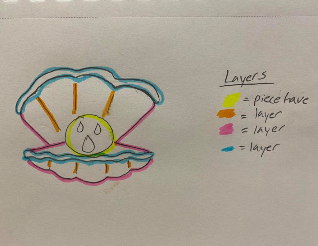
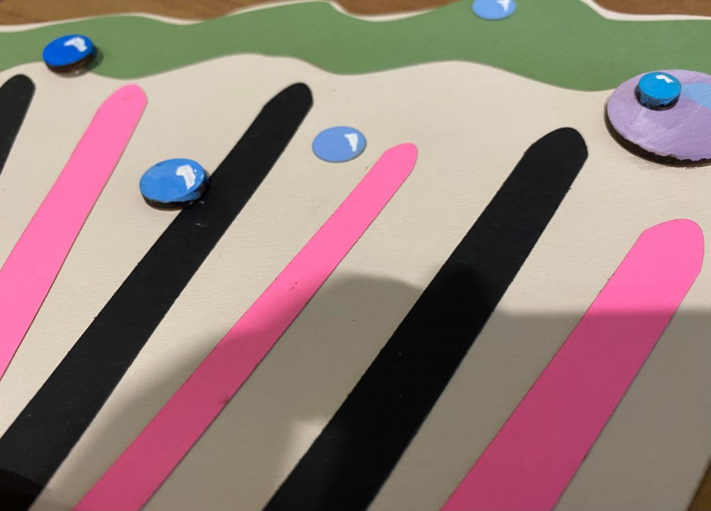
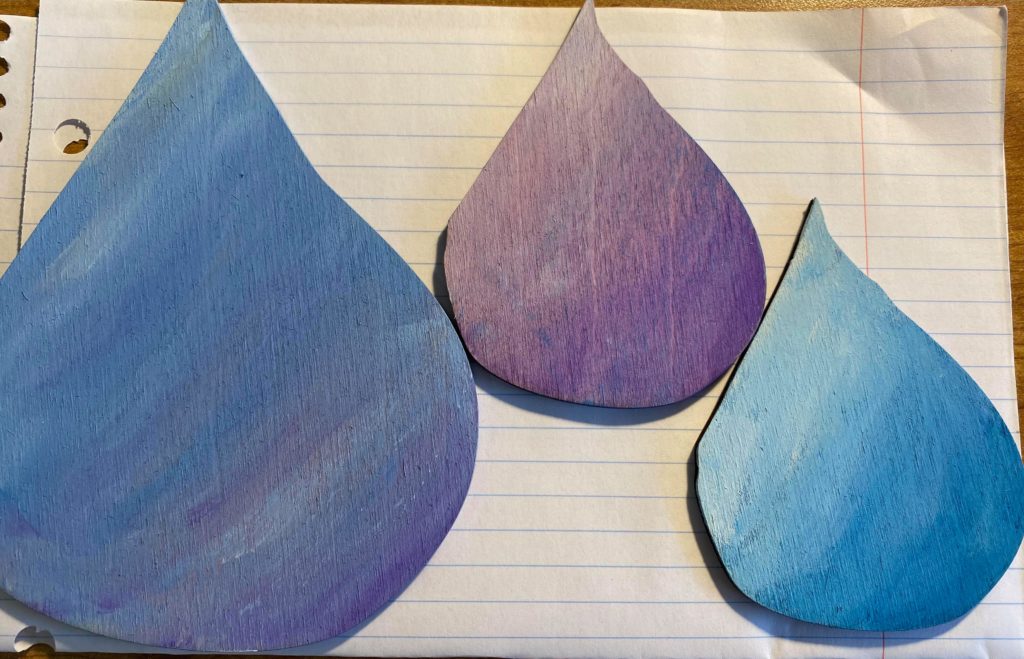
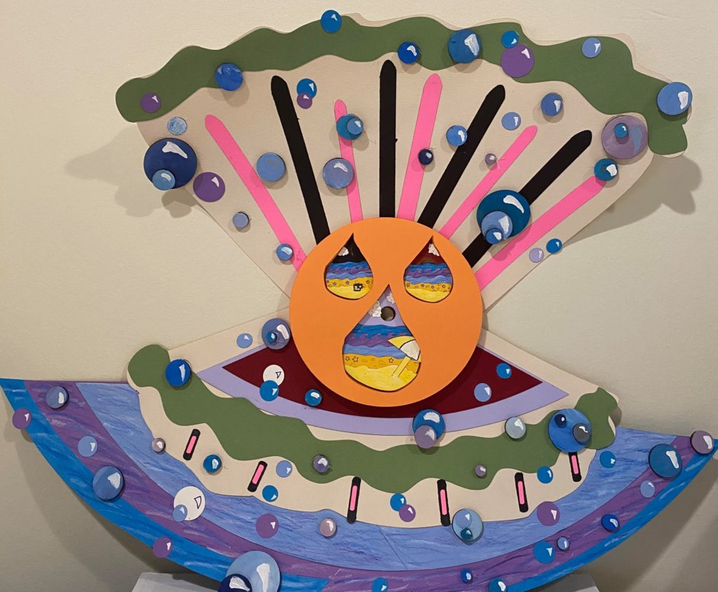
UPDATE 1: (4/15/21) Once again, I’ve finished my initial updated plan for the piece and made the oyster/clam shell. However, while separating out the layers I realized the potential for more layers in some places. For the shell lines I added an additional second layer on the bottom half and not the top half which was initially supposed to but while putting everything together the space on top felt empty so I separated out the two layers and had more shell lines. I also added two layers of the open shell bottom where the main circle piece rests in. While cutting those pieces I had initially planned on a layer being light blue but I ran into an issues each time I had cut the piece because of forgetting to cut out the negative space and existing cuts on the page. But now having those two pieces I thought it would be interesting for the shell itself to be a layer above something which resulted in the shell being above water. Additionally this is part of the reason why there is going to be another update. Because I added the one layer of water, I now want to mirror the water layers from the original part of the piece and will be going back to add the additional two water layers. Another part of the piece that wasn’t in my original updated plan and is also now part of the reason there is going to be a second update is the water bubbles on the piece. When I was cutting pieces of wood to use as additional depth for the circle between the shell and between the circle layers itself I thought of adding the wooden bubbles and potentially stacking them for more layers. So I cut several wooden bubbles and also had some cardstock circles leftover to create varying bubble depths in places on the shell. I want a couple more bubbles added to the piece and potentially hang off the piece. Another thing I’m considering is that from my initial test cut of the piece with wood I had some raindrop cutouts that I might incorporate into the piece. I’ve painted them and will wait till after I’ve added the additional water layers and bubble pieces/layers before I make my decision about them though.
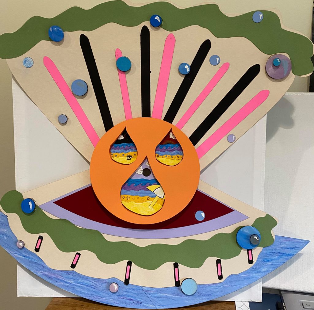
Update 2 (4/22/21): I’ve attached everything to the piece now. This is the final version.
love the use of color
The bold colors have made your beach scene so happy and inviting. I appreciate how you are rethinking the final display of your project. How big do you think you’re going to make this final shell of layers? In my opinion I love seeing that some vector engraves worked and your are leaving them, and I actually really like how some are cut while some aren’t. There is something really cool about being able to see the blue water through the stars cut out of the beach layers.
Hi! So I remembered I had 19.5″x25.5″ paper from another class, so I’m able to make the shell bigger than I had initially thought with the 8.5″x11″ cardstock. I’m not going to make it super big but big enough so that it won’t feel squashed and I’m also able to use the 8.5″x11″ cardstock for the additional layers on it. I’m still working it out in Inkscape.
Hi Emily,
I appreciate the details you added in the clouds with colored pencil. Do you have a plan for the negative space in your piece?
Hi! I don’t have a plan for the negative space of my piece. I’m now trying to decide if I want the negative space to cut through the clam/oyster background or if the negative space is now filled by the clam/oyster. I think I will end up cutting through it though.
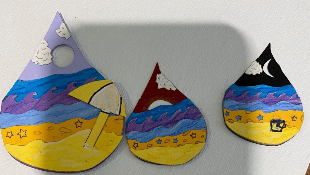
Hi! I notice and appreciate how the 3 scenes have the same beach and ocean compositions and colors but the skies are different. My question for you is are you going to use more cardstock or wood or another medium for the background layers you plan to add?
Hi! I plan on using cardstock/paper for the additional layers but similar to how I plan on adding pieces of wood to space out and add the top layer of the original piece, I might do the same for different background details.
Hi Emily! I appreciate the texture you added to your piece with the different patterns on each layer and especially the textured paper used for the sun/moon in the skies. I was wondering how you determined the colours for your piece? I think that they all look really nice together especially the purple sky in the daytime piece.
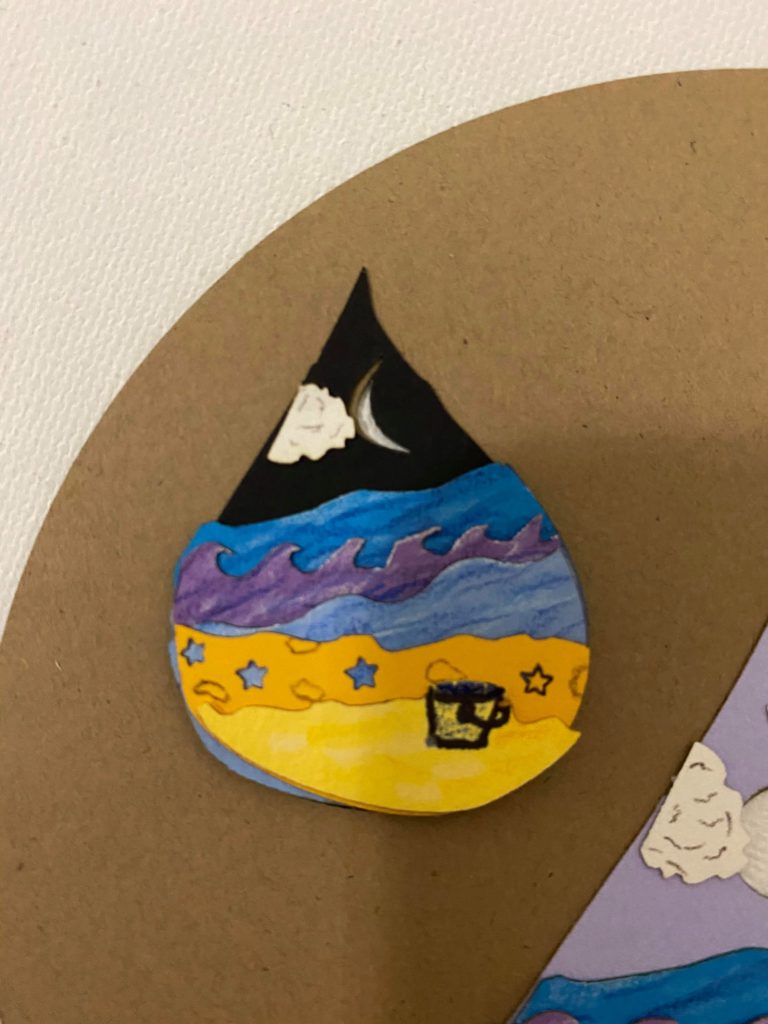
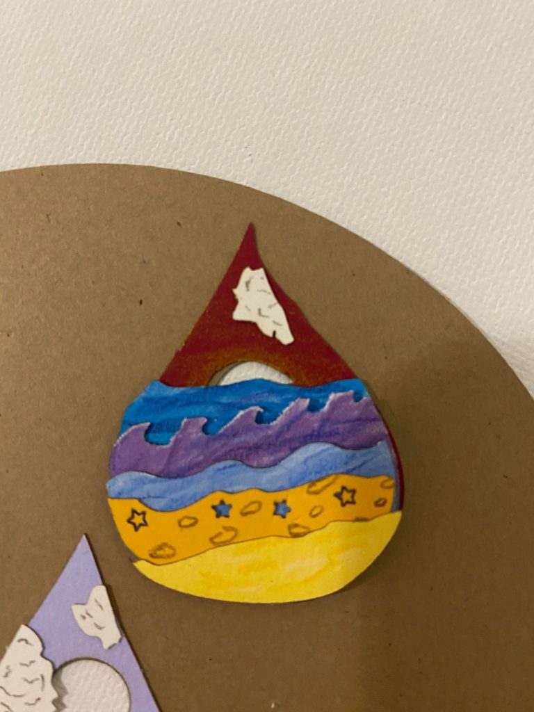
Hi! So for the background layers I tried to think of what the time of the day would be and what an interesting color for that might be. For the large raindrop I didn’t want to repeat using one of the blues from the ocean in the sky but also wanted it to be near that – which resulted in the light purple which is a color I liked and wanted to use in the piece somehow. As for the two smaller drops, the sunset raindrop was trying to take a color that might appear in a sunset and then use colored pencil to help it be the sun fading in the sky. As for the moon one, it almost ended up being the same color as the sunset raindrop, just to see how it would look if the smaller pieces pieces had identical backgrounds, but I preferred that each raindrop had their own time of day/background color so I went back to the black background.
Hi Emily! I appreciate the various background you painted on the water drops! Have you thought about using material to put the drops at varying distance from the background? I would also use a neutral background to help the colors in the drops pop more.
Hi! I hadn’t thought of doing that but that might’ve been something to consider but I already glued the raindrops to the back piece for it. I’m going to try to incorporate wood pieces in different places for more depth though.
I noticed that each raindrop represents a different time of day. What made you choose the relative sizes of each time (why did you choose daytime to be the larger than the others)?
In my opinion it would be cool to cut a pattern around the edges of the top and bottom layers, make it look like the raindrops are in the sun?
Hi! So the center raindrop was the original shape and I thought it would be interesting to have a repeating shape that isn’t necessarily the same size which resulted in the smaller two. The time of day was kind of random where I thought about maybe doing entirely different scenes in each raindrop but ended up going with the same scene but with slight differences. Daytime just ended up being the original again so it stayed.
Hi Emily! I appreciate the colors of the sky representing the different times of day at the beach. Was there a story you wanted to tell with this piece?
Going back to color, in my opinion, I think the backdrop should be more of a beachy “sun- bleached” wood color. Do you have any other plans to finish the piece?
Hello! I am struck by all the detail and color in this work. How did you decide what color to use where? I love how the colors fit a beach vibe, but are a little different than reality.
I love the update, especially the little bubbles coming out of the clam, it really makes a whole scene for the piece. I can’t wait to see the piece when you add in all the other things you’re planning.