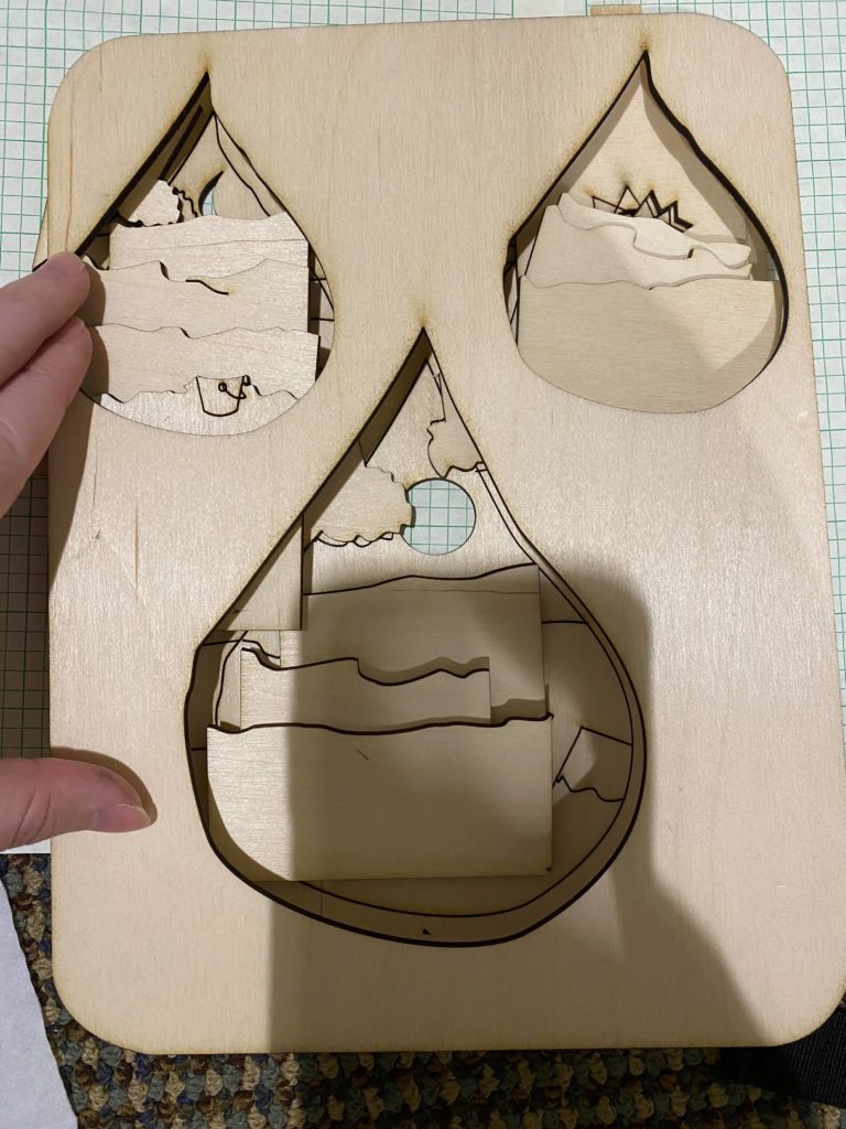
Cutting out the design showed me what I needed to adjust in the design so pieces that aren’t meant to be cut out don’t end up that way (the top of the bucket and the sun setting). Additionally, I think before going into final versions more testing of cuts is needed because I consistently had the problem where after my test and actually cutting the piece, sections of pieces wouldn’t be cut all the way through or pieces that weren’t meant to be cut out could be pushed out with a little force. I also made an issue for myself that can be seen in the photo that shows all my layers on top of each other that I cut the layers in a way that was saving material space and in way that I thought would cover the needed space and they didn’t. So between my final version and this version I will probably try to get another test in with the revised layer shapes so that sections aren’t missing.
Some Questions:
- I think the overall shape of the piece could change. I do like the rectangle with the rounded edge but I think changing the shape to be either a circle or the raindrop would better shape it. Would changing the shape help?
- I think to distinguish between the layers more, I might add rock shapes to each raindrops second sand layer or do something to the water to make it more clearly water. Is one more effective than the other?
Hi Emily,
In response to your second question, I think it would be cool to engrave some curvy lines in the water for waves.
Hi!
I think changing the background main shape to a circle would make the design more cohesive
Hi Emily! Responding to your first question, I actually think changing the overall shape to a circle would frame the raindrops nicely!
Hi Emily! I also think a circle or oval shape would flow better with the raindrop designs. For your second question, are you thinking of painting each layer once its done? I think adding color or even rastering designs on the layers would help distinguish them more.
Hi! I agree with the other comments suggesting to use a circle/oval shape! I also think that you could engrave some patterns into each layer to help distinguish them.
Hi Emily! I think using a waterdrop outline might create more harmony within the piece. So using the same shape but at different sizes might create a sense of uniformity and visual interest in the piece. To make the layers seem more differentiated, make sure they fit the droplets and adding rocks on the sand layers might help with showing what’s land and what’s not. I really like the depth in the piece so far!
I also think framing it with a water drop shape is a great idea. It would add a cool level of unity to the whole thing and frame it in a really interesting way. One way I think that would really help differentiate the layers is some color. Painting it or something similar should create a lot of contrast.
Hi Grace! I think if you wanted to enhance the effect that it is water you could add some more lines to represent waves or maybe even paint the layers.