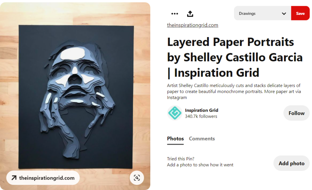
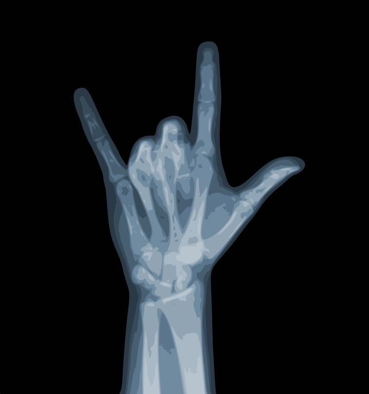
I was looking on Pinterest for some more inspiration and saw a few pieces by Shelley Castillo Garcia that I liked the style of. Her layers individually appear simple but depict a detailed image when put together. The monochromatic look also adds a formal and simplistic look to her pieces. I wanted to make a piece using her style. I thought of x-rays, since those are already in black and white and Garcia’s pieces are all grayscale, that on top of the fact that I could only find sets of grayscale paper and no other packs of paper with varying shades of the same color. I found paper that came in a grayscale pack with 9 different shades, and so I made the design of an x-ray of a hand with a bitmap trace of 9 colors from an image online. The current plan is to have the lightest color be the bottom layer and cut and stack the darker colors on top of it, so it will look like you are looking inside the x-ray, not like the x-ray is sticking out at you, but I will have to do some test cuts to see if I like the way that would look.
Hi Amanda! How big do you think your design will be? I notice that there are a lot of small details in every shade so I was wondering how you will keep track of them or if you will only focus on the major parts of the design.
I planned for my design to take up a good portion on a regular sized piece of printer paper, and I will scrap some of the very small pieces depending on how they come out cut but hopefully I can include most of them. Doing the design with the lightest on the bottom layer will allow most of the different colors to really just be holes in the layer above revealing the lighter color underneath.
What made you decide to do a hand for the x-ray?
My sister was showing me the sign language she has been learning the same day so I thought doing a hand in a fun position would be cool.
i Love this idea. How do you plan to balance the layer of the colors while also keeping the 3D shape to look like a hand?
I hope that the color of the paper on each layer will be different enough to keep the idea showing through, but I may have to change my design if it comes out different than planned.
Hi Amanda! I love your direction with colors alongside the X-ray hand. I’m curious, how do you plan to maintain a sense of a contrast when the piece is in the light?
If I can mess with the colors of the layers, go out looking and get varying degrees of shades for the layers I hope the contrast will show through.
How many layers do you plan on doing?
I currently plan on doing 9 layers.
Do you plan on stacking the paper on top of each other or using a different medium to add more height between each layer or paper?
I have thought about putting pieces of cardboard to separate the paper, but I will have to experiment with it to see which way I like it.
Woah I really like how you mix the color palette within the ideas of the layers for this design. I understand your inspiration for the layering but just curious, what were you thinking when you’re designing the piece? And what makes you choose this symbol?
My sister was showing me the sign language she learned and this is “I love you” in ASL.