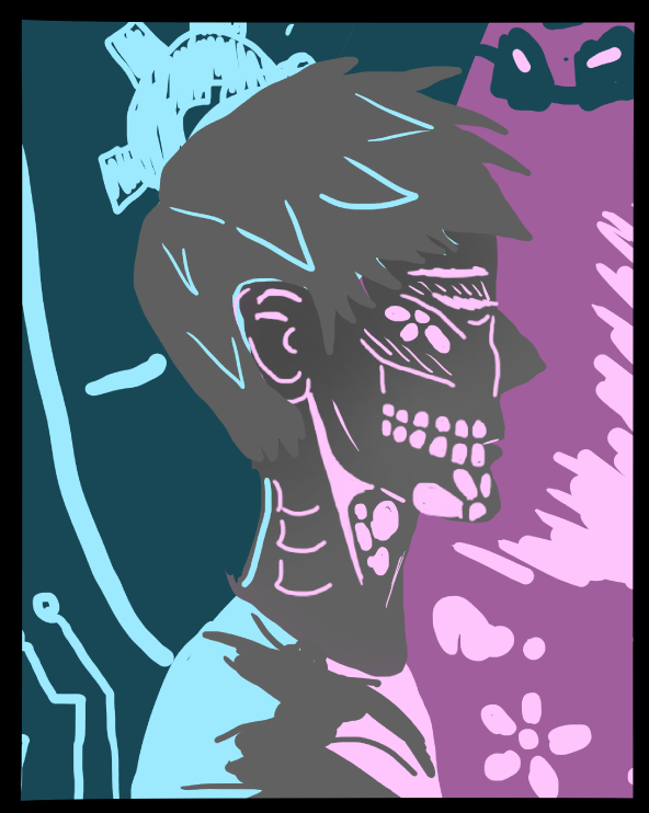
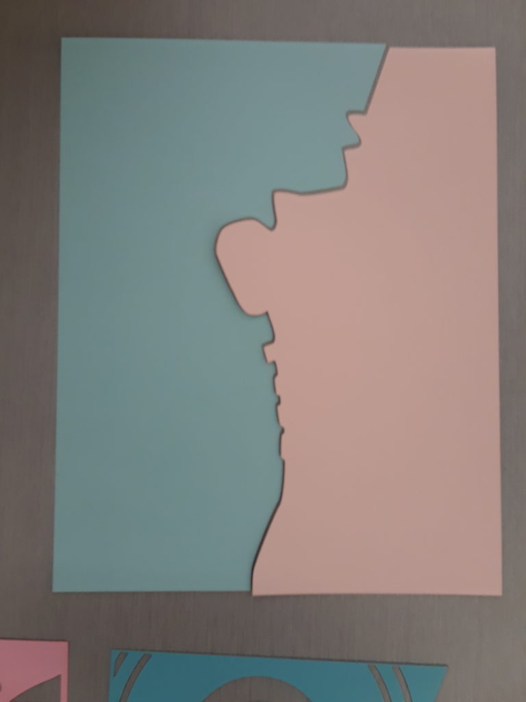
After looking over my design and creating a rough version of it in Inkscape, I decided to scrap my initial design. I am instead going to work on a mix between incorporating the idea of an organic/inorganic mix through the visual of a person. Below is a sketch I’m starting to flesh out. I’m planning on doing most of the work by hand in Krita first and then using the image trace in Inkscape to make the final pieces. I plant to have very wide pieces that have intricate cuts. I did experiment with my paper as well and found that the light pink and light blue had very good transmission levels, but the others blocked out light very easily. This is exactly what I wanted to work with to create the high contrast equivalent to the sketch.
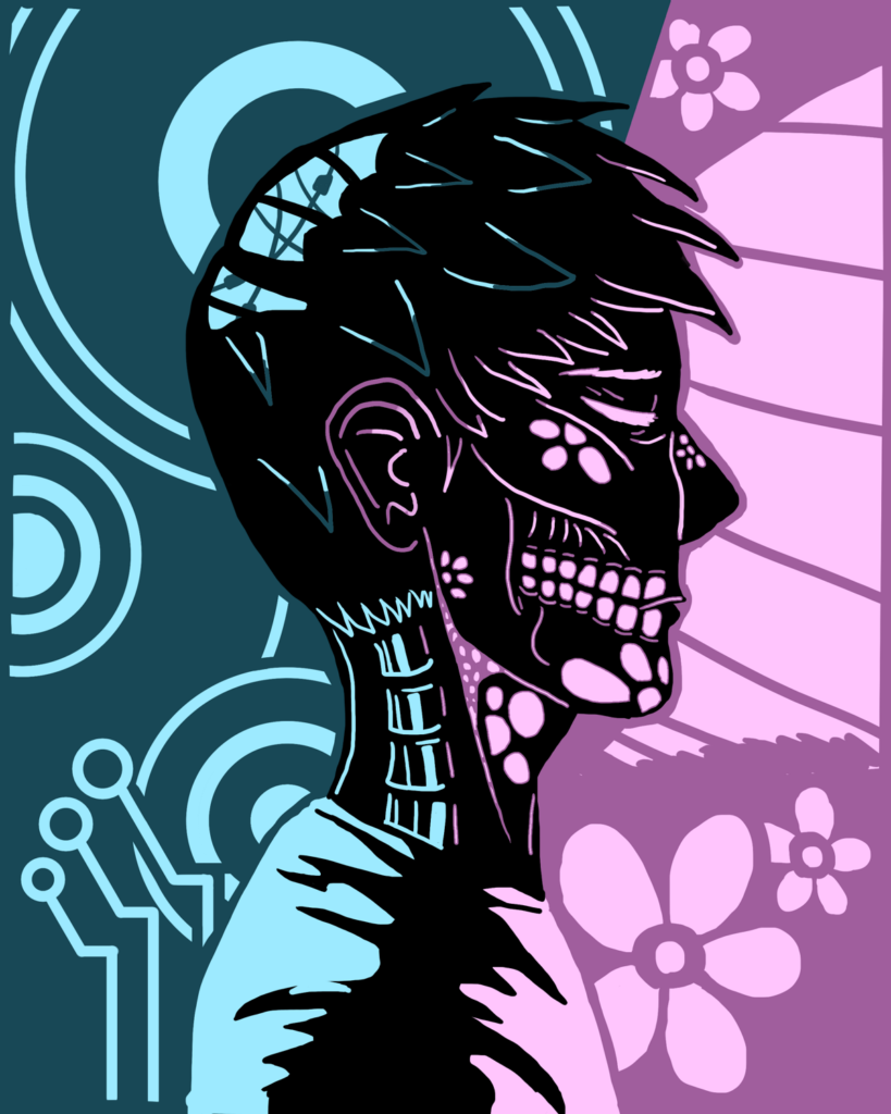
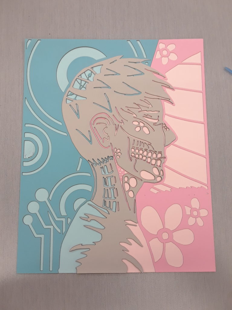
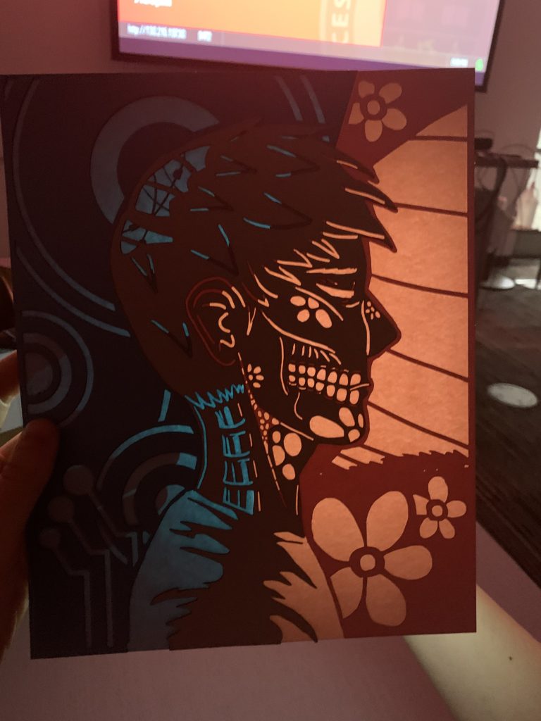
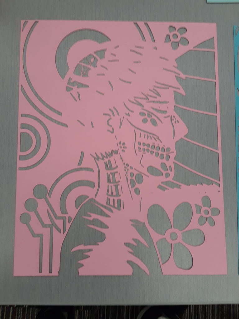
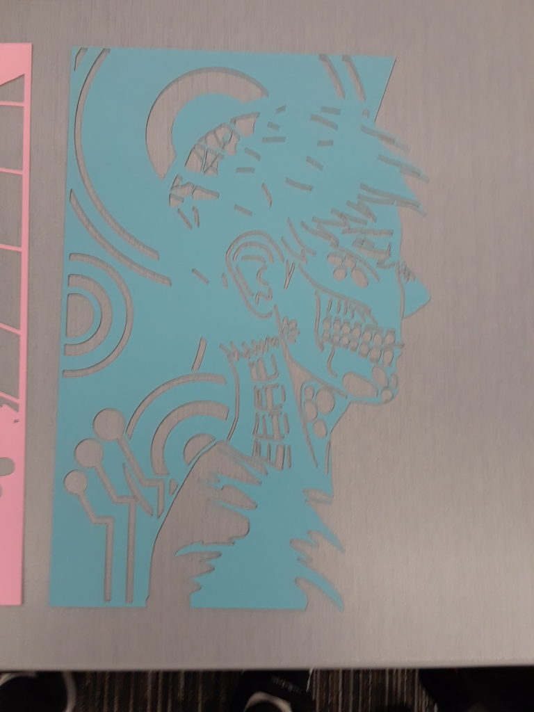
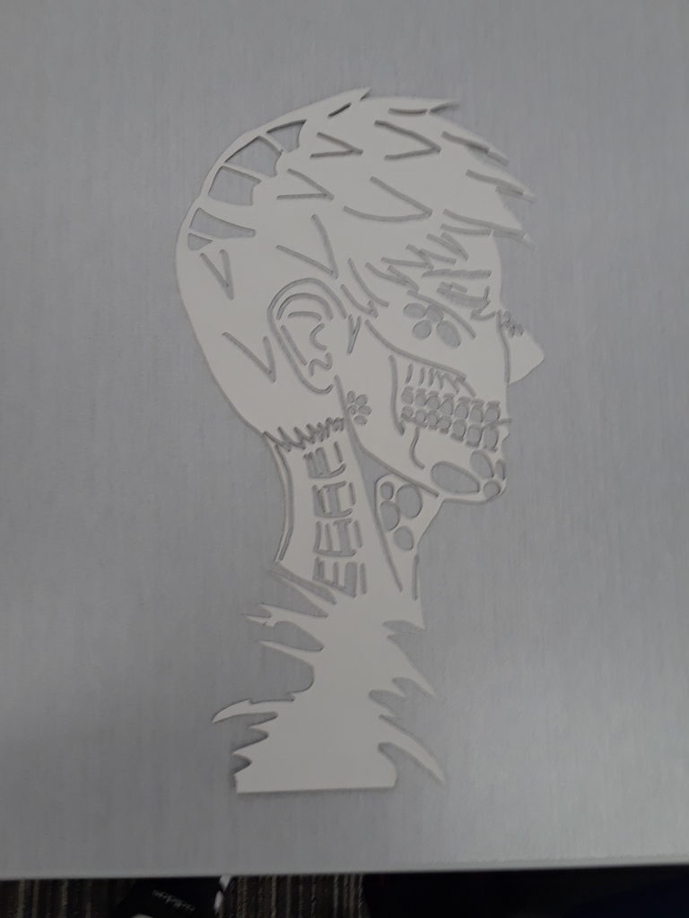
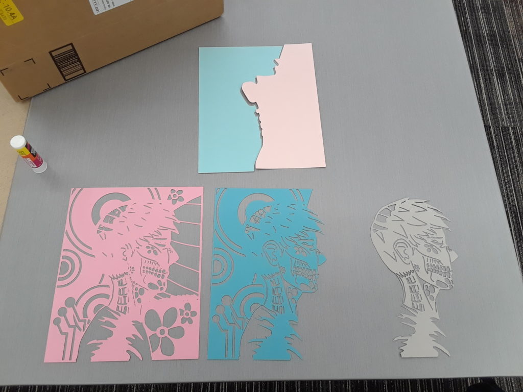
After finishing the final illustration, I was able to use Inkscape’s bitmap tracing to get my layers. I did have some issues with that as Inkscape didn’t recognize the top layer of black and combined it with the dark blue. I got about this by upping how many colors there were and deleting the unnecessary ones. The light blue and light pink needed to be separate pieces as well to maximize the light that was transmitted through the piece. I had designed my illustration so that I could have a distinct divide down the center and could separate the back up. Even with the precision of the laser, I had a slight issue with kerf, however, this only caused two small holes that only I noticed at very specific angles and shouldn’t be able to be easily picked out when the piece is looked at and lit diffusely. I test lit the piece with a projector in Foisie. I was very impressed by how well all the small details I added came out only the piece as well, like the lines on the face and smaller flowers. I ultimately decided not to use the sticky dots that I ordered as the details might get obscured. However, I have a lot of cardstock left and I’m excited to do further work with it!
Update 04/26/2021:
It’s finished!
I laser cut, constructed, and painted the box this evening and was able to get batteries for my LED strip!
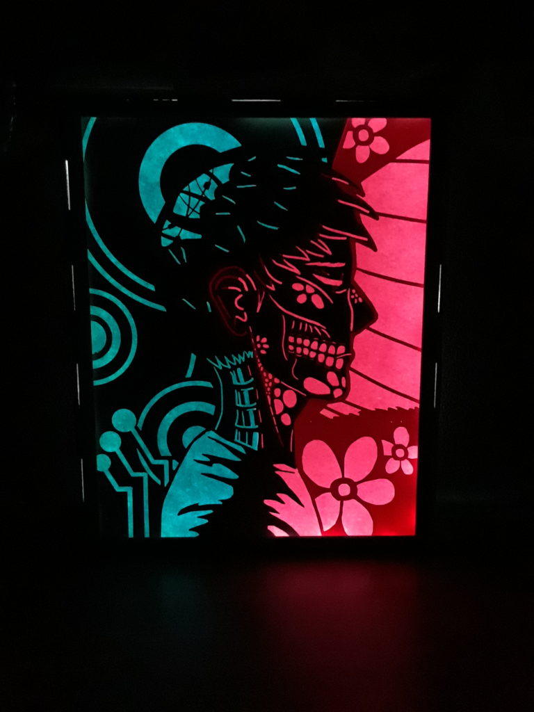
Below is a video of it running through an RGB cycle.
Question: Since I want to do more of these, do you have suggestions on how I could make the image able to be swapped out?
Hi! I noticed the layered small details. What were your thoughts about spacing the layers without the sticky dots?
I thought about it, and immediately after cutting out the pieces I lifted the pieces apart and I didn’t like how you could see the colors more separate so I kept the close layers.
Hi! I notice the amount of depth and detail in the piece within the limited color palette. What was your inspiration for this silhouette profile design?
My opinion would be that I enjoy the way the body/ anatomy parts are juxtaposed against the flowers and natural designs
Thank you! I was initially thinking about the contrast between art and robotics. I chose the close up because it allowed me to work with more details and increase the contrast between natural and unnatural.
Hi Kat! I appreciate the natural vs more technical sides of your piece. Will your piece be in a light box or have a stand for light to shine behind it?
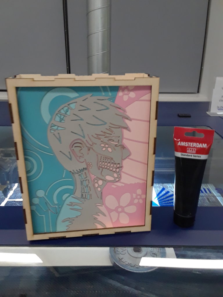
The piece will be in a light box. I added keyhole-like hole for the piece to be able to be hung up on the wall.
Hi! I appreciate how the design in the foreground and the background interact with each other to create an overall intricate design. Your final piece looks amazing and I like how the purple and blue LEDs look!
I like this, is it going to be the same image on each side?
The way the colors on the two sides contrast with each other is really interesting, especially how it affects the light from the LEDs. Fantastic job!
Hi Kat! I appreciate how the LEDs change the main colors of the piece. Sometimes they look like the same colors, and other times they are contrasting. I love how this turned out!
The head design reminds me of the skeletons from the day of the dead, with the bones and the flowers creating that life/death contrast. Is there any symbolic meaning to these choices specific to you?
As for your question, i’m not quite sure, but this is amazing! My favorite part about this piece is the two-toned light! I wonder if this is due to the diffrence in the paper color or if you some how were able to split the paper behind and put two different LED strips in there? Either way the effect is so sick!