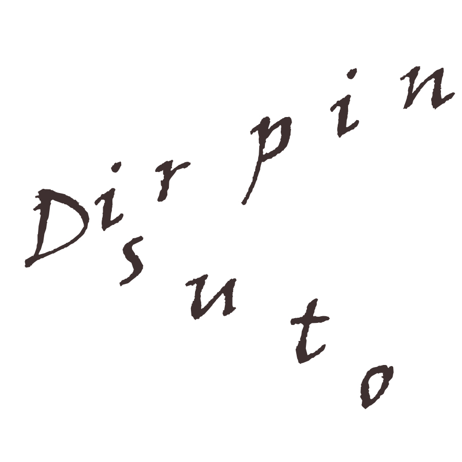
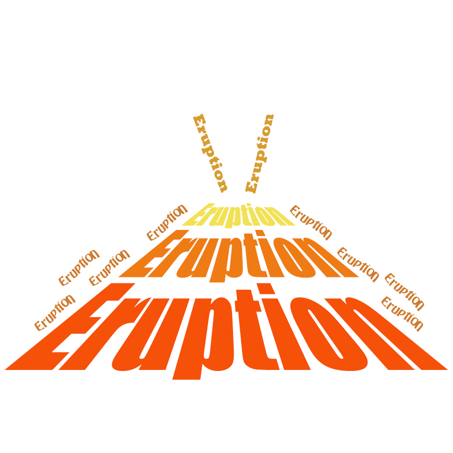
My words were Buoyancy, Disruption, and Eruption.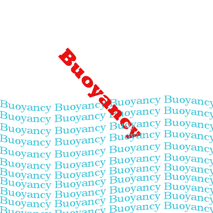
5 Replies to “Expressive Typography”
Leave a Reply
You must be logged in to post a comment.

C18 Digital Imaging & Computer Art
Worcester Polytechnic Institute
My words were Buoyancy, Disruption, and Eruption.
You must be logged in to post a comment.
Your image for disruption was very cleverly done because it disrupts the person trying to read it and gets more disruptive further into the word by spacing the letters out more.
For your Buoyancy picture, I like the idea as to how you went to represent the word. It might have worked a little better if part of the word were a bit more submerged withing the other words.
I like how you’ve created a volcano with the word eruption alone. The choice of color works well in the piece because it almost seems at though hot lava is coming from the top! The font choices also work well because the powerful font leads your eyes up the volcano with more natural font used for the flowing lava.
I honestly love your colors for the “Eruption” piece. It’s effective and visually pleasing. Color is everything when it comes to heat, and you captured it well.
I like the use of Impact on the Eruption piece. It’s a pretty compact and bold font, so it works well with the intensity of an eruption. The different colors for each level was a nice touch.
The wavelike words for Buoyancy brought out what you were going for. I’m not sure if the red text is a buoy or not, but the color seems to indicate it; however, at the angle the word is pointing, it looks like the word might be sinking a bit. I think you should tilt the word horizontally a bit to better give the illusion of floating on the water.
Disruption looks rather neat, but it’s a little tough to see what the image is conveying. It looks like the D is broadcasting the rest of the word out rather than the word being interrupted by the D.