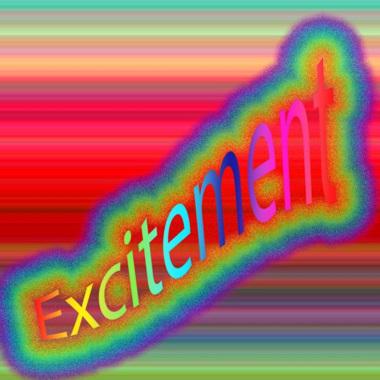
I like how you have used color to show excitement! The rainbow of color across the word and unique effect of rainbow dust catches the eye. Then there’s also the background that’s just full of color as well. These effects as whole draw your eye around the piece.
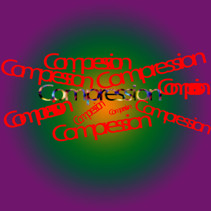
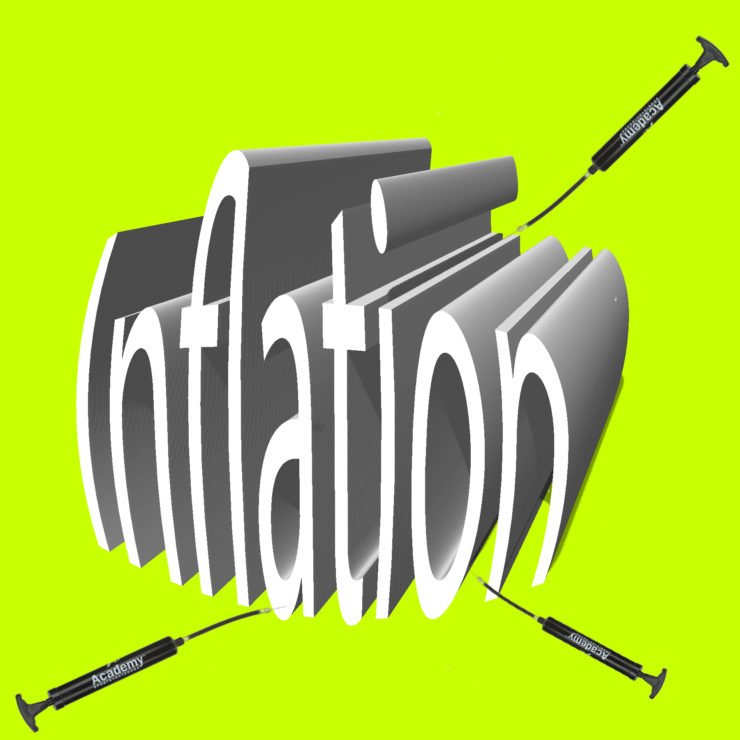
Your inflation piece looks really cool and definitely gives off the effect of being blown up. For you compression image, I would recommend varying the letter heights and roundness as you move towards the center, give it an inward motion.
The bright vibrant colors in your excitement picture defintly convey the image of excitement and energy. The way the end of the word seems to come out towards the front of the page also helps with giving the picture movement and energy.
The “excitement” piece reminds me very much of the works of Bill Wurtz, a musician and artist who got meme’d on Youtube a while ago. The inflation piece is strong in its use of the three-dimensional text, but the air pumps look almost like syringes, and take a minute to be recognized as air pumps instead.
Excitement is properly bright, cheery, and loud in its color choice. The glowing effect adds a little more levity to it.
I like how you started smushing together the individual “compression”s while they are congregating in the center. The comparatively tight circle adds a little to the claustrophobic feel of it.
The Inflation piece being the only one with 3D text also worked thematically with the word’s definition. The pumps in the image look like they stand out a bit from the rest of the word, though. The black on them makes for a nice contrast, but (this is a bit of a personal thing) they should be vectored or made of flat shapes; this way, the 2D of the pumps can also contrast nicely with the 3D of the text, also implying that the pumps are on a different dimension from the word in its current state.

I like how you have used color to show excitement! The rainbow of color across the word and unique effect of rainbow dust catches the eye. Then there’s also the background that’s just full of color as well. These effects as whole draw your eye around the piece.
Your inflation piece looks really cool and definitely gives off the effect of being blown up. For you compression image, I would recommend varying the letter heights and roundness as you move towards the center, give it an inward motion.
The bright vibrant colors in your excitement picture defintly convey the image of excitement and energy. The way the end of the word seems to come out towards the front of the page also helps with giving the picture movement and energy.
The “excitement” piece reminds me very much of the works of Bill Wurtz, a musician and artist who got meme’d on Youtube a while ago. The inflation piece is strong in its use of the three-dimensional text, but the air pumps look almost like syringes, and take a minute to be recognized as air pumps instead.
Excitement is properly bright, cheery, and loud in its color choice. The glowing effect adds a little more levity to it.
I like how you started smushing together the individual “compression”s while they are congregating in the center. The comparatively tight circle adds a little to the claustrophobic feel of it.
The Inflation piece being the only one with 3D text also worked thematically with the word’s definition. The pumps in the image look like they stand out a bit from the rest of the word, though. The black on them makes for a nice contrast, but (this is a bit of a personal thing) they should be vectored or made of flat shapes; this way, the 2D of the pumps can also contrast nicely with the 3D of the text, also implying that the pumps are on a different dimension from the word in its current state.