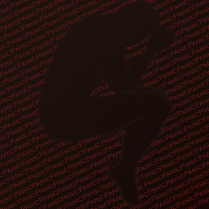
Panic:
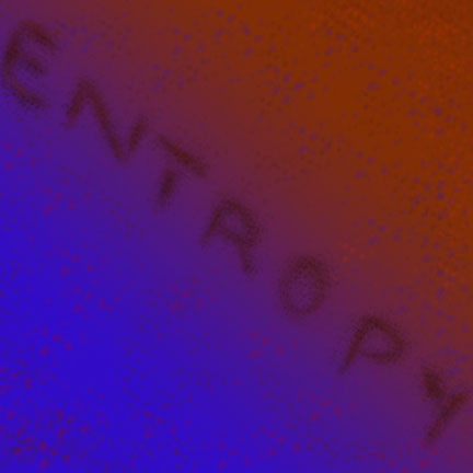
Entropy:
Confusion
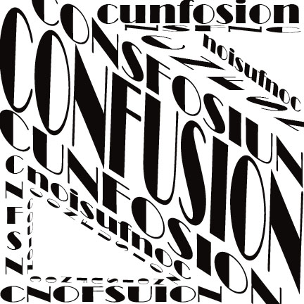
(yes the word confusion is intentionally misspelled)

C18 Digital Imaging & Computer Art
Worcester Polytechnic Institute
Panic:
Entropy:
Confusion
(yes the word confusion is intentionally misspelled)
You must be logged in to post a comment.
The design for ‘confusion’ is particularly interesting because the word itself appears out of order in some parts of the design, which is known to definitely cause confusion in other circumstances. The somewhat haphazard angles and shapes make for a design that’s intriguing to look at.
I really like the design for confusion. I like that you can boldly see the word in the middle but everything else gets mixed up, just like the word. The panic I am not really sure why you chose what you did, but maybe with a little more explaining, I would understand it.
I really like your confusion and panic pieces in particular. The fetal position in panic already displaces a panic emotion even if the words weren’t there. I also really like how confusion is not only all over the place but misspelled. My only comment would be to add more unpredictability in the entropy one. Really caption what the word means. Overall though, really nice job.
The confusion piece has a lot going on with different orientations and fonts as well as the small spelling change to make people double take. Definitely creates the feeling of confusion in my mind.
The Panic and Entropy images really work out. The font for confusion doesn’t quite fit for me, it seems a little clear cut and confident compared to the rest of the image. That being said the design in placement and misspelling is very interesting. Great work!
Your “Panic” piece is really interesting. You used negative space to relay an important message to the viewer. Also, the lack of any spaces between the words portray “Panic” in a fast paced manner. Good Job!
The concept you went for with Panic is really creative and very well executed. I really feel the panic.