For my expressive typography assignment I chose to use the words inflation, eruption, and buoyancy.


C18 Digital Imaging & Computer Art
Worcester Polytechnic Institute
For my expressive typography assignment I chose to use the words inflation, eruption, and buoyancy.
You must be logged in to post a comment.
I like the use of buoy-like structure and colors for your design for buoyancy. The simple water and sky in the background accentuates the whole picture as well.
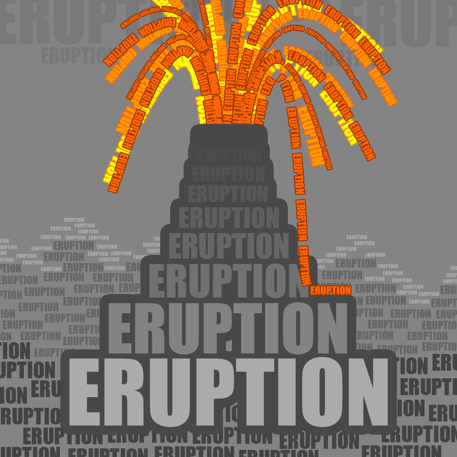
In your eruption image, you did really well using different font colors and outlines to form the picture of the volcano.
All three images are great. You use lots of different colors and shadows in your eruption image to create a feeling of building up to something, which ends up being the eruption.
I really enjoy the way you varied the colors and sizes of the text in order to create a sense of depth in the scene.
The amount of detail in each one of these pictures is insane. The masks on the buoyancy one really give thought to other objects associated with the ocean. I especially like the eruption picture because you conveyed a real image of a volcano so well with all of the different colors and sizes used on the text.
These pieces are all stunning. Every one is crafted with a theme of what people associate the word with as well as subtle details (the mountains behind the volcano) to provide really complete pieces.
I really love all of these. They’re so detailed and look amazing; it’s obvious you put a lot of work into them. The buoyancy one is my favorite of all the word art pieces. It’s super cute and well executed.
I like how in your “eruption” typography you managed to create a foreground, midground, and background.