
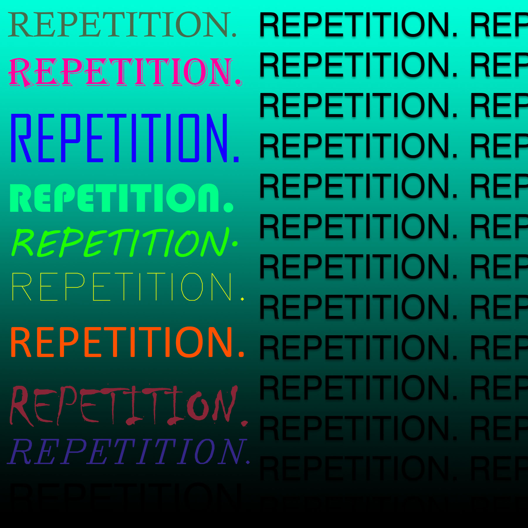
Repetition: I wanted this first picture to be split. One side having repetition, but in different ways while the other side had the same repetition over and over.
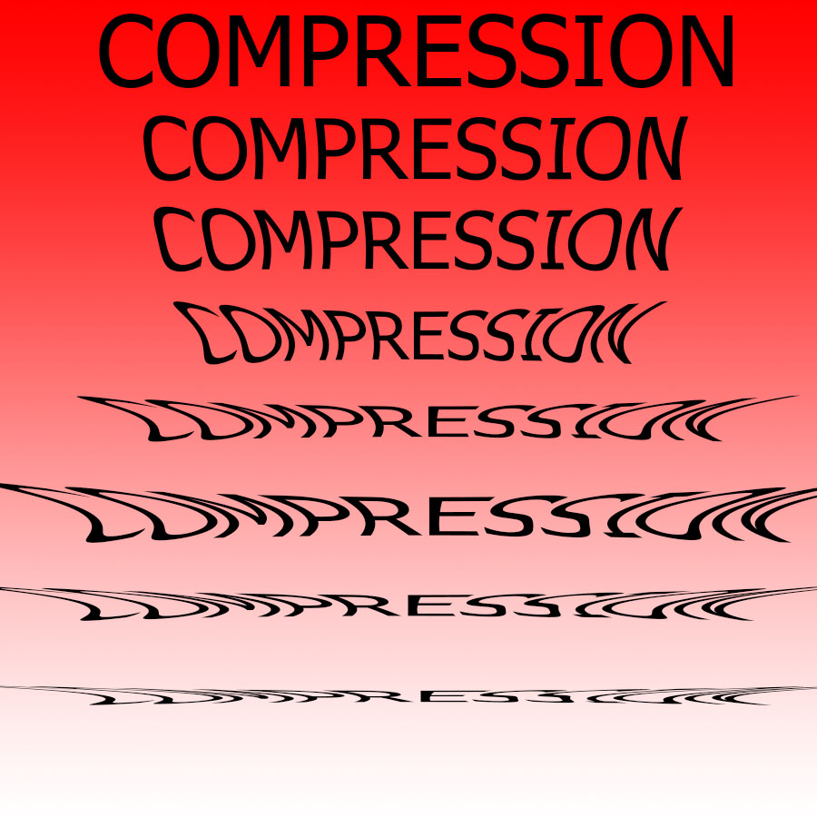
Compression: I wanted the topic of this picture to be the word getting more and more compressed as the picture goes on.
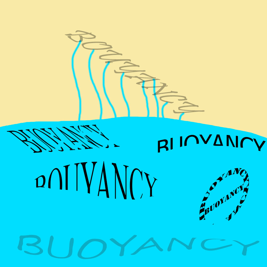
Buoyancy: I wanted this to be various buoyant words in a beach-like setting.
I have a suggestion for your compression artwork. I think it would have been better if you didn’t compress the words in two directions. I see you compressed it vertically and in the middle horizontally. I think if you just stuck with one of them, it would have turned out better.
I like the color scheme you have used in your repetition artwork. It might have been interesting if the repetitions on the right side of the word had been like this as well.
For the compression picture I really like your concept of the word getting more compressed and in that kinda getting a bit more distorted but it is a little bit hard to tell as it gets compressed in different ways, instead of just one constant way.
The first two images, “repetition” and “compression”, make perfect sense to me and are effective. The last image confuses me, however. “Buoyancy” is misspelled several times, but it also appears that water is leaking out of(?) one buoyancy to fill a pool or something, or possibly that several tendrils of water are holding one buoyancy above the rest? Some shadows or omitting the top buoyancy altogether may have helped make this image cleaner.