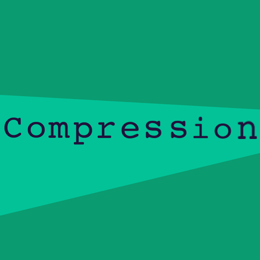
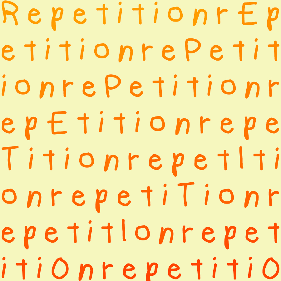
Each has a bit of a subtle thematic element, and a more obvious component.
![]()

C18 Digital Imaging & Computer Art
Worcester Polytechnic Institute
Each has a bit of a subtle thematic element, and a more obvious component.
![]()
You must be logged in to post a comment.
I really like the cleanness and simplicity of your transition artwork. However, it is just a little annoying that the fonts sizes appear to be slightly different. Also, I love the color change from the left and right half. Really pops out.
In your compression work, I can see what you are doing with the background which is working well, but It could have been more interesting if you had manipulated the letters in some way to show compression.
I think the font, color scheme, and random capitalization really work well in the repetition piece to make it stand out and look interesting but also sell the idea of repetition well.
The simple colors, cute pastel palette, and clean font make all of these a real treat to look at. My only complaint is that “Compression” was not made to fit the lighter area being compressed. Otherwise, wonderful job!