
Hello,
I probably had the most trouble with this assignment. Being limited to just text manipulation was not easy, and as a result for this assignment I did not feel as creative as in previous assignments. Here are my three words:
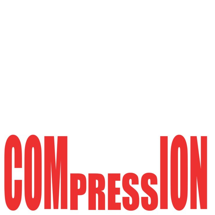
For my first ^ I did “Compression”. I liked this the best, as it used just the words and left some empty space for effect. The one thing I would have liked to do if possible was to add Mario and act like it was a “POW” block.
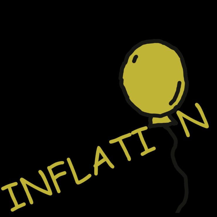
Next I did “inflation” ^. At first I really toyed with making the word into money or something along those lines, as the word of course does not just have one definition. I couldn’t get it to work well, so this was my backup plan. It came out well, with the “O” being a balloon, and the black background makes it seem like its floating out of the void.
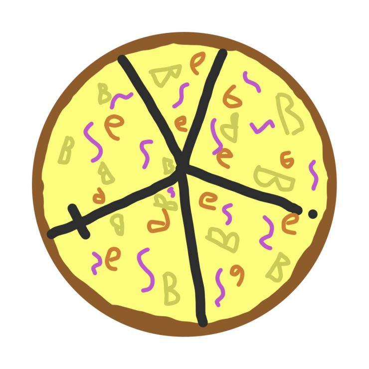
My last word I did was “Obesity” ^. This one was fun as I aimed for that childish look of pizza that every kindergartener draws, but if you look closer they are all just letters spelling the word “Obesity”. The “O” is the crust, the “Y” “I” and “T” are the slices, and the “B” “E” and “S” are the toppings.
The piece is kind of humorous. I love how the letters are all scattered like toppings on the pizza. The font of the letters certainly give off the silly feeling you were aiming for.
I love the inflation picture. The carefree font and color scheme makes it seem like it’s from a children’s book and the balloon is about to be given to a little kid. The easygoing and relaxed color and detail of the balloon furthers this effect.
I like your idea for compression but I think you could have compressed the letters more. Maybe if you made them wider it would have looked more like compression.
i really like the inflation picture. the marker-style font choice goes alone with the balloon sketch really well. I can kinda tell you drew the balloon by hand, but i think i will be cleaner if you do a oval shape using vectors
I laughed out loud at your Obesity piece. It was such a creative and funny idea. I like how you even added the i and the t into the cuts between slices.