
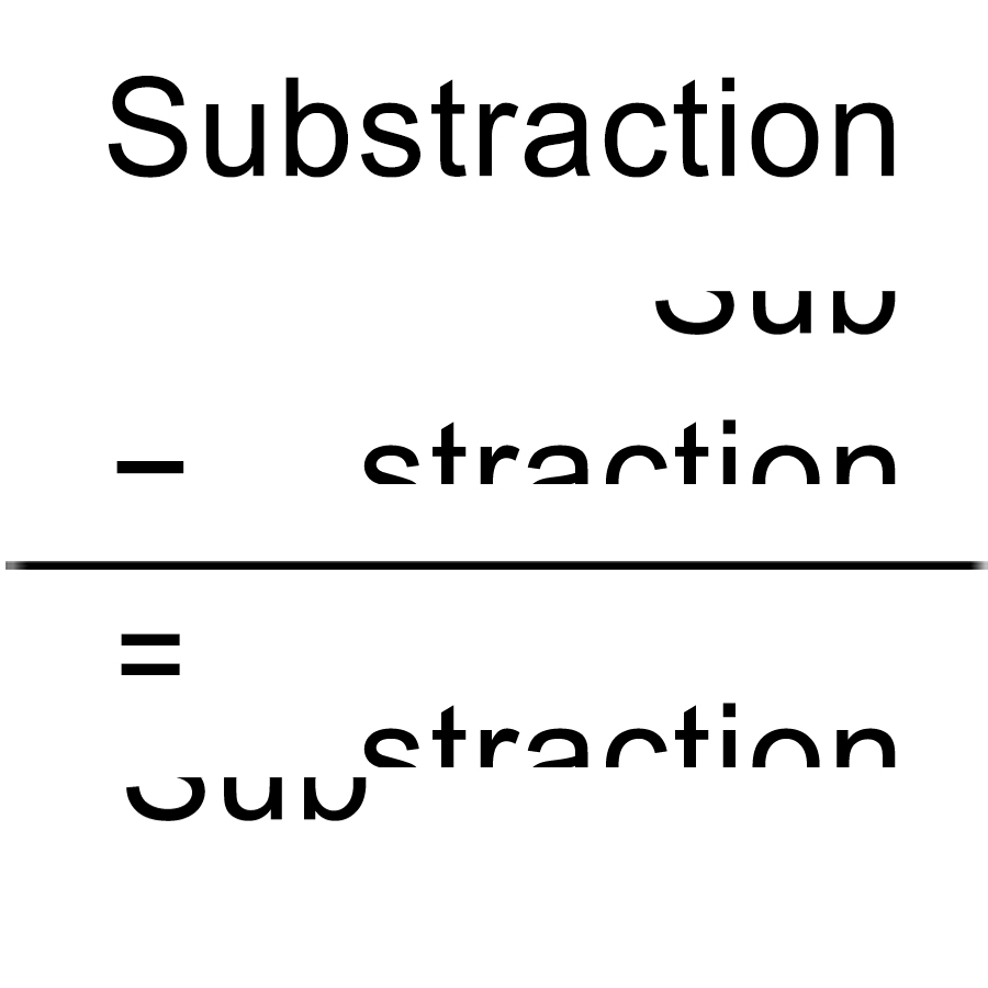
Subtraction: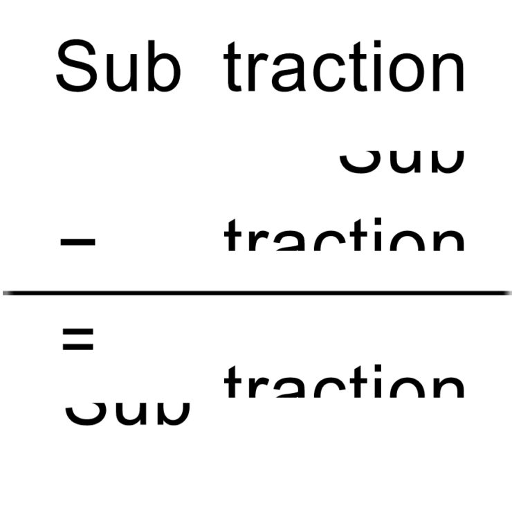
I made this word into a math calculation, subtracting parts of the word from original word and result in the new shape.
Inflation:
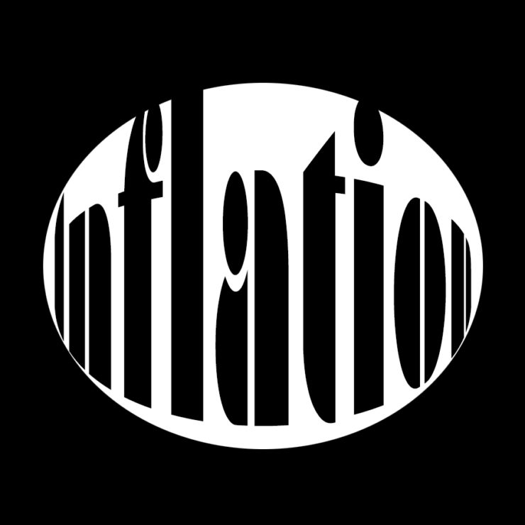
I wanted to create an effect of the fish eyeball lens, the word inflation expands in an oval shape and i chose a thick type font to make this effect stronger
Buoyancy:
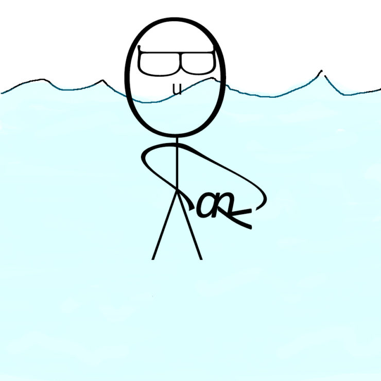
I used letters from the word “Buoyancy” in different size and font to draw a big-head guy floating on the water, and he’s playing around with a little fish
Your subtraction design is very clever. The use of math to, in the literal sense, subtract a word is a really nice touch.
I really like your subtraction piece. Relating it to mathematical subtraction was an interesting way to go about portraying it
It took me a second to understand the buoyancy piece, but now that I see it I think it is fantastic. Very creative in thinking of a not so obvious way of representing buoyancy.
Subtraction is spot-on. It looks like a very simple, but effective infographic on how the word is used. You used the space well.
The font for Inflation is very big and blocky, which helps to illustrate how much bigger it gets the further the circle expands. Of all the ones I’ve seen on the word, this is the first I’ve seen where the word appears to be on a balloon rather than being the balloon itself.