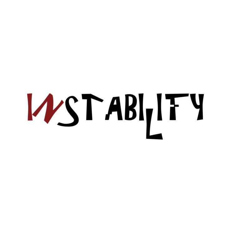
I like the cleanliness and simple grey/red color palette of these typographies. I especially enjoy the glitchy bits of “instability” that are cut and moved slightly from where they are supposed to be, and I wish there was even more of that going on!
Instability looks somewhat glitched, but pretty well-put together. It does not seem to convey the message behind the word well; to expand on the concept, it would be best if you shifted some of the letters a bit more, or perhaps had them in a way that looks like the letters could fall apart. The way the word looks now, aside from the glitched areas, it could stand for a very long time.