
My first typography was inflation. I thought most people would think of a balloon being inflated so I took the other definition and made a sort of stock/price increase scene.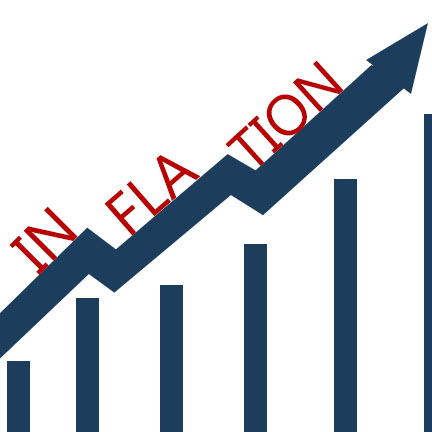
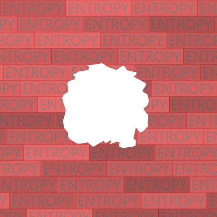
For my entropy typography, I had a pretty clean brick layout with the word entropy on them. The bricks should show order, but I thought it would be more interesting if I made them say entropy to contradict what it actually showed. Then I made a hole in the brick wall to show the actual disorder of this brick wall.
For buoyancy, I did a gradient background of dark water. Then I made bubble letters using the blending options on the words to make to appear to be more bubble and floating. Finally, I inserted a pattern of random circles to show bubbles floating up with I think made a pretty good affect.
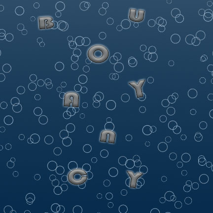
Your buoyancy image is very effective in making the letters seem like they’re floating upwards along with the bubbles. The font choice combined with the glow around the edges of the letters makes them almost look like they’re bubbles too.
I really like your inflation piece because, exactly like you said, it’s not the first thing I would think about when I hear the word inflation. The piece is very clean and precise, and ultimately demonstrates the word very well!
I love your buoyancy piece. Excellent choice of background and the glowing shadows around your text give the piece a lot of motion as it seems like the letters are floating upwards.
The buoyancy picture really has a lot of detail in it that makes it stand out. The realistic looking water and glowing, shadowed text actually makes it look like objects floating underwater which helps fit the theme of the image great.
I think the inflation piece with relation to finances and stocks really works well and the simple cleanness of it really helps it to look good.
I think it’s super cool that you went more towards the economic definition of inflation rather than focusing on the idea of a ball. It’s really refreshing and works well.