
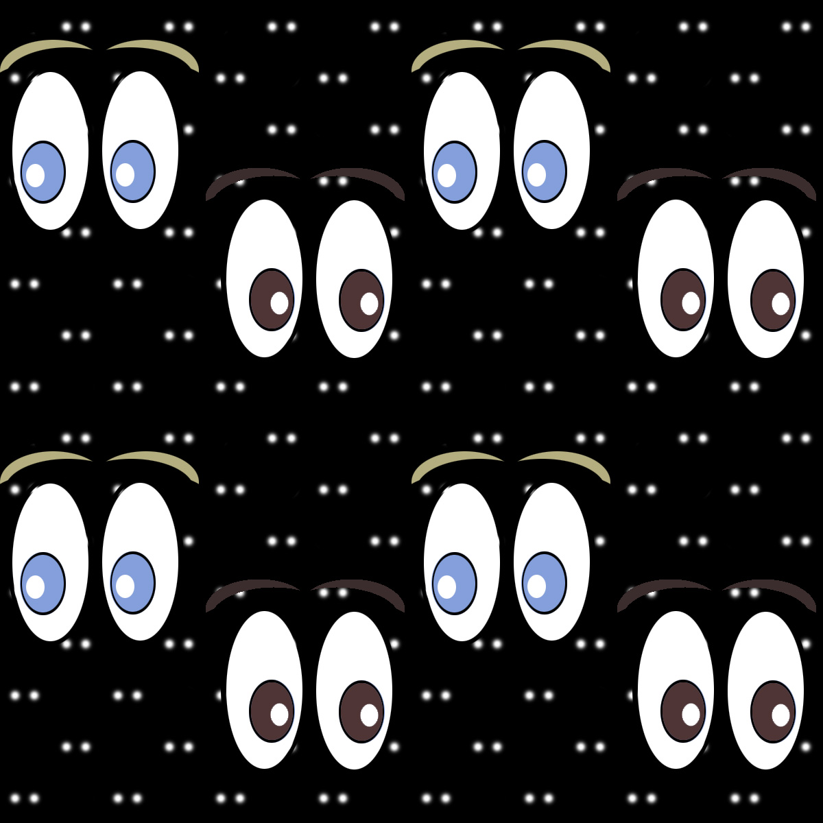
My first pattern falls under the animal category as the background is supposed to be similar to photos you see of animal eyes glowing in the dark.
My second pattern falls under the synthetic category. I took a picture of a can of Monster I had and used one part of the green “M” for the ring, while I cut the “o” from the word “Monster” for the center. I did, however, download the lightning bolt in the corner of each tile, but it was edited somewhat to fit better with the rest of the image.
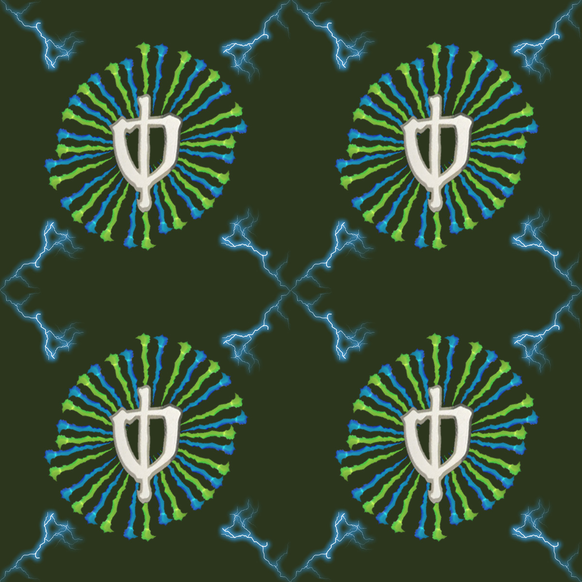
The second design has a very pleasing palate of colors. The fact that the circles made of the monster logo don’t quite line up around the circumference gives some interest to the design, as well as making the top right and bottom left of the circle pop out as opposed to the other sectors – which look pressed in.
The difference between the background and foreground on the first pattern makes the pattern have some depth which makes it more interesting for the eye to follow and creates a more visually deep pattern which I like a lot.
I like the contrast between the cartoony foreground vs the more realistic looking background. One thing that kind of bugs me is the colors in the photo but I don’t know much about color theory so I could be wrong.