I really like your vegetable pattern. Specifically I like how in the intersection points (where there’s the most empty space) it is not just a square, but an oblong rectangle. It brings out the light blue stripes well.
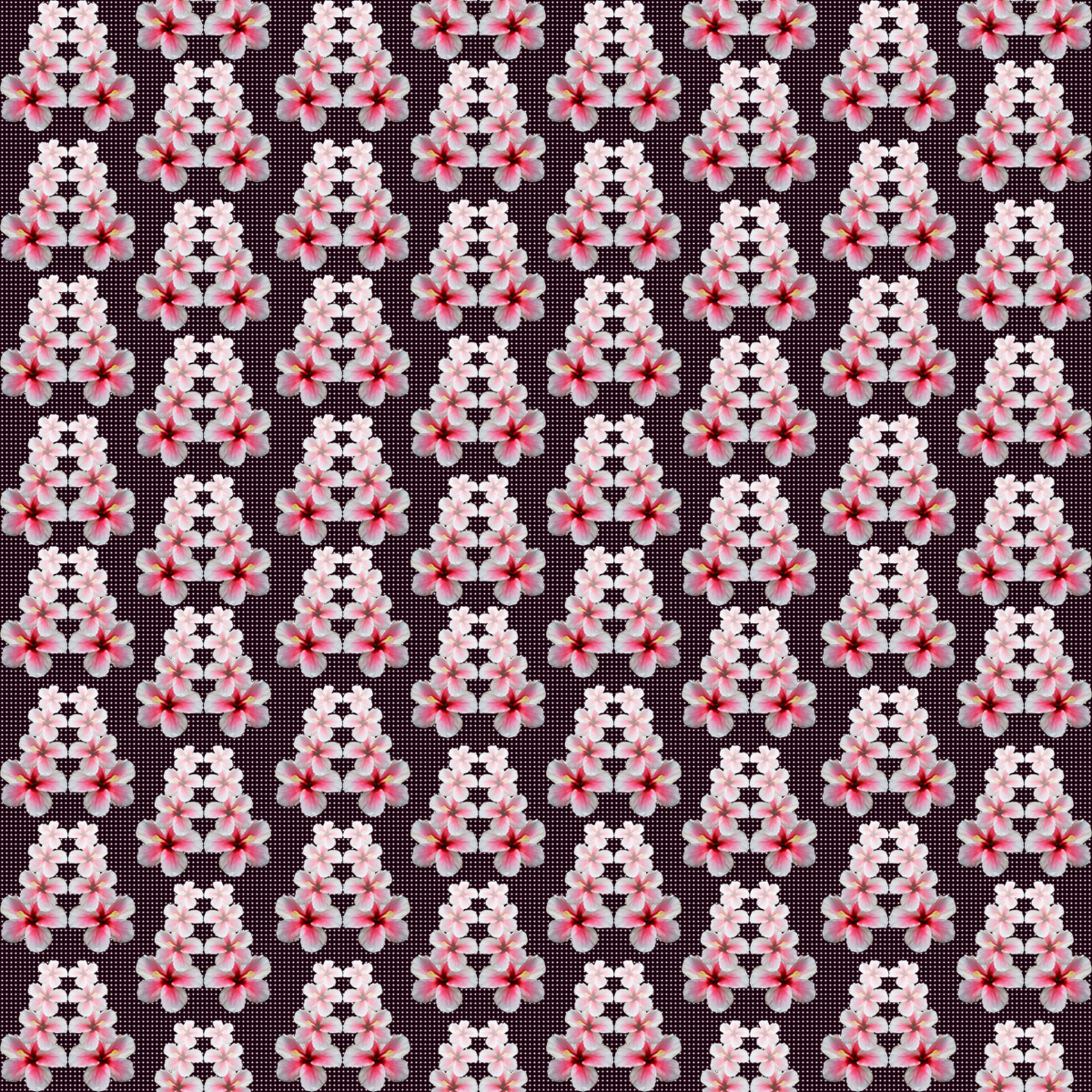
The way the cherry blossoms are laddered and have a gradient is very pleasing to the eye. Everything flows smoothly with a cute pink-and-black color palette. Great job!
The color palette on your second pattern is very refreshing. I love how the green beans are straight yet the way you arranged them yields an awesome wavy pattern.
I love the second pattern. I would, however, suggest making the background a slight gray color or making the herb a darker color for more contrast – making it easier to look at.
The color scheme in both of these pictures works well. The light colors in the top picture allow the flowers to pop off the page. When scrolling fast down the page, the vegetable pattern almost moves like an illusion.
I think the first pattern does a really good job in filling all available space but leaving enough negative space that it doesn’t feel cluttered. It looks like everything is exactly where it should be and it all fits together nicely
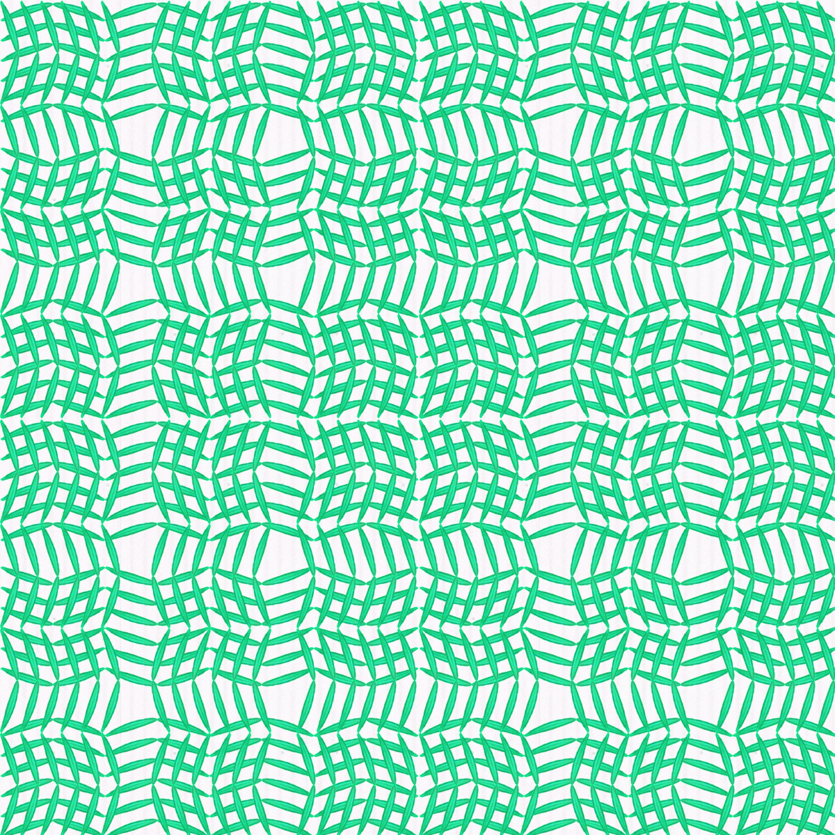

I really like your vegetable pattern. Specifically I like how in the intersection points (where there’s the most empty space) it is not just a square, but an oblong rectangle. It brings out the light blue stripes well.
The way the cherry blossoms are laddered and have a gradient is very pleasing to the eye. Everything flows smoothly with a cute pink-and-black color palette. Great job!
The color palette on your second pattern is very refreshing. I love how the green beans are straight yet the way you arranged them yields an awesome wavy pattern.
I love the second pattern. I would, however, suggest making the background a slight gray color or making the herb a darker color for more contrast – making it easier to look at.
I like the apparent paths that are made in the first pattern in the negative space.
The color scheme in both of these pictures works well. The light colors in the top picture allow the flowers to pop off the page. When scrolling fast down the page, the vegetable pattern almost moves like an illusion.
I think the first pattern does a really good job in filling all available space but leaving enough negative space that it doesn’t feel cluttered. It looks like everything is exactly where it should be and it all fits together nicely