
For my patterns, I took photos of some cool things I keep on my desk, cropped them out from their background, did some editing, and made seamless patterns from them.
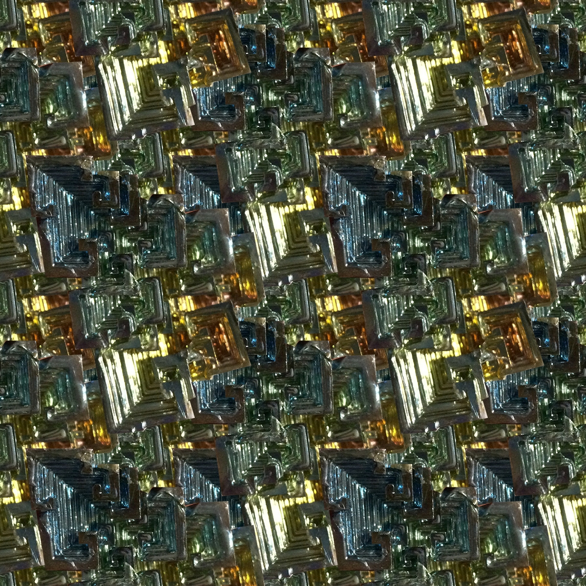
This is a photo of some Bismuth I own – an artificially grown crystal (cool, right?). Ergo, this could be seen as an interpretation of either “mineral” or “synthetic”. I love the square pattern and I wanted to find a way to make it seem like it stretches on forever. I also love the way it fades from amber to sea green.
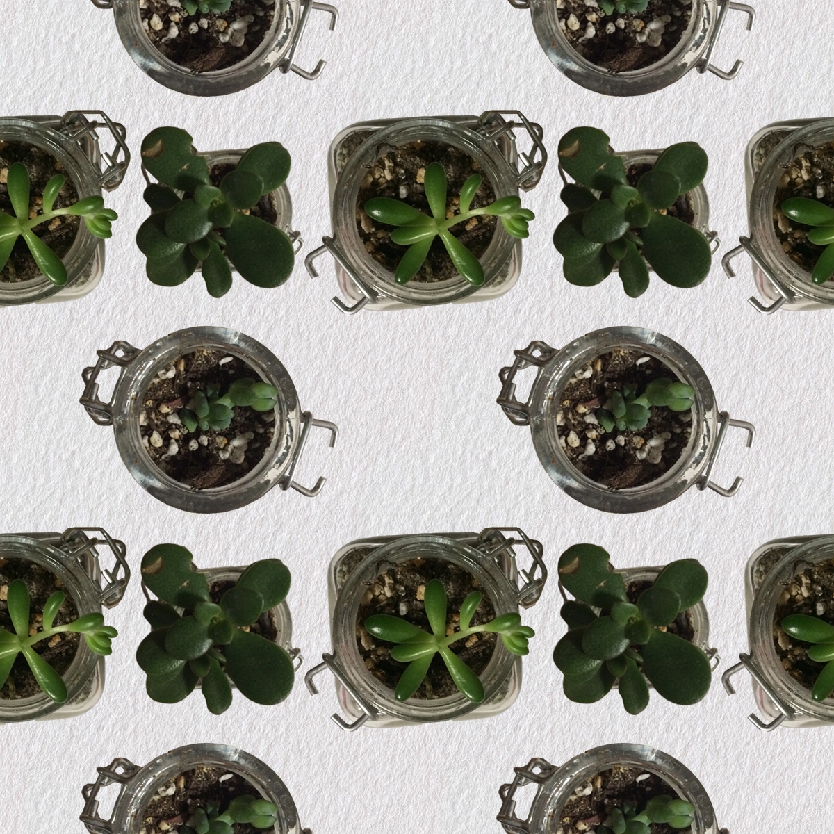
These are some photos of succulents in cute glass pots on my desk as my interpretation of the prompt “vegetable.” The background paper is from a source online.
For your second pattern, I like the simplicity of the background without it just being a single color. It works well with the more detailed succulents in the foreground.
The way you got the first pattern to tile seamlessly is really cool and helps to make it a really nice pattern. Also the colors in it flow well helps it maintain its looks when tiled.
I really enjoy the fact that you used three different succulents as opposed to just one or two in different arrangements. It adds variety while keeping it nice and simple. Also your background for that one is very filling, as opposed to empty space.
The tiling on the first picture is really good. The picture appears to be chaotic, yet it naturally tiles easily. The chaotic design is also very well done, since it does not distract the eye from the overall design.
I like how seamless your first pattern looks. It is impressive that you can’t see jagged lines where the pattern repeats. It almost looks as if the pattern was not repeated.
The mineral pattern seems to only have about 4-5 different colored stones in it but just at a glance it seems to hold much more color. The stacking of the stones gives a nice feeling of depth to the piece and the ripple looking lines inside each stone do the same.
I like the sense of depth in the first pattern and also the contrast between the different size of stones.