
Hello all,
I did two patterns. Ill get right into it.
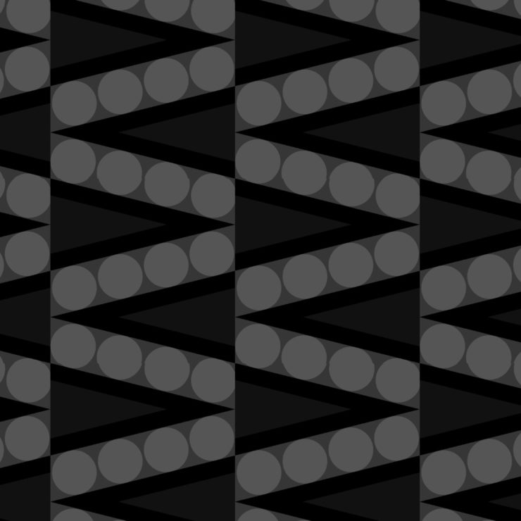
The first pattern I did was based off the synthetic theme, and I imagined pea pods, but in a more robust and geometrical way. The colors are black and white because they now look mechanical and some day we may just be eating gray synthesized peas. I hope not.
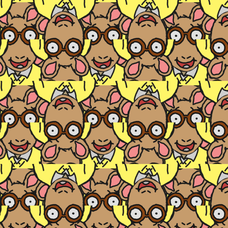
For my second pattern I did the animals theme. My favorite animal is by far the Aardvark, which I drew myself. Because it’s a drawing, it does not look life-like, but I found that this “cartoon”-ish look was able to be transcribed into a reoccurring fashion quite well. Plus, a good Aardvark smile is always nice to see! It also brings me back to my childhood for some strange reason…
The shapes flow well in your first pattern with a nice focus on the movement. The double layered triangles also give the pattern a nice edge in it.
Your “aardvark” pattern seems to have vertical stripes rather than tiles – which is actually kind of refreshing to see. The texture you used to outline the character reminds me of the picture books I used to read when I was little. Also, interesting choice leaving his tongue gray.
One point of criticism that I would make is that the lower corners of his shoulders slightly overlap his glasses and eyes. It is a cool pattern of Arther though!
The first pattern has an endless, seamless look to it, especially with the shapes you put into it. With the Arthur pattern, however, where the tile ends is much more visible. I would suggest incorporating Arthur’s shirt into the design, such as cloning the sleeves to look like they come in front of the ears of the right-side up Arthurs. Otherwise, I like the overlapping idea.