I like the simplicity of your animal pattern because it results in a very unique design! Your choice of lighter tones instead of vibrant colors makes the piece seem calm and peaceful. The silhouettes of the animals are not only cute but fairly detailed! Furthermore, I think the white background works very well because it makes the animals and shapes stand out distinctly.
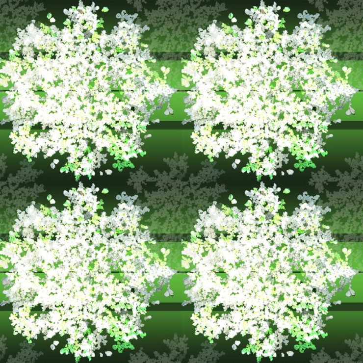
I like the gradients of green that you have in your first pattern, as well as the repeating element of the vegetable slightly transparent in the background. It really gives a nice sense of what’s in the foreground and the background. The darker stripes are also a nice guide for the eye, because the subject matter is very detailed, it’s good to have a simple element guiding the flow of the piece.
The was the animal pattern turned out truly is a chaotic design (in a positive way). To me, it seems that all the animals are struggling to climb the different blocks in the image, and the pattern is entirely seamless and almost looks to be a real image. Excellent choice of choosing where to cut the original pattern.
The transparent flowers in the background of the first pattern really give the image a lot of depth and fills in the background very nicely. I also like that they are not exactly centered.
I like the contrast of light and dark with the green in the first pattern. I also like how the foreground is repeated in the background but smaller and darker, which adds depth to the pattern.
The top picture gives off a “Christmas vibe” since the colors compliment eachother so well. I like how you kept it simple by having a few of the large white objects instead of numerous small ones. I like the varied sizes of the animals.
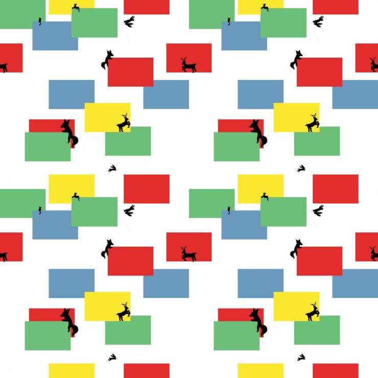

I like the simplicity of your animal pattern because it results in a very unique design! Your choice of lighter tones instead of vibrant colors makes the piece seem calm and peaceful. The silhouettes of the animals are not only cute but fairly detailed! Furthermore, I think the white background works very well because it makes the animals and shapes stand out distinctly.
I like the gradients of green that you have in your first pattern, as well as the repeating element of the vegetable slightly transparent in the background. It really gives a nice sense of what’s in the foreground and the background. The darker stripes are also a nice guide for the eye, because the subject matter is very detailed, it’s good to have a simple element guiding the flow of the piece.
The was the animal pattern turned out truly is a chaotic design (in a positive way). To me, it seems that all the animals are struggling to climb the different blocks in the image, and the pattern is entirely seamless and almost looks to be a real image. Excellent choice of choosing where to cut the original pattern.
I like the background layer of transparent flowers in the first pattern. It really adds depth to the pattern.
The transparent flowers in the background of the first pattern really give the image a lot of depth and fills in the background very nicely. I also like that they are not exactly centered.
I like the contrast of light and dark with the green in the first pattern. I also like how the foreground is repeated in the background but smaller and darker, which adds depth to the pattern.
The top picture gives off a “Christmas vibe” since the colors compliment eachother so well. I like how you kept it simple by having a few of the large white objects instead of numerous small ones. I like the varied sizes of the animals.