
Using the most common paint schemes of sixteen of the best Nascar drivers, I averaged the paints scheme packages that Nascar releases in order to create a new image and attempt to spot a theme. The image is unique and it is clear that the image is a race car. The wind shields, tires, and features of the car, in general, are very distinct. Furthermore, looking at the front of the car, the Ford and Chevrolet symbols can be easily seen along with the word Camry, Toyota’s model. The Goodyear tire emblems can also be seen although not quite legible.
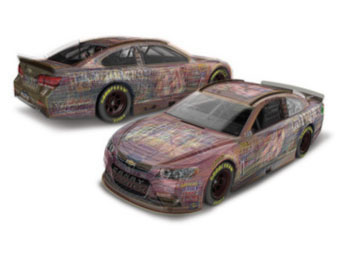
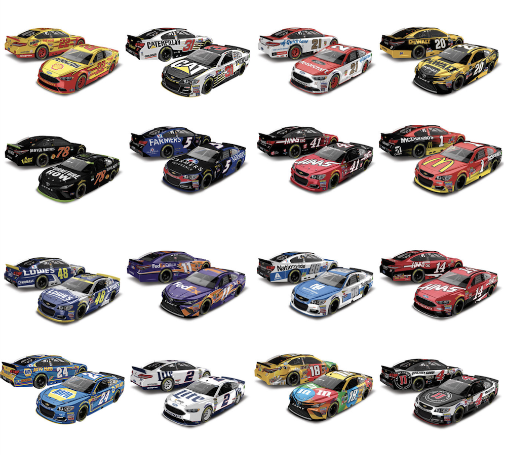
An interesting characteristic from the artwork is that the average color seems to be red, at least pretty clearly at the nose of the car. This could be a result of many drivers racing in the color red, or drivers purposely not racing in the color green, which has historically been a color of bad luck in the sport. The image below is of the sixteen driver cars that I used in my averaging image in which non of the schemes are clearly painted green.
I like the idea behind this piece. I like that, in combining the cars, a single greyish car with few distinguishable features appears, as if to suggest that it racing is all about the driver AND the car and not each individually. Interesting topic!
Averaging the cars was a great way to see the similarities between everyones machines in Nascar. I love how the common symbols stand out and then others blur together. For an example where the number should be there are some white globs. I also found the fact about not have green on their cars very interesting and this was a great way to prove it.
I really like the averaging on this piece because the different coloring on the original cars leaves the new piece to have sort of a graffiti effect. Because all of the cars are individual to distinguish each one for the sport, its great to see a mixed one.