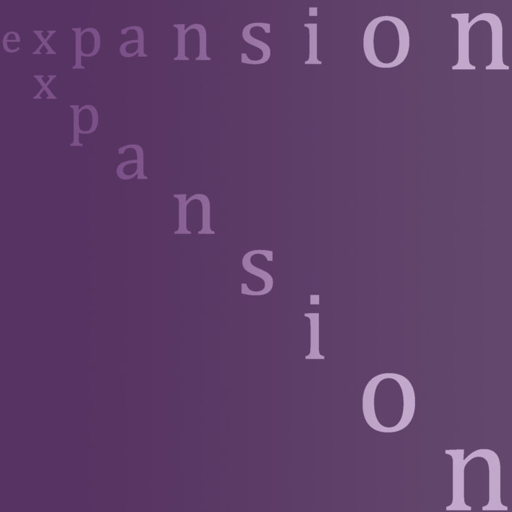
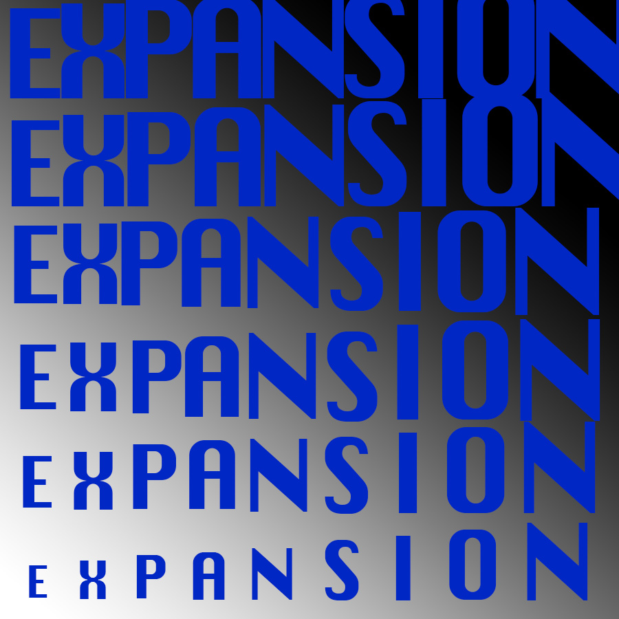
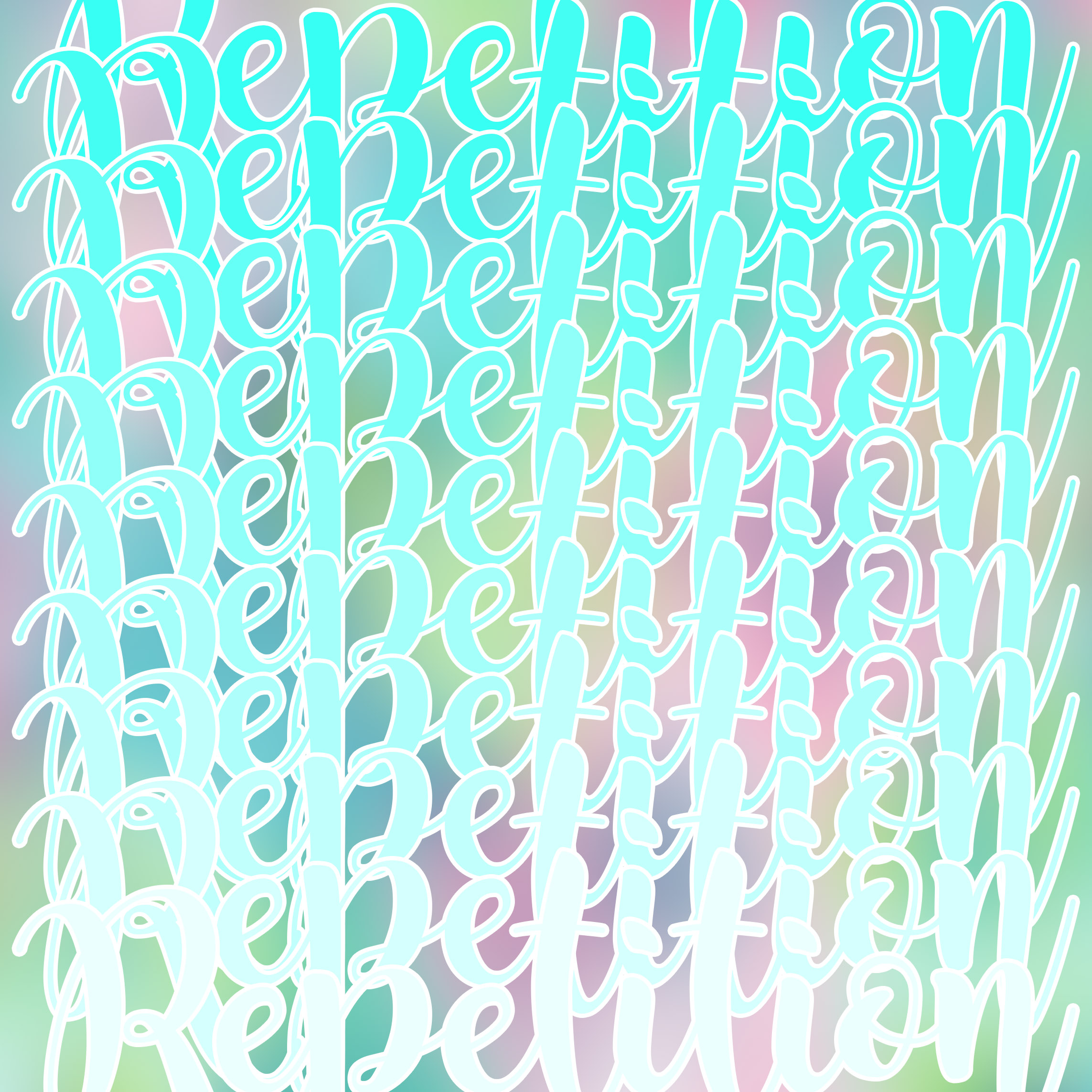
Expansion:
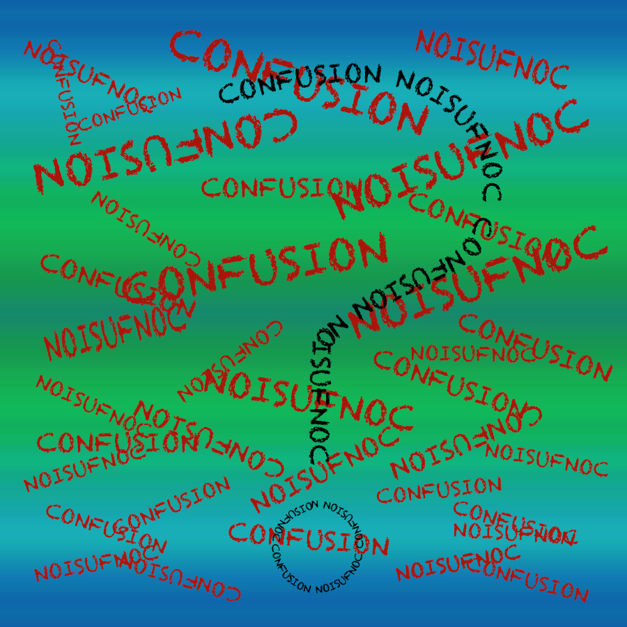
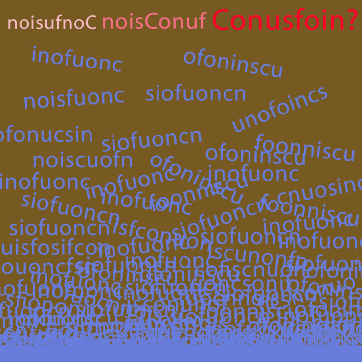
Confusion:
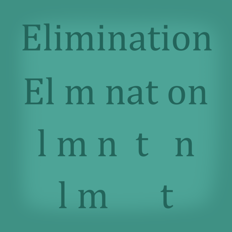
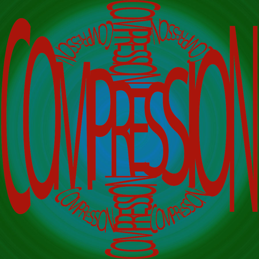
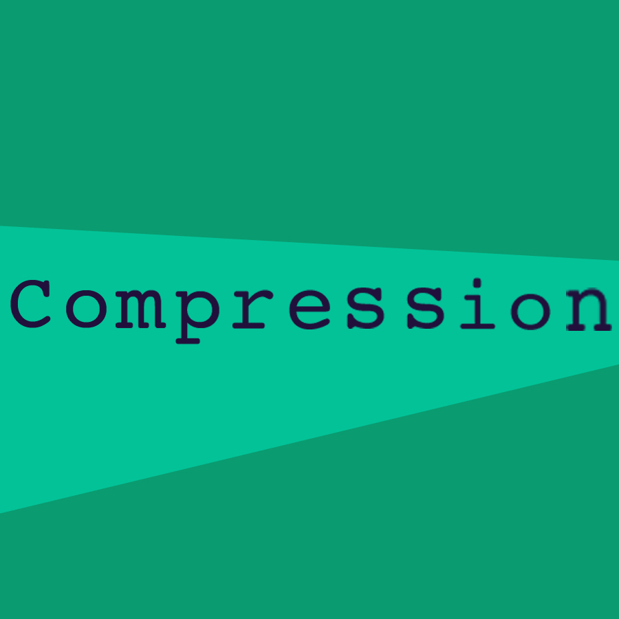
Compression:

C18 Digital Imaging & Computer Art
Worcester Polytechnic Institute
Expansion:
Confusion:
Compression:
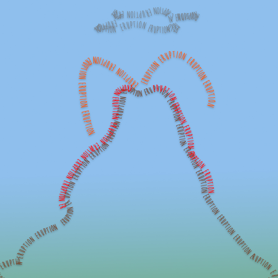
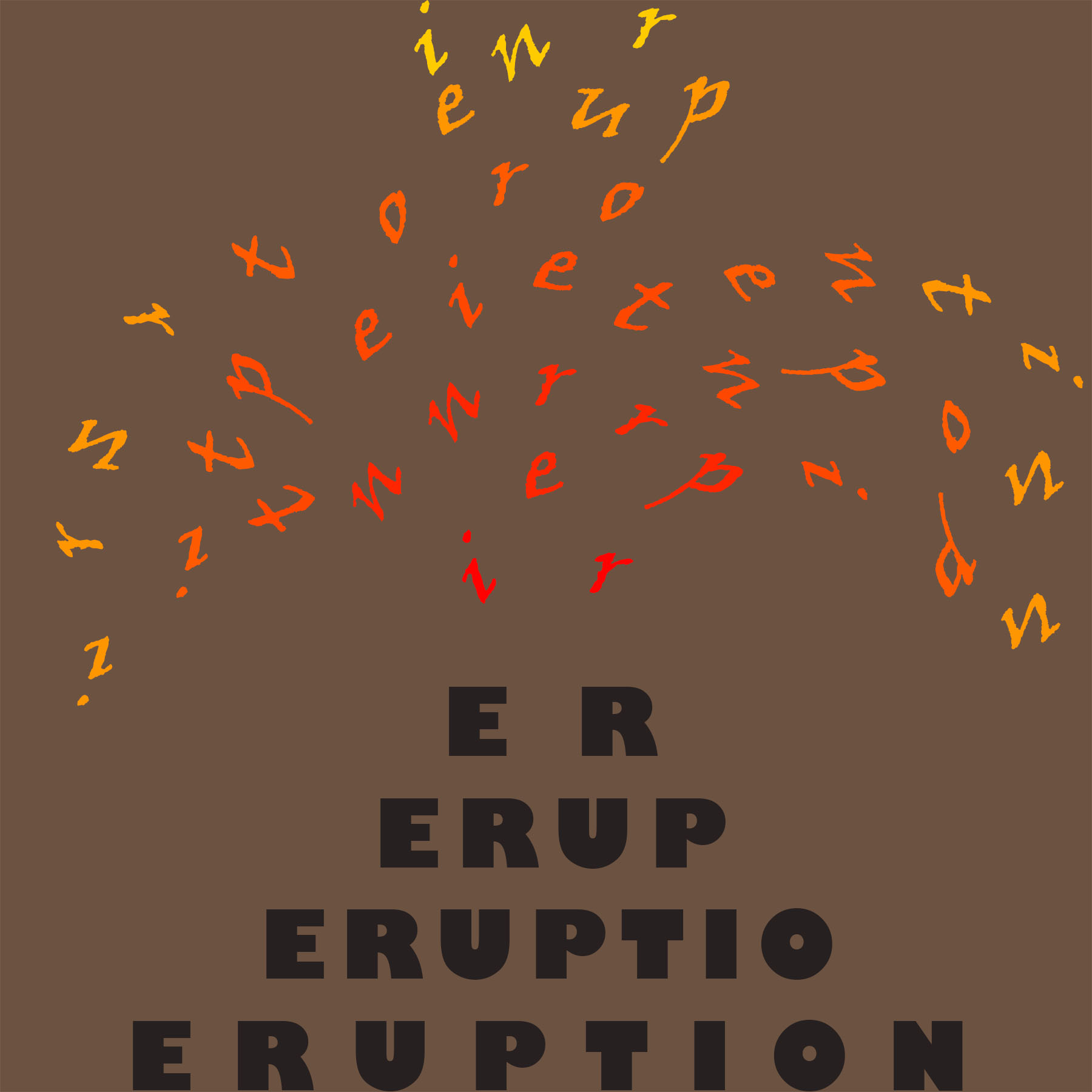
Eruption:
Escape:

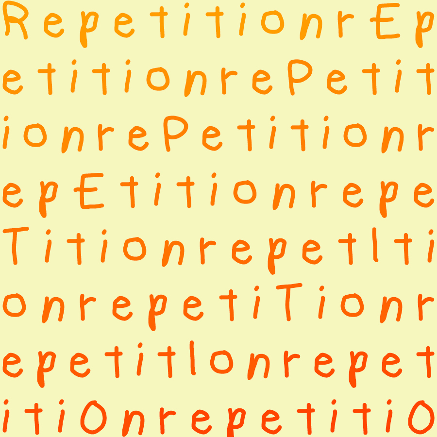
Transition:
![]()
For anyone wondering, I swear I did not steal this idea from Kyle. I saw his as I was going to upload mine but I guess great minds think alike am I right?
Each has a bit of a subtle thematic element, and a more obvious component.
![]()
My first typography was inflation. I thought most people would think of a balloon being inflated so I took the other definition and made a sort of stock/price increase scene.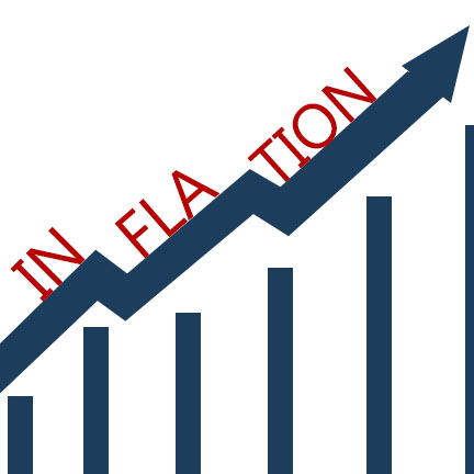
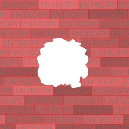
For my entropy typography, I had a pretty clean brick layout with the word entropy on them. The bricks should show order, but I thought it would be more interesting if I made them say entropy to contradict what it actually showed. Then I made a hole in the brick wall to show the actual disorder of this brick wall.
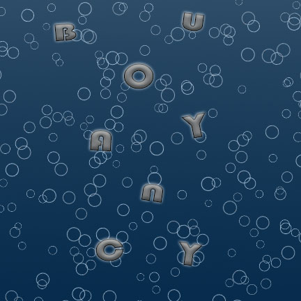
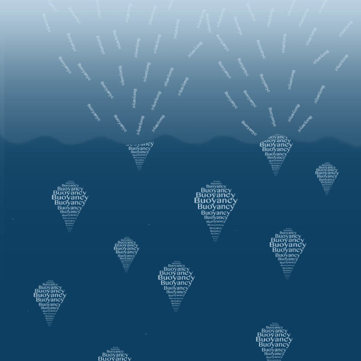
For buoyancy, I did a gradient background of dark water. Then I made bubble letters using the blending options on the words to make to appear to be more bubble and floating. Finally, I inserted a pattern of random circles to show bubbles floating up with I think made a pretty good affect.
My first word was obsession. The look I was aiming for here was almost in a crazy mental state and almost do a chalkboard effect that simulates a teacher making a student write the same thing out 100’s of times. As the person writes the conjugations of obsession more, they get obsessed with it and it leads to their downfall, denoted by blurred and distorted writing, as they are lost to anything but the word. 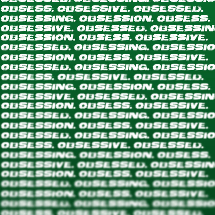
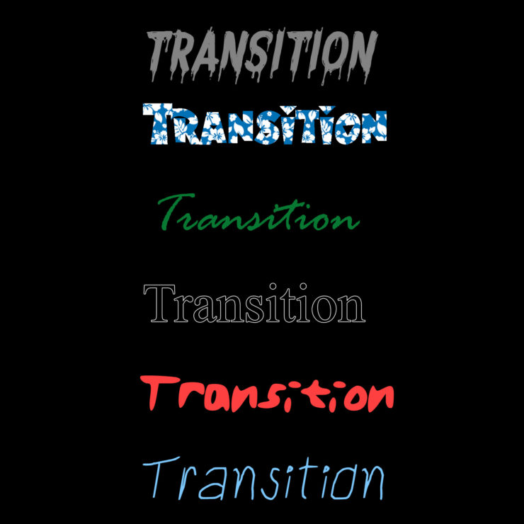
My second word was transition. The idea here was essentially to match fonts to each major life transition; in order they are childhood (relaxed, kid-like font), adolescence (the rebel/crazy font and color), college (Times New Roman is something every student knows), adulthood (signing documents and making the ‘green’), retirement (going on vacation), and death (destroyed, decaying font.)
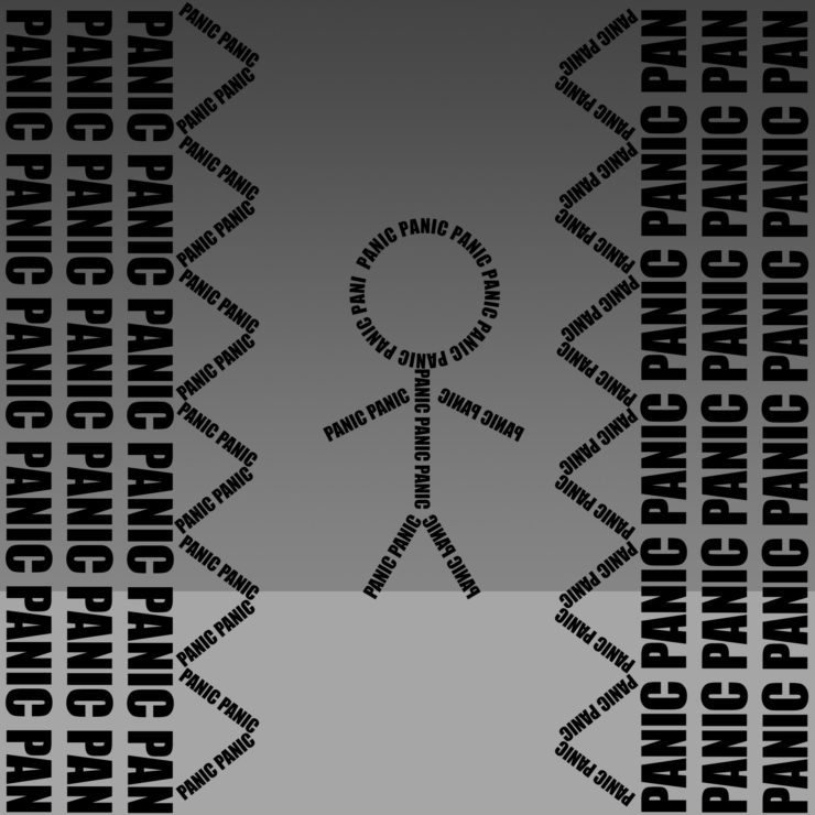
The last word was Panic. Clearly here, the small man is panicking due to the crushing spiked walls quickly approaching him.
Hello,
I probably had the most trouble with this assignment. Being limited to just text manipulation was not easy, and as a result for this assignment I did not feel as creative as in previous assignments. Here are my three words:
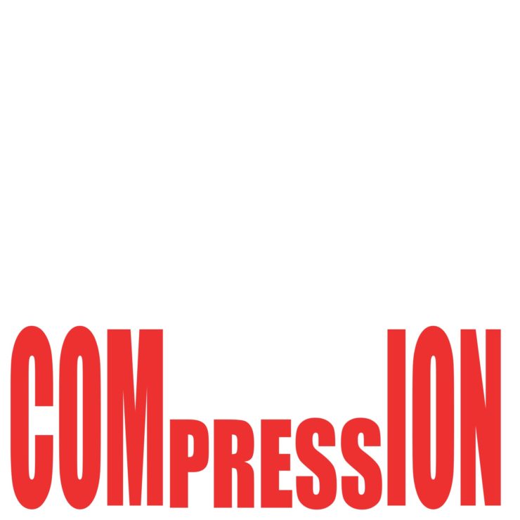
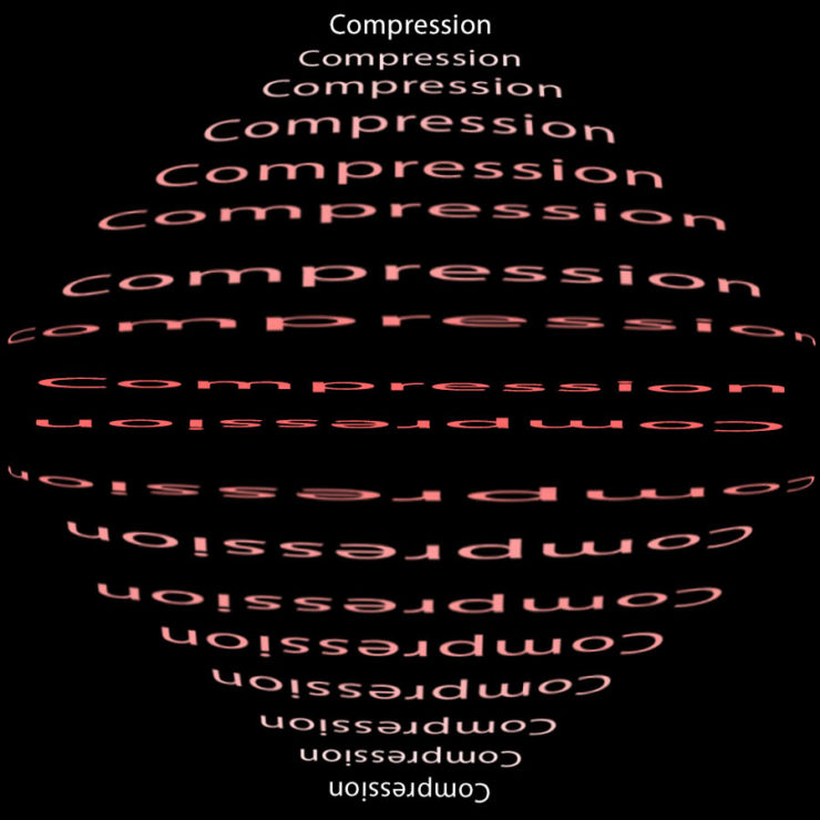
For my first ^ I did “Compression”. I liked this the best, as it used just the words and left some empty space for effect. The one thing I would have liked to do if possible was to add Mario and act like it was a “POW” block.
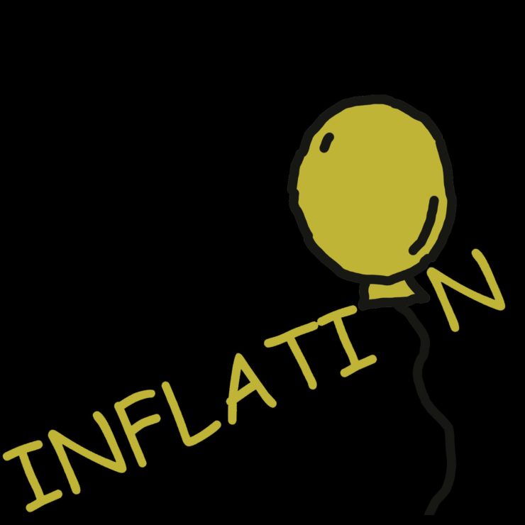
Next I did “inflation” ^. At first I really toyed with making the word into money or something along those lines, as the word of course does not just have one definition. I couldn’t get it to work well, so this was my backup plan. It came out well, with the “O” being a balloon, and the black background makes it seem like its floating out of the void.
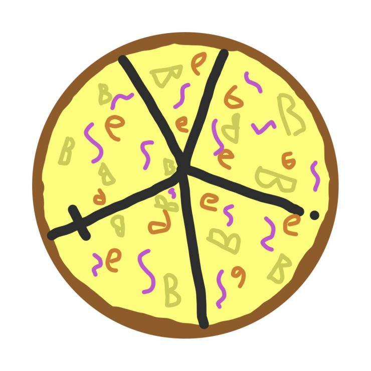
My last word I did was “Obesity” ^. This one was fun as I aimed for that childish look of pizza that every kindergartener draws, but if you look closer they are all just letters spelling the word “Obesity”. The “O” is the crust, the “Y” “I” and “T” are the slices, and the “B” “E” and “S” are the toppings.
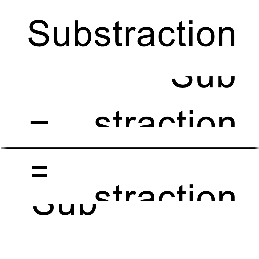
Subtraction: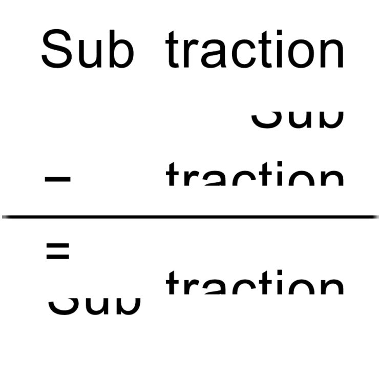
I made this word into a math calculation, subtracting parts of the word from original word and result in the new shape.
Inflation:
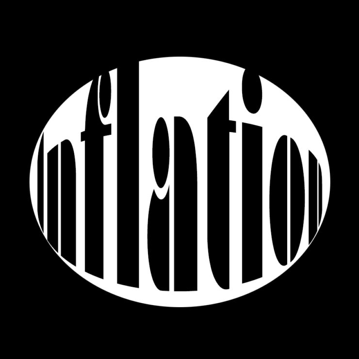
I wanted to create an effect of the fish eyeball lens, the word inflation expands in an oval shape and i chose a thick type font to make this effect stronger
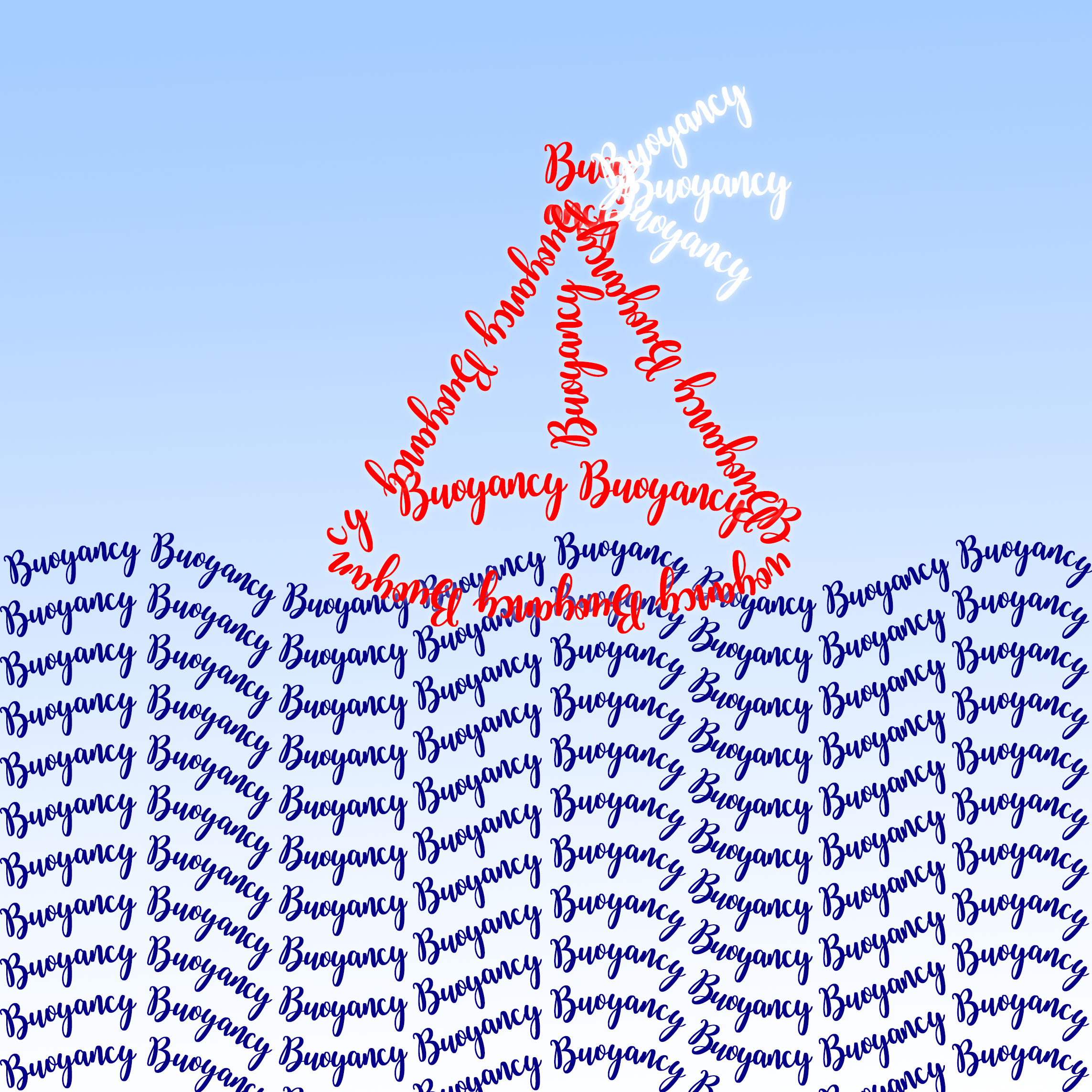
Buoyancy:
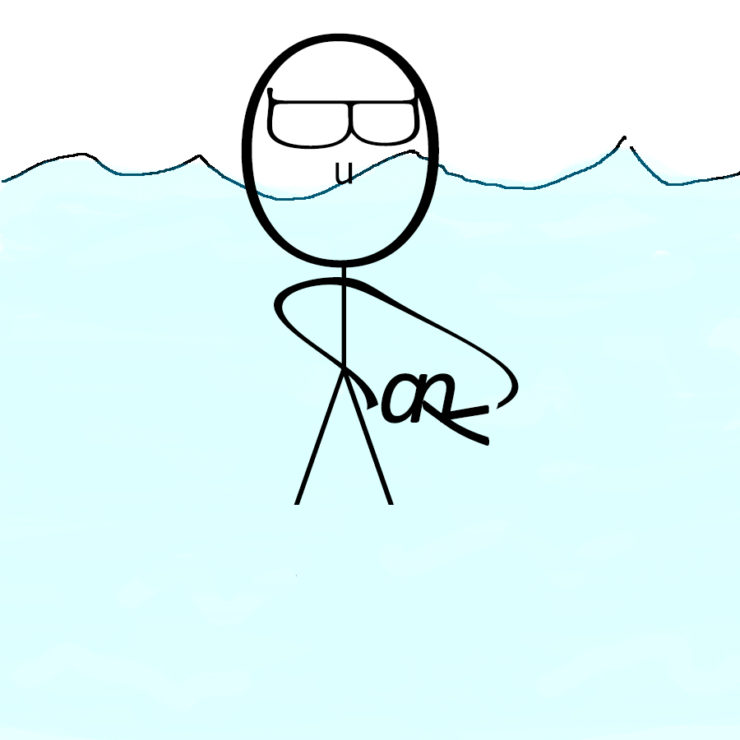
I used letters from the word “Buoyancy” in different size and font to draw a big-head guy floating on the water, and he’s playing around with a little fish