
Hello,
For my midterm assignment I edited a portrait of myself looking rather dapper. It took quite a while to decide how I was going to manipulate my photo, and I finally decided on some galaxy-replacement therapy. The only part of the image that is original is my face.
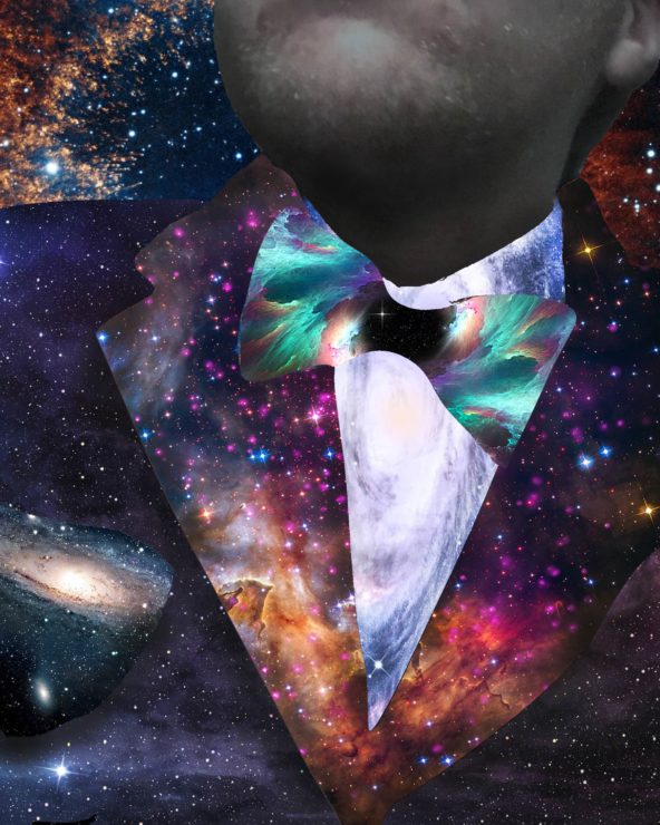
Photos used:
https://az616578.vo.msecnd.net/files/2016/10/15/6361209775984223581480794734_space111.jpg
https://newevolutiondesigns.com/images/freebies/space-wallpaper-17.jpg
https://cdn.wccftech.com/wp-content/uploads/2016/09/spacee.jpg
http://chicagopolicyreview.org/wp-content/uploads/2016/04/space-4.1-CPR.jpg
http://magazine.viterbi.usc.edu/wp-content/uploads/BSP_054.jpg
https://i.ytimg.com/vi/lt0WQ8JzLz4/maxresdefault.jpg
Your portrait is very interesting in that at first glance, it looks like a kaleidoscope of galaxies, but when you realize they make up the outfit, you see the image in a whole different way.
You did a very good job at maintaining a consistent theme and changing the colors in an appropriate manner. I especially like how the colors go from darker on the outside to much lighter on the inside
It is impressive that you only used pictures of galaxies yet you can still clearly see the shape of the suit.
I find it admirable that you found pictures of galaxies with varying degrees of light and stars to illustrate the layers of the suit. Looks like a lot of other people liked the galaxy idea too, because after this image was posted, there was quite a trend!..
Nice job with the space theme. I’m digging the overlaying of different cosmos for the suit. The scene is very defined, concise, and eye-catching. the contrasting colors in each part also don’t clash with one another, which brings it together a lot more. The fact that you left your face obscured during this scene made the emphasis on the suit a lot more pronounced.