7 Replies to “Expressive Typography – Kyria Nelson”
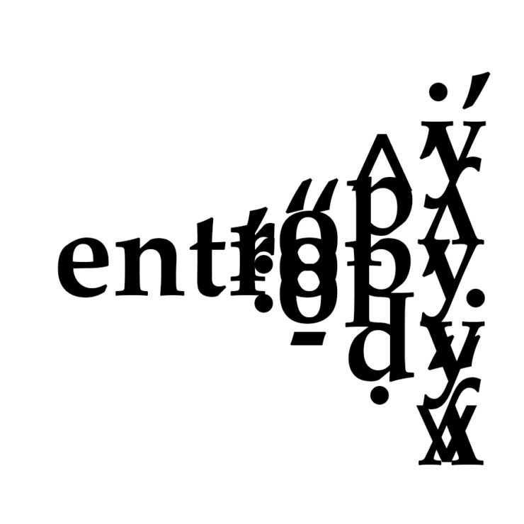
I enjoy how you made entropy disorderly over time, while making it interesting to look at and not too wild. The simple color palate of black and white adds to the effect.
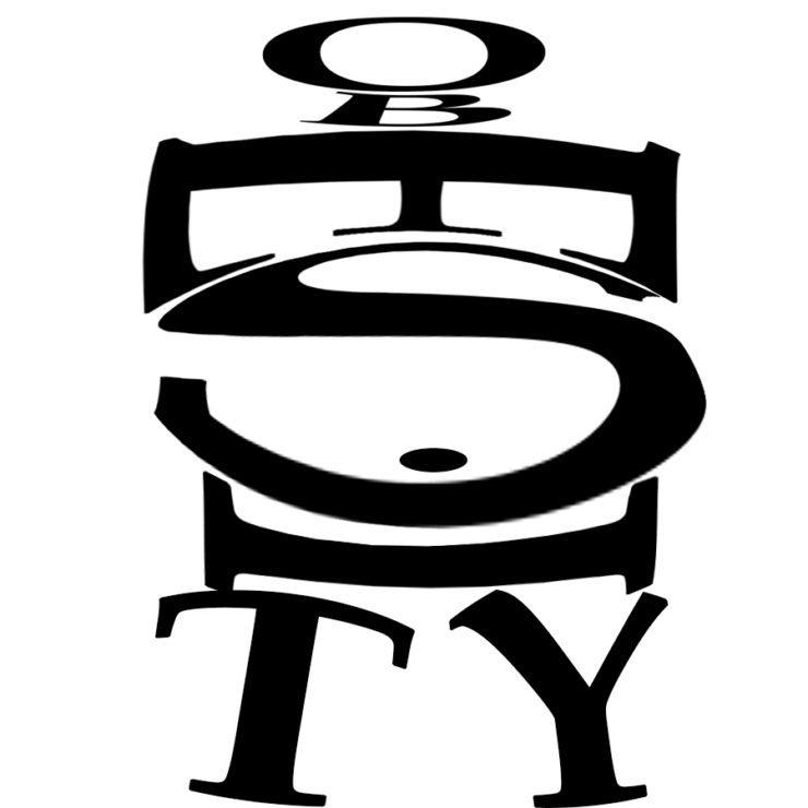
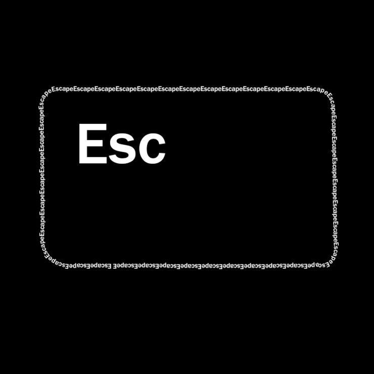
The obesity one is very cool. I like how you put the E sideways to fit the shape of the person more. Also I love the two feet as the letter T and Y. Very creative. I also really like your esc button.
The use of the dot from the lowercase “i” as the belly button for the person in your “obesity” piece is a nice, subtle touch that I didn’t notice the first time around. I also like the idea for your “escape” piece. One way you could improve it could be to have the “e” at the end of “escape” run into the beginning of the next word.
Your arrangement of the word obesity to create an image of a person is very creative. It is impressive that the letters are different directions but it is still readable.
i like how the level of chaos builds up over time in your entropy art, just like the definition of the word itself. The use of various letters upside down made some of them seem like math symbols

I enjoy how you made entropy disorderly over time, while making it interesting to look at and not too wild. The simple color palate of black and white adds to the effect.
The obesity one is very cool. I like how you put the E sideways to fit the shape of the person more. Also I love the two feet as the letter T and Y. Very creative. I also really like your esc button.
The use of the dot from the lowercase “i” as the belly button for the person in your “obesity” piece is a nice, subtle touch that I didn’t notice the first time around. I also like the idea for your “escape” piece. One way you could improve it could be to have the “e” at the end of “escape” run into the beginning of the next word.
I actually love the idea of the Escape key, and the boarder is so simple yet effective. Nicely done.
I like the concept you went for with the word Escape. It’s very different from what I would first think of rather than being cliche. Nicely done!
Your arrangement of the word obesity to create an image of a person is very creative. It is impressive that the letters are different directions but it is still readable.
i like how the level of chaos builds up over time in your entropy art, just like the definition of the word itself. The use of various letters upside down made some of them seem like math symbols