I really like your escape one. It’s really cool how simple rectangles together can look like a door opening. Also, I am not sure how you did your compression picture to get all your letters warped like that. Really cool!
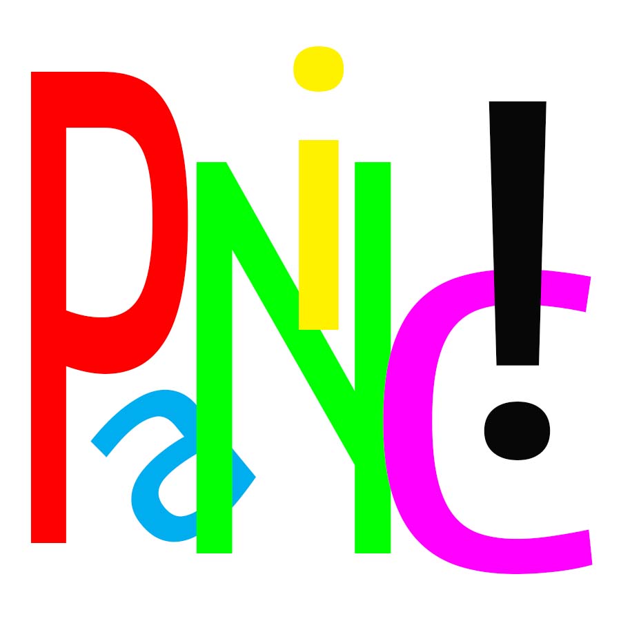
I really like all of them. When I look at the compression one, it really makes me feel like there is an elastic around the word. I did something very similar for the escape word as well, so I really have nothing to say about that. My only critique would be to play around with the orientation a bit more for panic. Although the color shows “panic,” maybe some letters being upside down would show it a little bit more. Other than that, Great job.
I think you did a really good job on all of these. I especially like the escape one because of the contrast between the dark wall and the light doorway. Your compression piece was well done with the band running across it. It does a really good job at conveying compression
The idea behind the compression piece is great. The bending inwards of the word perfectly match the ‘elastic’ and it looks extremely realistic, even as simply letters on a 2D plane.
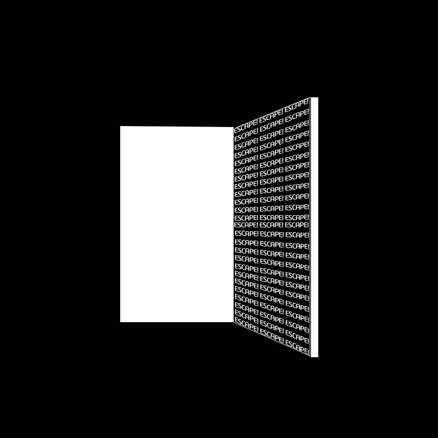


I really like your escape one. It’s really cool how simple rectangles together can look like a door opening. Also, I am not sure how you did your compression picture to get all your letters warped like that. Really cool!
I really like all of them. When I look at the compression one, it really makes me feel like there is an elastic around the word. I did something very similar for the escape word as well, so I really have nothing to say about that. My only critique would be to play around with the orientation a bit more for panic. Although the color shows “panic,” maybe some letters being upside down would show it a little bit more. Other than that, Great job.
I think you did a really good job on all of these. I especially like the escape one because of the contrast between the dark wall and the light doorway. Your compression piece was well done with the band running across it. It does a really good job at conveying compression
The compression piece looks awesome. Really creative to add the elastic around the word to give it that much more of a tense feeling.
The idea behind the compression piece is great. The bending inwards of the word perfectly match the ‘elastic’ and it looks extremely realistic, even as simply letters on a 2D plane.
I really like your Compression piece. The elastic you drew around it really drives the concept home without being too extra.