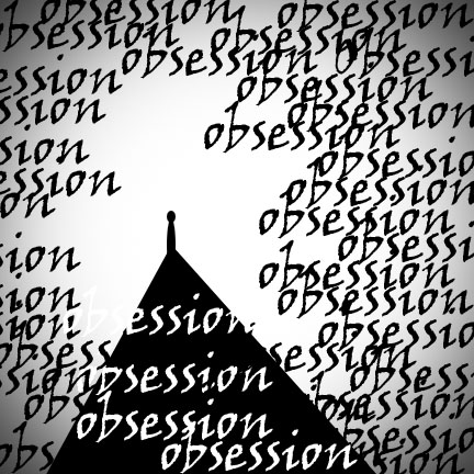
The design for ‘obsession’ is very neat because the obsession seems to surround a humanoid like figure in a situation that seems contemplative and stagnant. This is very appropriate because usually when obsessing about something, it’s not the easiest situation to leave.
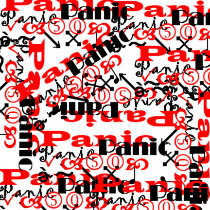
Your panic piece is very fitting. The color choice of red and black on the white background give the aggressive feel to the words and the various fonts and orientations are overwhelming, giving off the panic effect really well.
The word disruption looks as if it ripped the grey apart which is very fitting for the word. Obsession is also very well done. There is a large amount of clutter around the piece and then a opening which directs your eye towards the obsession.


The design for ‘obsession’ is very neat because the obsession seems to surround a humanoid like figure in a situation that seems contemplative and stagnant. This is very appropriate because usually when obsessing about something, it’s not the easiest situation to leave.
Your image for panic is very chaotic in a way that’s very fitting for the word. The use of many different fonts works well for panic.
Your panic piece is very fitting. The color choice of red and black on the white background give the aggressive feel to the words and the various fonts and orientations are overwhelming, giving off the panic effect really well.
The word disruption looks as if it ripped the grey apart which is very fitting for the word. Obsession is also very well done. There is a large amount of clutter around the piece and then a opening which directs your eye towards the obsession.