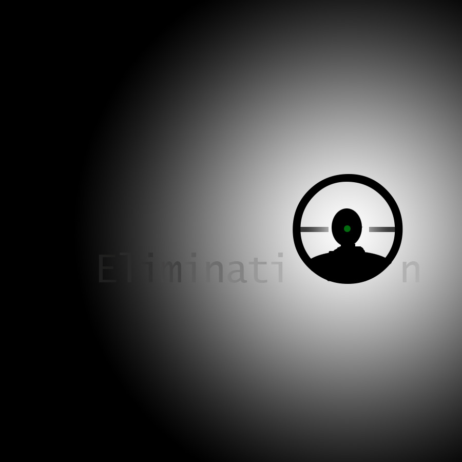
I really like your elimination one. Especially where you have the gradient. I think it would have worked even better if you make the scope’s center in line with the text.
The simplicity of the elimination piece really emphasizes how someone ‘taking the shot’ needs only to focus on the target and block out all outside distractions. In addition, the way someone reads the word naturally draws them to the person within the sight of the scope and adds a very clean feel to the piece.
The text effects used on the escape piece look really nice. Its impressive how you used only the words stretched and morphed in such ways that it really does look like a cage and other things are in the picture when it is really just escape.
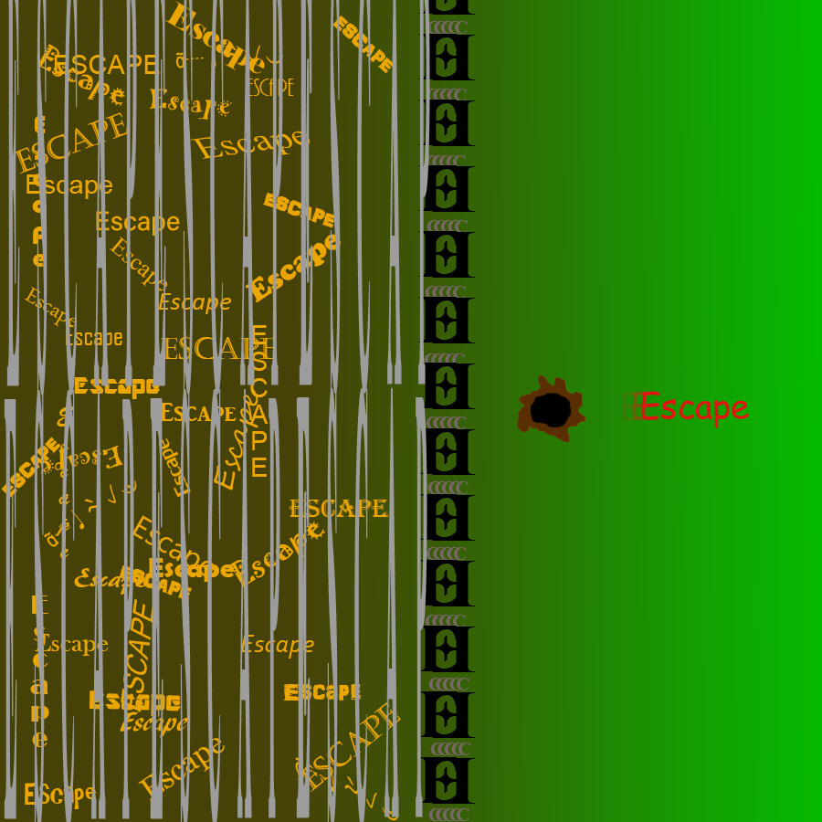

I like how you stretched out the letters to form a cage around the other escapes, as well as the way you made the red escape look like it’s moving.
I really like your elimination one. Especially where you have the gradient. I think it would have worked even better if you make the scope’s center in line with the text.
The simplicity of the elimination piece really emphasizes how someone ‘taking the shot’ needs only to focus on the target and block out all outside distractions. In addition, the way someone reads the word naturally draws them to the person within the sight of the scope and adds a very clean feel to the piece.
The text effects used on the escape piece look really nice. Its impressive how you used only the words stretched and morphed in such ways that it really does look like a cage and other things are in the picture when it is really just escape.