The gradients on all of these pieces help show the mood of each image here very well. Specifically the confusion one combines green and blue in such a way that fits the mood of the image very well.
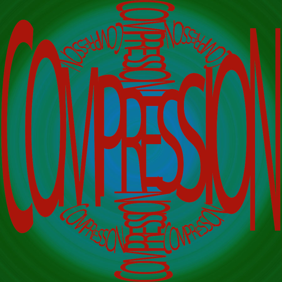
I like the idea you came up with for Compression, but it looks really busy. It might look a little more pleasing without the vertical compressions, and just the one horizontal and the ones creating the ring.
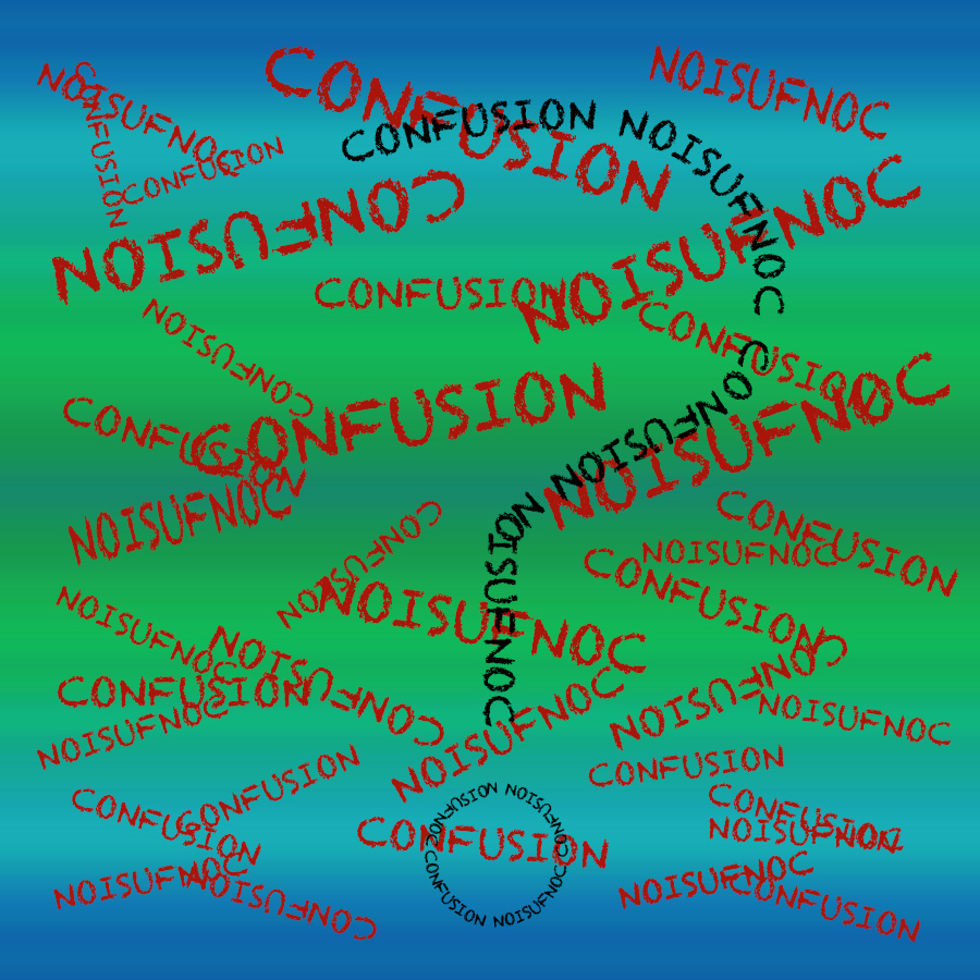

Your confusion picture fits the word perfectly, being very chaotic and all over the place helps drive that idea of confusion.
I like how your confusion piece has the gradient that follows the expansion of expansion
expansion piece* also why doesn’t wordpress have a delete/edit comment option
The gradients on all of these pieces help show the mood of each image here very well. Specifically the confusion one combines green and blue in such a way that fits the mood of the image very well.
The color schemes of all the images really help to add more to the pictures as they almost expand on the word you are describing.
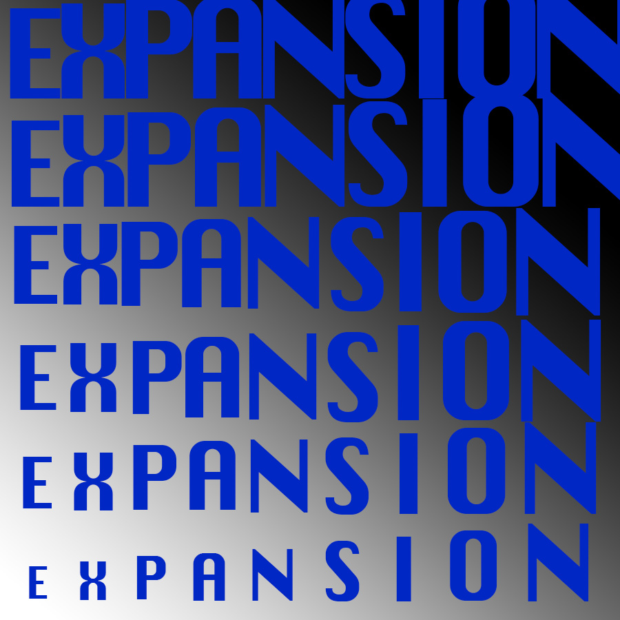
Your “Expansion” piece is almost like an optical illusion, and I had to look twice to see! Nice job, and nice colors.
I like the idea you came up with for Compression, but it looks really busy. It might look a little more pleasing without the vertical compressions, and just the one horizontal and the ones creating the ring.