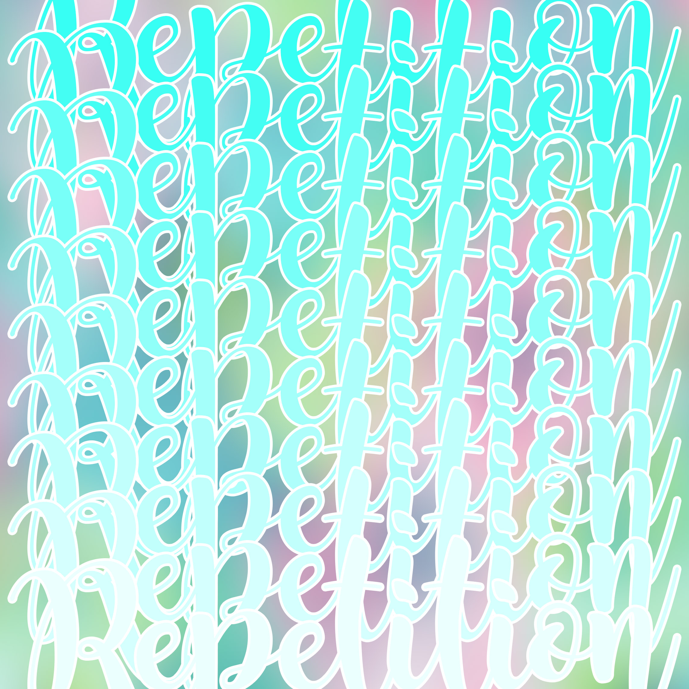
The first two, I would change nothing. They are both extremely well done to the point that even if they were just random letters, someone could still get what word it was. My only comment for the repetition piece is that it is a bit hard to read. The background and text color are very similar and the overlapping make it hard to see the outline of the text. Either reducing the amount of overlapping or maybe adding a black outline to the text would greatly improve its clarity. Overall though, very well done.
The color scheme on your repetition photo is a bit too bright, making it hard to read the words. It would definitely look better if you either added a darker background or darkened the letters a bit.
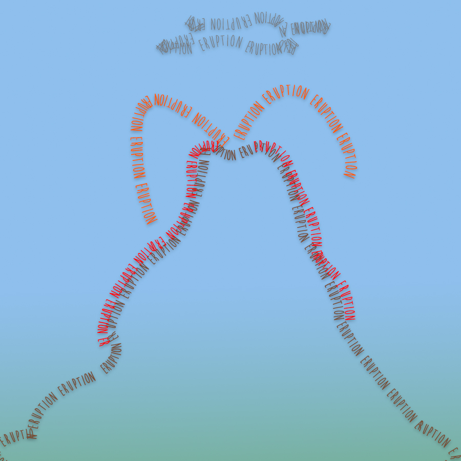
The eruption design looks really nice but the little blurry text effect makes it a little bit hard to understand the word sometimes though overall it is still readable and very nice looking.
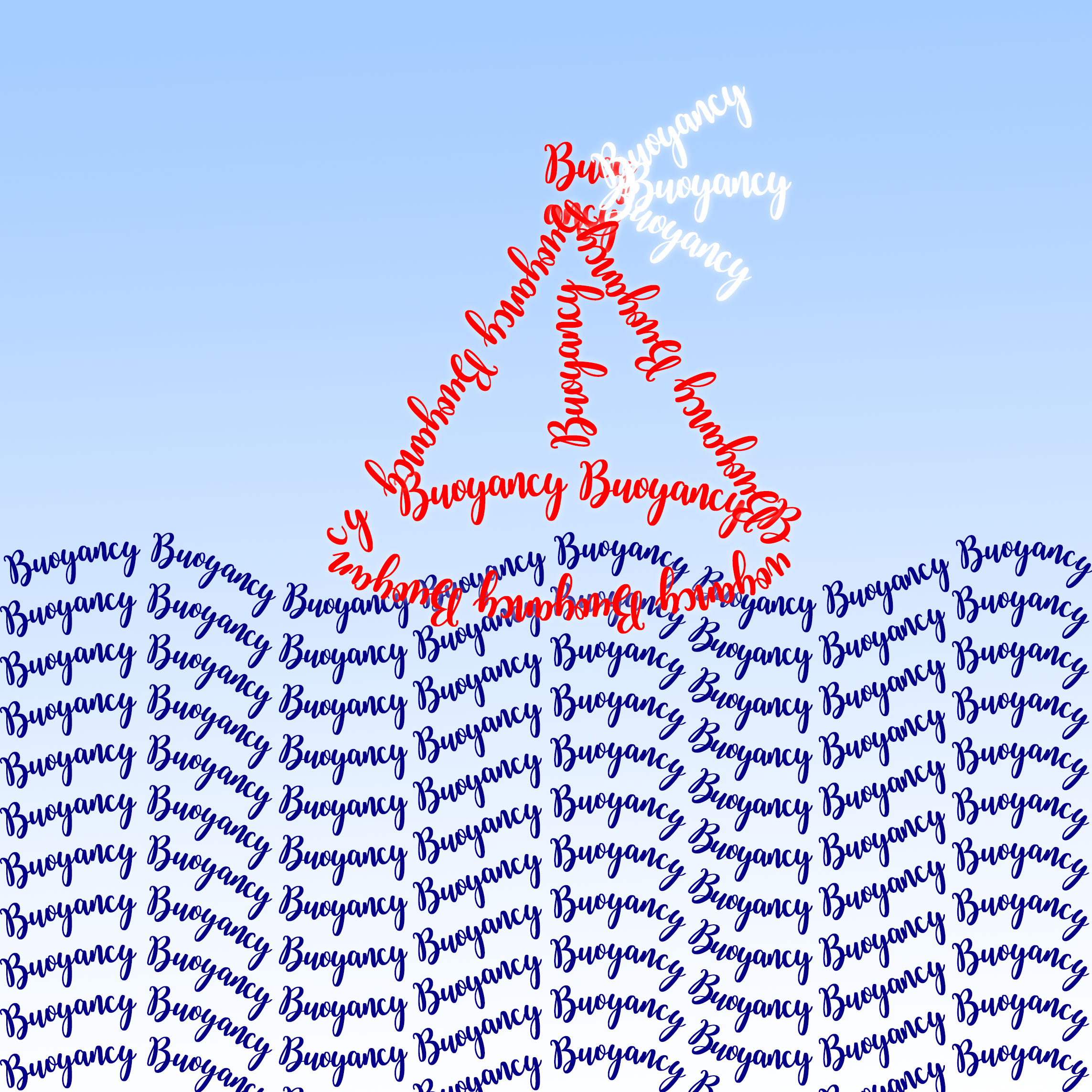
i like the idea of repetition, or text pattern. but the picture might seem a bit busy if this is overly used. For example, you third picture is a bit hard to read, and the part where boat overlays with wave in the second picture is also a bit messy
Even though the repition picture is a little hard to read I think it works very well for what the word is. If you repeated that tile you could have a cool pattern which is exactly what the word repition is about.

The first two, I would change nothing. They are both extremely well done to the point that even if they were just random letters, someone could still get what word it was. My only comment for the repetition piece is that it is a bit hard to read. The background and text color are very similar and the overlapping make it hard to see the outline of the text. Either reducing the amount of overlapping or maybe adding a black outline to the text would greatly improve its clarity. Overall though, very well done.
The color scheme on your repetition photo is a bit too bright, making it hard to read the words. It would definitely look better if you either added a darker background or darkened the letters a bit.
The eruption design looks really nice but the little blurry text effect makes it a little bit hard to understand the word sometimes though overall it is still readable and very nice looking.
i like the idea of repetition, or text pattern. but the picture might seem a bit busy if this is overly used. For example, you third picture is a bit hard to read, and the part where boat overlays with wave in the second picture is also a bit messy
Even though the repition picture is a little hard to read I think it works very well for what the word is. If you repeated that tile you could have a cool pattern which is exactly what the word repition is about.