I really like your expansion artwork. You made it look like it is popping out of the page which makes it look very cool. Also, for your disruption artwork, I think it would have been better if you just replaced one of the italicized “disruption” with the comic sans “disruption.” I think it would have made for a more interesting art-piece, however, what you have does work.
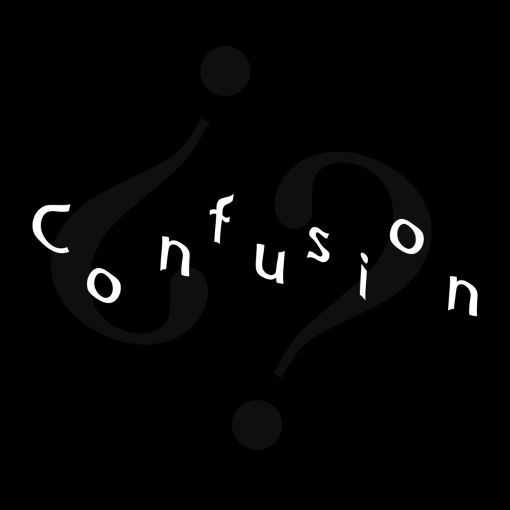
The expansion piece is the one that stands out for me, because of its depth and motion. For confusion, the question marks could have stood out a little more. Disruption is very clear and represents the word well.
The confusion art really strikes me as fitting the word very well. Just the waves in the text and the question marks really pull it together to represent confusion.


I really like your expansion artwork. You made it look like it is popping out of the page which makes it look very cool. Also, for your disruption artwork, I think it would have been better if you just replaced one of the italicized “disruption” with the comic sans “disruption.” I think it would have made for a more interesting art-piece, however, what you have does work.
The expansion piece is the one that stands out for me, because of its depth and motion. For confusion, the question marks could have stood out a little more. Disruption is very clear and represents the word well.
The confusion art really strikes me as fitting the word very well. Just the waves in the text and the question marks really pull it together to represent confusion.