The design behind ‘instability’ is simple but effective. The curvature of the letters at the bottom further accents the precarious situation the letters above it are in. The inconsistency of size lends itself to the very word used.
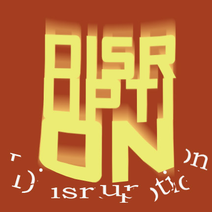
When I look at your “disruption” typography it looks like a fist smashing into the broken word! This happens for me because the effect you’ve used creates a lot of movement downward in the work.
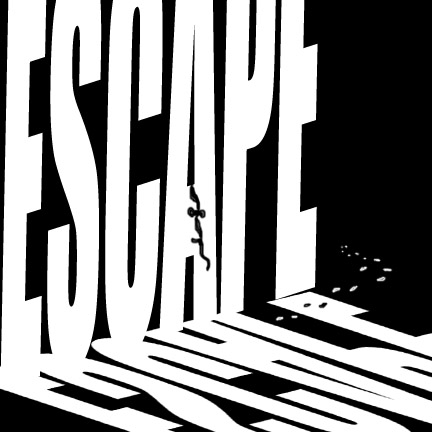
Your Escape typography really hits the nail on the head. I really like the crudely made rope and the footsteps that show someone scaling the wall and escaping, a good change from most other people’s doorway-themed escapes (not that there’s anything wrong with them)
The impact, yet brokenness of your “disruption” image is really effective. The glowing shadow in the word also gives the image not only depth, but a sense of blurriness as you somewhat struggle to read the word.
The perspective that the Escape piece shows is awesome. A large ‘shadow’ being cast by the horizontal escape makes it seem as though the vertical escape is a towering, looming wall that whatever escaped through has to tackle as an obstacle.
i think you really did a good job using the entire canvas. when the fonts are that big and bold, they become really visually appealing. The word “escape” looked like a wall
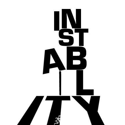

The design behind ‘instability’ is simple but effective. The curvature of the letters at the bottom further accents the precarious situation the letters above it are in. The inconsistency of size lends itself to the very word used.
When I look at your “disruption” typography it looks like a fist smashing into the broken word! This happens for me because the effect you’ve used creates a lot of movement downward in the work.
Your Escape typography really hits the nail on the head. I really like the crudely made rope and the footsteps that show someone scaling the wall and escaping, a good change from most other people’s doorway-themed escapes (not that there’s anything wrong with them)
The impact, yet brokenness of your “disruption” image is really effective. The glowing shadow in the word also gives the image not only depth, but a sense of blurriness as you somewhat struggle to read the word.
The perspective that the Escape piece shows is awesome. A large ‘shadow’ being cast by the horizontal escape makes it seem as though the vertical escape is a towering, looming wall that whatever escaped through has to tackle as an obstacle.
I love how your Escape looks like a scene, rather than just a normal piece of word art. The mirror you created really adds depth and looks great.
i think you really did a good job using the entire canvas. when the fonts are that big and bold, they become really visually appealing. The word “escape” looked like a wall