I love the way the word exhaustion is gradually falling apart as if the letters are too tired to hold the word together. The way the n is tipped over makes it look like it has fallen asleep.
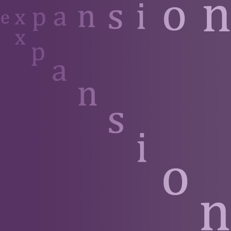
For your expansion picture, I think that it would have worked better if there were a more dynamic change in size between each letter. The way how it is now works well enough, I just think that it would work better if they were a bit bigger.
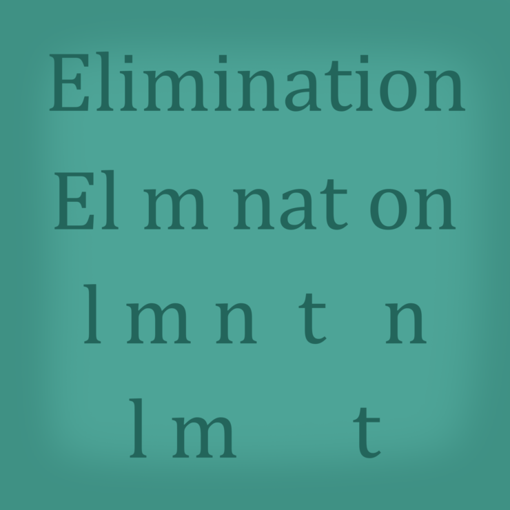
I really like what you did for elimination and exhaustion. For the expansion, i think you could have been more dramatic. Maybe make the word expansion really small at the beginning and keep repeating the word as well as the font size. Overall though I really like them.
I like the gradients used on all of the backgrounds here and how each picture is very simple but conveys the meaning of the word very clearly. I like exhaustion especially because of how the gradient gets darker and the word just seems to fade out as it falls.
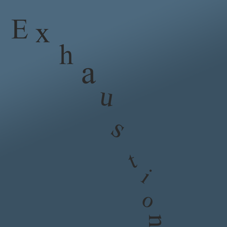

I love the way the word exhaustion is gradually falling apart as if the letters are too tired to hold the word together. The way the n is tipped over makes it look like it has fallen asleep.
For your expansion picture, I think that it would have worked better if there were a more dynamic change in size between each letter. The way how it is now works well enough, I just think that it would work better if they were a bit bigger.
I really like what you did for elimination and exhaustion. For the expansion, i think you could have been more dramatic. Maybe make the word expansion really small at the beginning and keep repeating the word as well as the font size. Overall though I really like them.
I like the gradients used on all of the backgrounds here and how each picture is very simple but conveys the meaning of the word very clearly. I like exhaustion especially because of how the gradient gets darker and the word just seems to fade out as it falls.