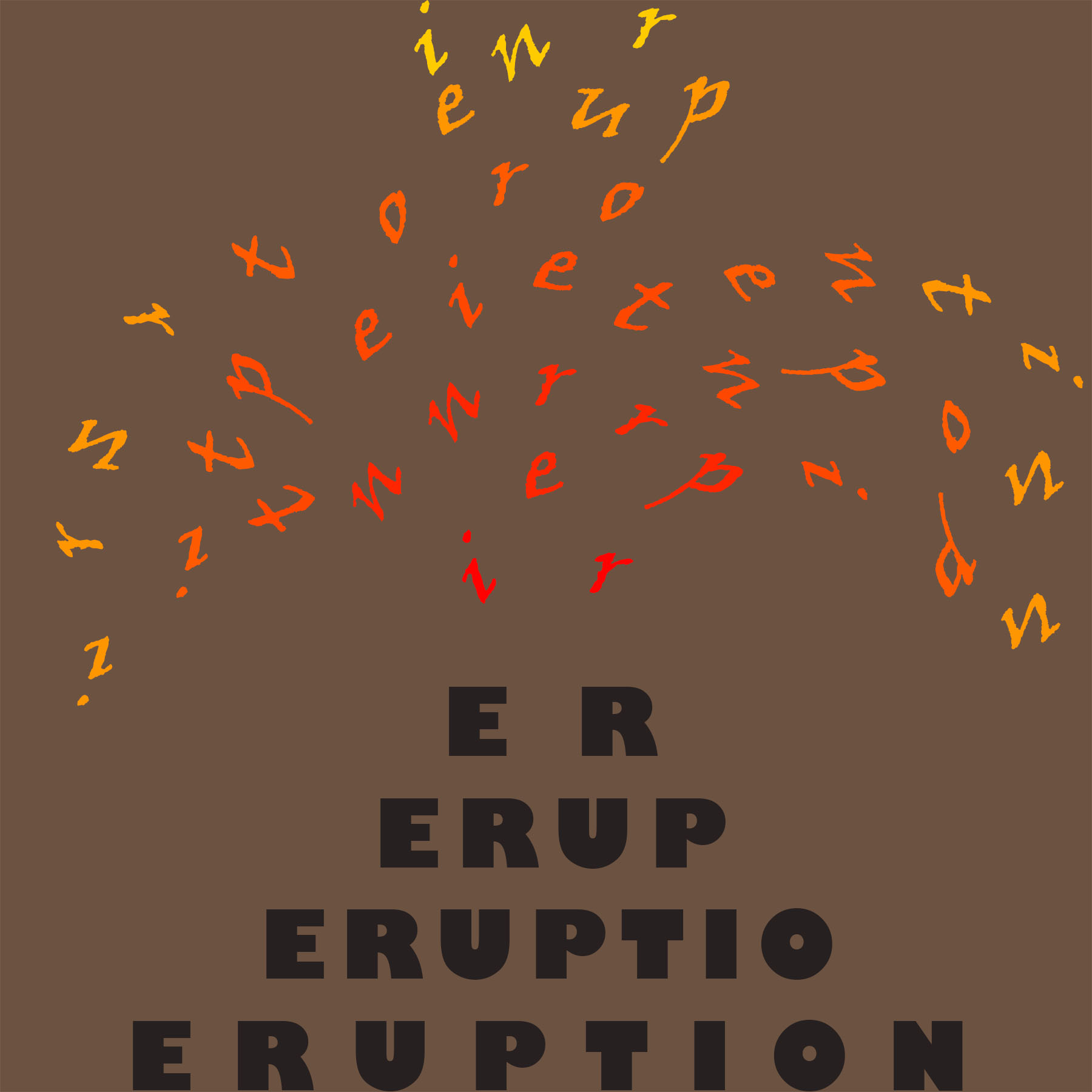
Eruption:
Escape:

Transition:
![]()
For anyone wondering, I swear I did not steal this idea from Kyle. I saw his as I was going to upload mine but I guess great minds think alike am I right?

C18 Digital Imaging & Computer Art
Worcester Polytechnic Institute
Eruption:
Escape:
Transition:
![]()
For anyone wondering, I swear I did not steal this idea from Kyle. I saw his as I was going to upload mine but I guess great minds think alike am I right?
You must be logged in to post a comment.
Your transition picture was done very well. The contrasting colors and different text fonts are very distinct from one another that it reflects the idea of switching between scenes, or a transition.
I really like how you not only changed the colors but also the fonts for transition. For the eruption one, I think the font really fits the volcano part but I would have liked to see the word eruption a little more coherently instead of randomly separated. Nice job
In the eruption piece I like how the color changes slightly from letter to letter in the lava. It creates this understanding of movement in the piece which works very well.
The eruption piece conveys the picture of a volcano erupting in such a simplistic way that conveys the meaning of the word very well. I like the small detail of the gradient on the text that’s erupting out of the base. It was a nice small detail.
The color scheme and fonts for transition work very well as they describe the word perfectly and really convey a sense of transition to the word itself.
Your font choice for the word Transition is really key for this piece. They were well chosen and really add to the concept you were going for with the complimentary colors.