
My first word was obsession. The look I was aiming for here was almost in a crazy mental state and almost do a chalkboard effect that simulates a teacher making a student write the same thing out 100’s of times. As the person writes the conjugations of obsession more, they get obsessed with it and it leads to their downfall, denoted by blurred and distorted writing, as they are lost to anything but the word. 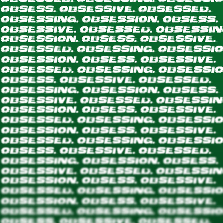
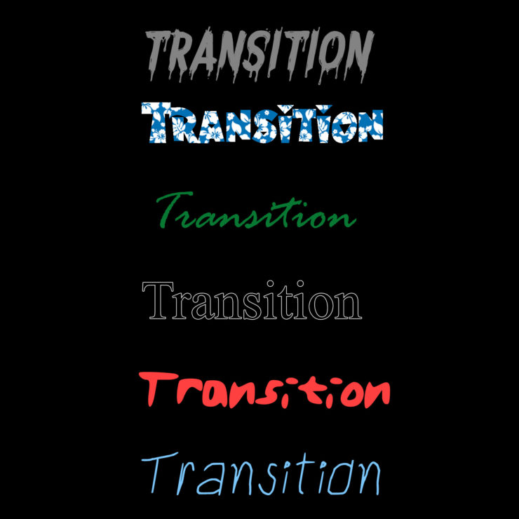
My second word was transition. The idea here was essentially to match fonts to each major life transition; in order they are childhood (relaxed, kid-like font), adolescence (the rebel/crazy font and color), college (Times New Roman is something every student knows), adulthood (signing documents and making the ‘green’), retirement (going on vacation), and death (destroyed, decaying font.)
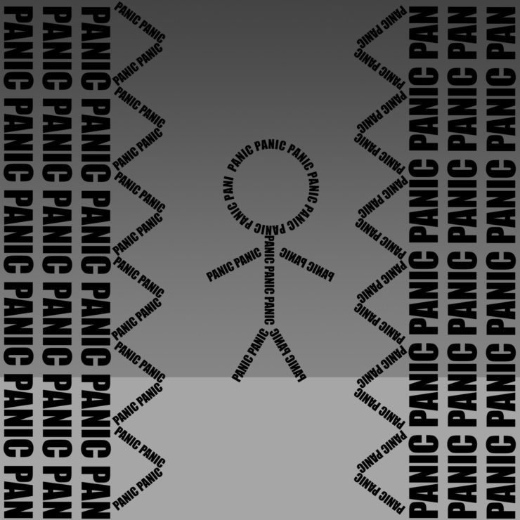
The last word was Panic. Clearly here, the small man is panicking due to the crushing spiked walls quickly approaching him.
I love how in the obsession picture you blur the lower words signifying the downfall of having such an obsession.
When looking at your transition work, at first, I did not see a clear transition. However, after reading your comment I find the words very fitting, especially the fonts, to create a transition throughout life.
I like the idea behind your transition piece, however, I think it could be emphasized more if the same transition occurred over one instance of the word.
The obsession piece is really cool, because the word is conjugated all sorts of ways but still focused on obsession. I like the idea of changing focus, but it would have made more sense to me top to bottom, as if the only focus was the obsession.
i love the panic picture, it’s amazing how only 2 different font size of words can convey the idea of panic. I really look like one of those stick figure games on the web, and the grey shade background really synergize with the forground
The “Obsession” picture is perfect. The way the words overlap and blur and dissolve is stunning. Nice job!