
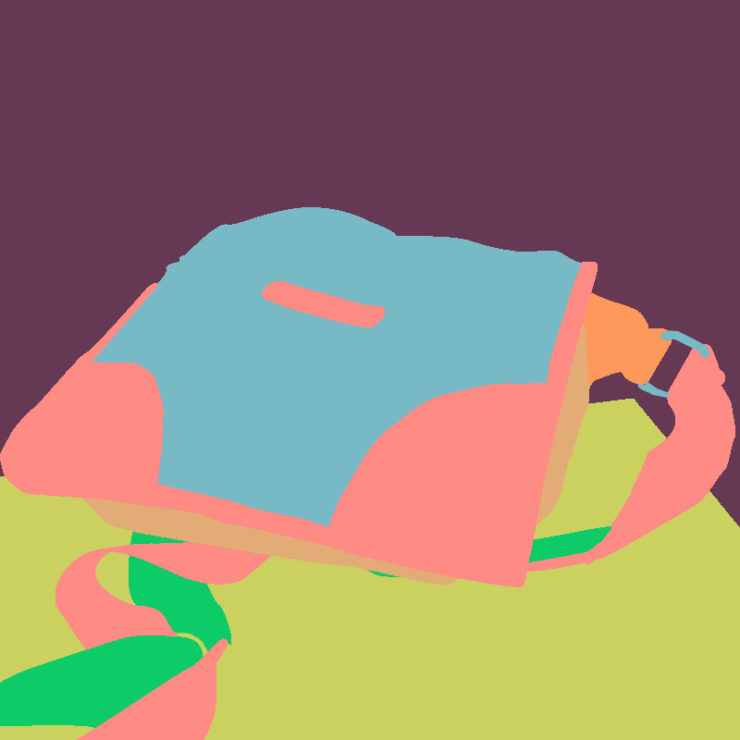
The subject of the piece was of a personal handbag of mine, one of which was extremely special to me.
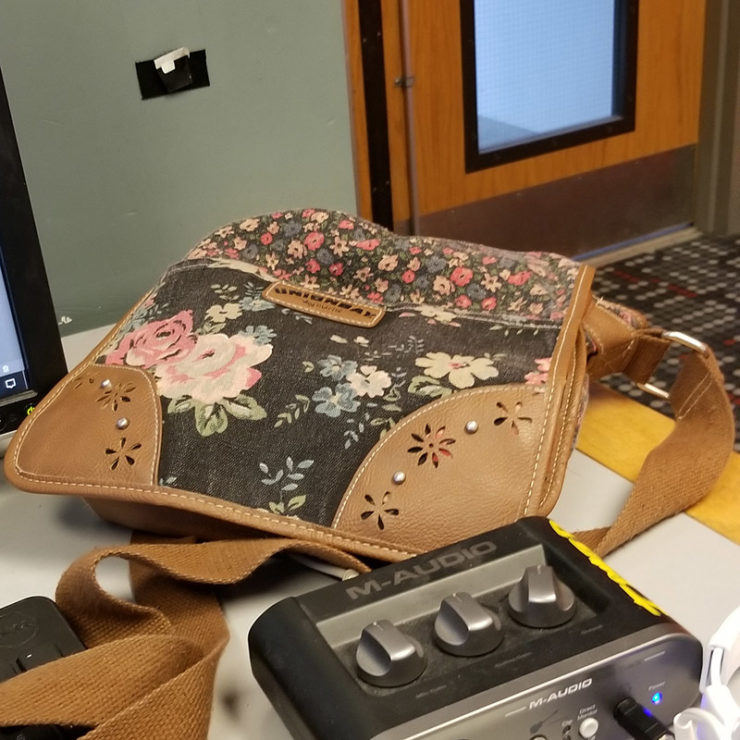
The original, for comparison:
Admittedly, there’s a lot I could have done with this one. I recall wanting to focus on the bag patterns, but felt like the shape of the bag itself was interesting to portray.
While I really like your attention to the bag, the solid purple background is a bit distracting in my opinion. I think maybe using a different less dominant color or choosing to use some of the features in the photo would of been a better choice, but I do like the color scheme of the bag. I also like how it blends well with the desk color.
I think the color scheme you chose is really nice and all the colors work well together. I think it would have been interesting to see some of the patterns on the bag like the flowers on the leather.
The color pallet that you chose for this design is very interesting. I think the neon colors that you chose fit well together and compliment each other nicely. With the pink and green straps, even though the shapes themselves are simplified, you still get a feeling that they are bending and folding.
The color scheme that you used was very interesting. They work very well together, and I thought that the backpack was going to have the same color scheme. The detail on the actual backpack may have been difficult to show. I wish you could’ve incorporated the background more to show the overall image better.