I like that you used complementary colors in your first design, and how all the fish are swimming in the same direction – giving a feeling of flowing down the river. You’ve achieved an interesting kind of asymmetrical feel to your design, as all the fish seem almost randomly placed like they would be in say, a river. There would be only one thing that I might make a tweak to, and it would be the overall size of each of the elements. I would make everything just a bit bigger.
I like your first pattern. It really looks like you have a large school of fish with such a simple design and it doesn’t look tiled at all. Also, the color contrast between the fish and the background makes the fish pop out really well. Also, your waves fill in the empty space which was a good idea.
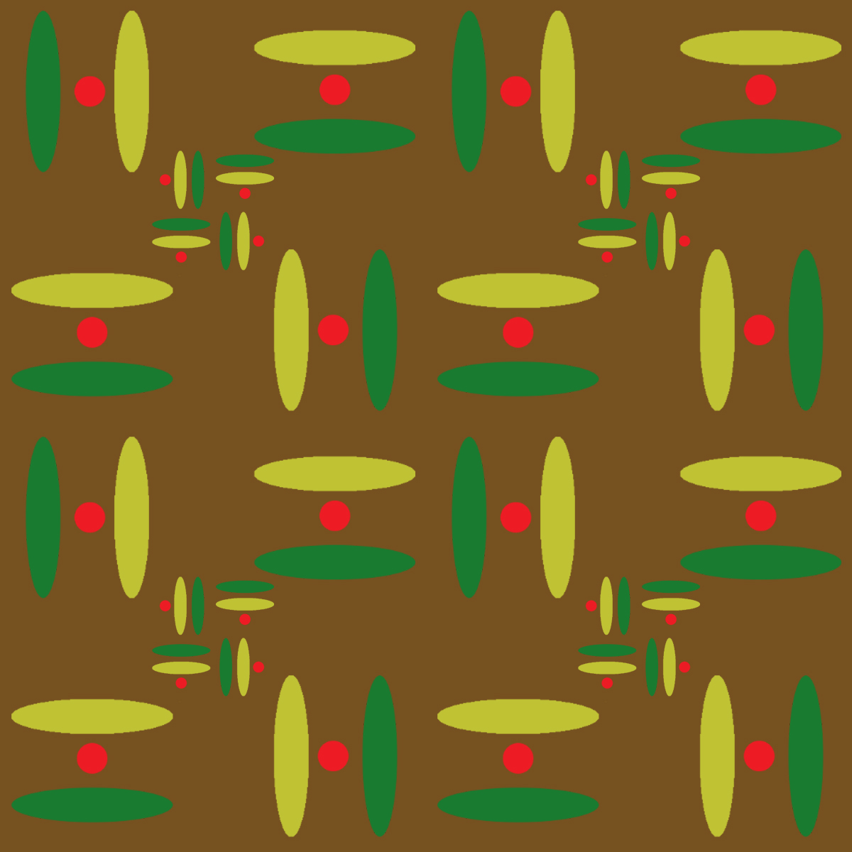
The pattern in your second picture seems to be a bit too simplistic. There isn’t a central idea for the eye to focus on, so it makes the picture seem more empty than it actually is.
I actually enjoy the simplicity of the second pattern, especially with the different sized shapes to create some cool depth effects. I would suggest using another color rather than yellow, though. The brown really washes out the yellow – perhaps a brighter yellow or even a blue could work.
I think your placement of fish makes it hard to tell where the pattern tiles and gives it a natural look. The background dots also add an additional layer while keeping the natural theme.
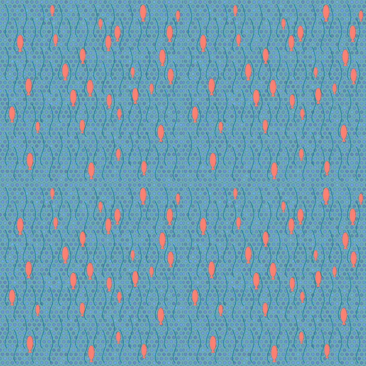

I like how the dots in the background of your animal pattern are different shades of blue. It gives the image more of a feeling of movement.
I like that you used complementary colors in your first design, and how all the fish are swimming in the same direction – giving a feeling of flowing down the river. You’ve achieved an interesting kind of asymmetrical feel to your design, as all the fish seem almost randomly placed like they would be in say, a river. There would be only one thing that I might make a tweak to, and it would be the overall size of each of the elements. I would make everything just a bit bigger.
I like the simplicity of your second pattern but think maybe the color scheme could be adjusted. The brown kind of washes out the other colors.
I like your first pattern. It really looks like you have a large school of fish with such a simple design and it doesn’t look tiled at all. Also, the color contrast between the fish and the background makes the fish pop out really well. Also, your waves fill in the empty space which was a good idea.
The pattern in your second picture seems to be a bit too simplistic. There isn’t a central idea for the eye to focus on, so it makes the picture seem more empty than it actually is.
I actually enjoy the simplicity of the second pattern, especially with the different sized shapes to create some cool depth effects. I would suggest using another color rather than yellow, though. The brown really washes out the yellow – perhaps a brighter yellow or even a blue could work.
I think your placement of fish makes it hard to tell where the pattern tiles and gives it a natural look. The background dots also add an additional layer while keeping the natural theme.