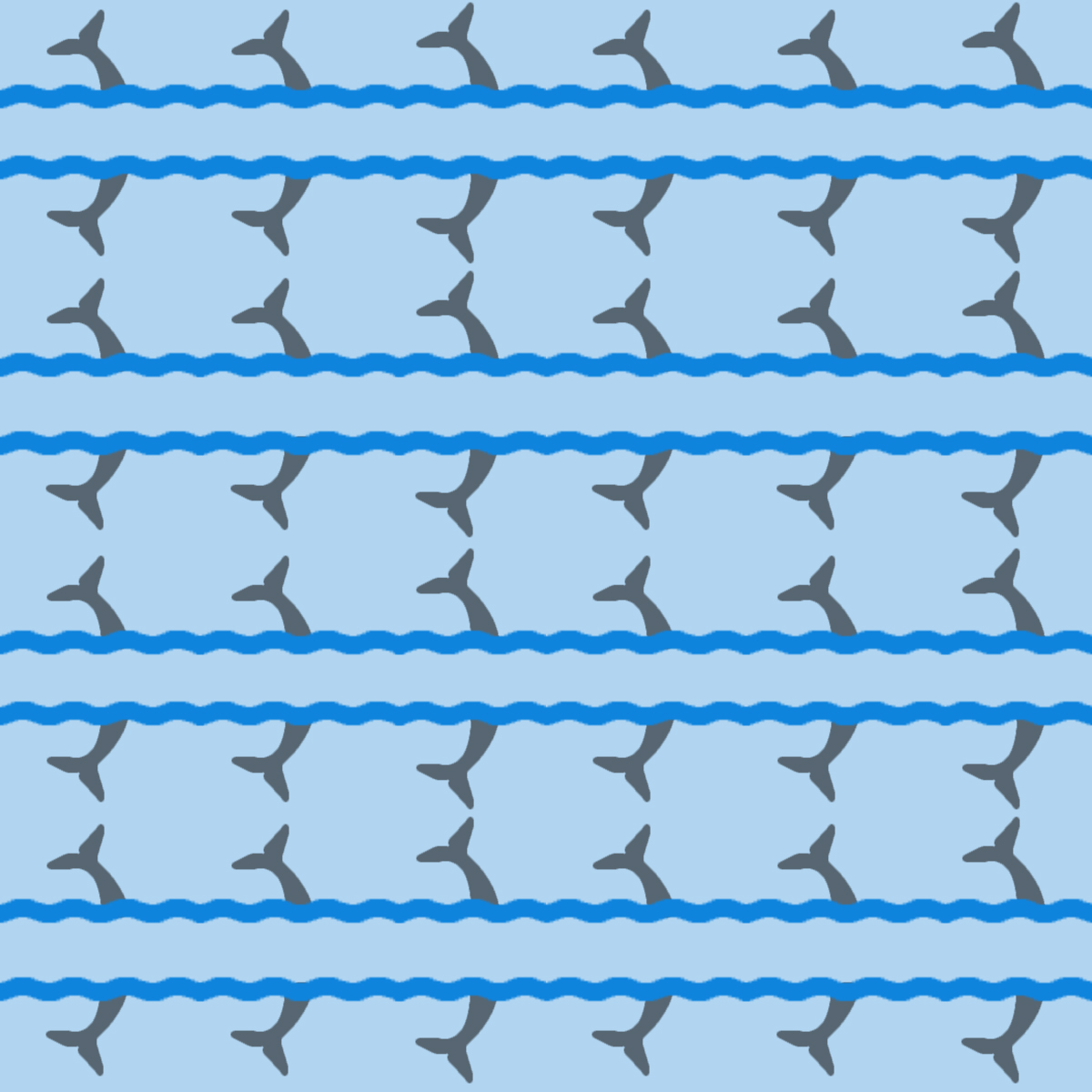
I think the color scheme in the whale pattern is very visually appealing and helps to create a good sense of motion in it with the nice differences in colors.
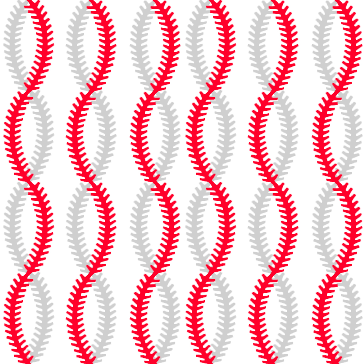
I think that someone brought up the fact in class that it could have possibly been more interesting if every other red and grey stripe would have been flip-flopped. Although it is already a strong depiction of a baseball, this could have been something to take the piece just one step further. I remembered that you questioned the use of the grey strips in class; however, I feel that they are essential to the work in defining the shape of the ball. They seem to also work as a type of shadow creating depth in the piece.
I love the simplicity of the whale pattern because it fits with the theme of a calm ocean. The ability of it to repeat also plays a nice role of the pattern.

I think the color scheme in the whale pattern is very visually appealing and helps to create a good sense of motion in it with the nice differences in colors.
Your baseball stripes pattern is wonderful. I love the feeling of movement as I scroll past it, and I love the three dimensionality. Nice Job!
I think that someone brought up the fact in class that it could have possibly been more interesting if every other red and grey stripe would have been flip-flopped. Although it is already a strong depiction of a baseball, this could have been something to take the piece just one step further. I remembered that you questioned the use of the grey strips in class; however, I feel that they are essential to the work in defining the shape of the ball. They seem to also work as a type of shadow creating depth in the piece.
I love the simplicity of the whale pattern because it fits with the theme of a calm ocean. The ability of it to repeat also plays a nice role of the pattern.