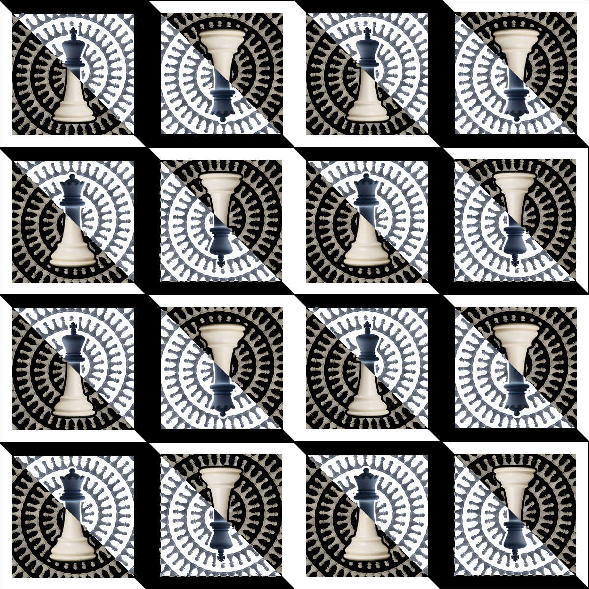
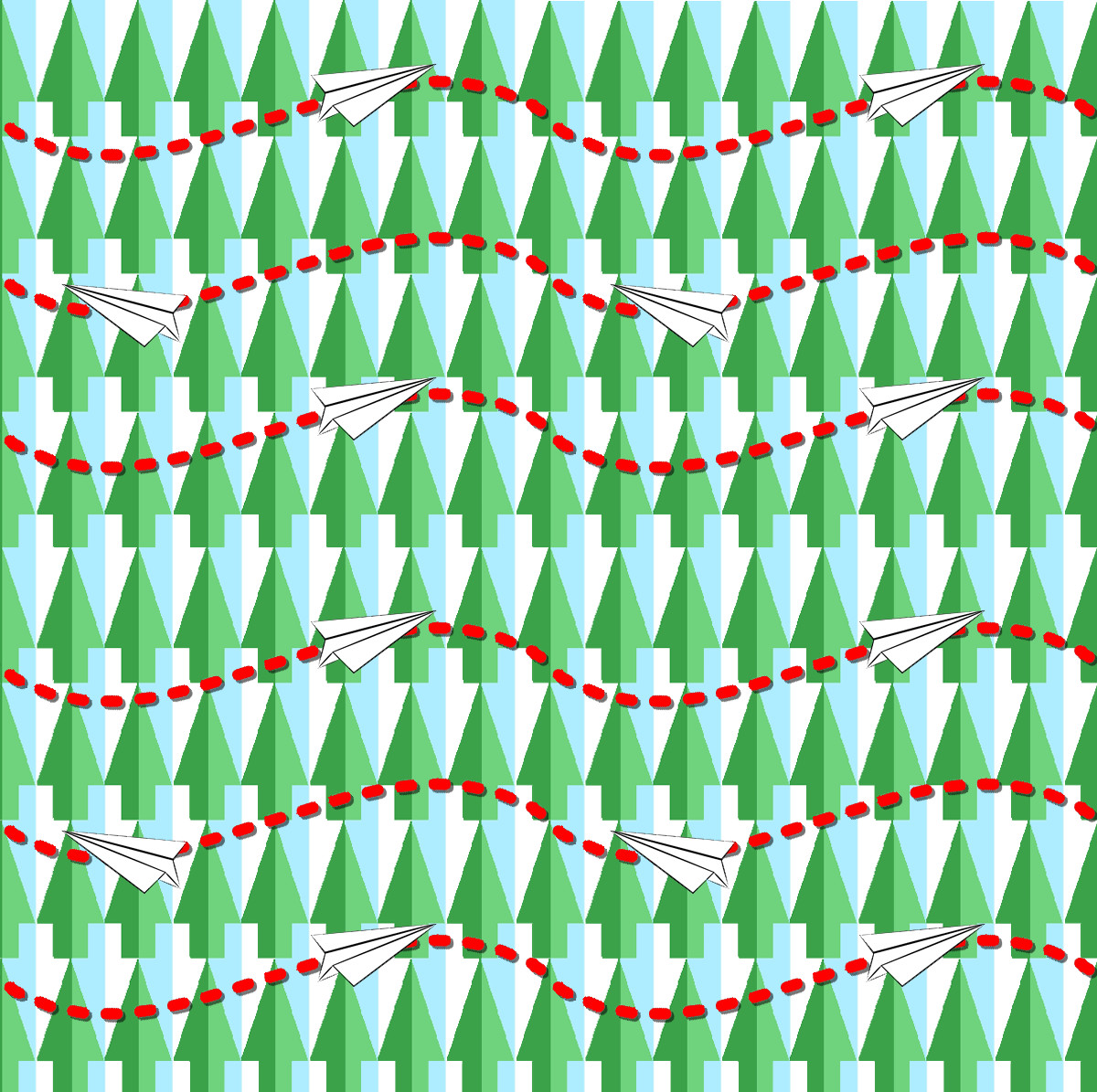
Very well done. I like the flow of both of your patterns. For the first one I really like how you contrasted the dark and light, how the dark blue is on the light card and the white is on the dark card. For the second pattern, I like all the details put into the background, it makes it all flow very well.
The longer I stare at your first pattern the more patterns and shapes I am able to see within it. The diagonal strips seem to even make some parts of the pattern pop out. On the chess pieces it looks as if you inverted the color instead of just coloring it in black. This kept the shadows on the object and gave it a finished look.
The symbolism you described in class for your second picture is very interesting. Everything in the image is used for something, which makes the picture an interesting piece to analyze.
Your second piece has a really interesting dynamic to it. Every time I scroll back to it, my eyes fixate on a separate set of trees each time- sometimes the winter ones and sometimes the summer ones. It reminds me a bit of that dress that caused such an uproar a few years ago. Regardless, whichever set of trees I focus on dictates which way my gaze is directed in the piece and it’s quite a task to differentiate the other set of trees from the background. Great idea.
The dark/light contrasts in your first pattern are magnificent. They create so many shapes and illusions. The “L” outlines around the squares create a very nice depth to the image. Well done!
I like that the chess pattern switches between the white and black pieces to include both sets. In fact, since the entire pattern is black and white I like the theme it sets.
I enjoy both patterns, although the first is especially transfixing. The use of a true-to-life off white prevents an overly contrasting image. This lets the smaller details shine through, such as the spiraling pattern of smaller pieces. Wonderful levels of depth, and use of how the tiles interact as well for a great overall piece.