The cans in the second pattern are interesting to look at, both by themselves and the way they alternate and are staggered. The only problem I have with this design is the hard yellow background color, which washes out the shiny orange and red on the cans.
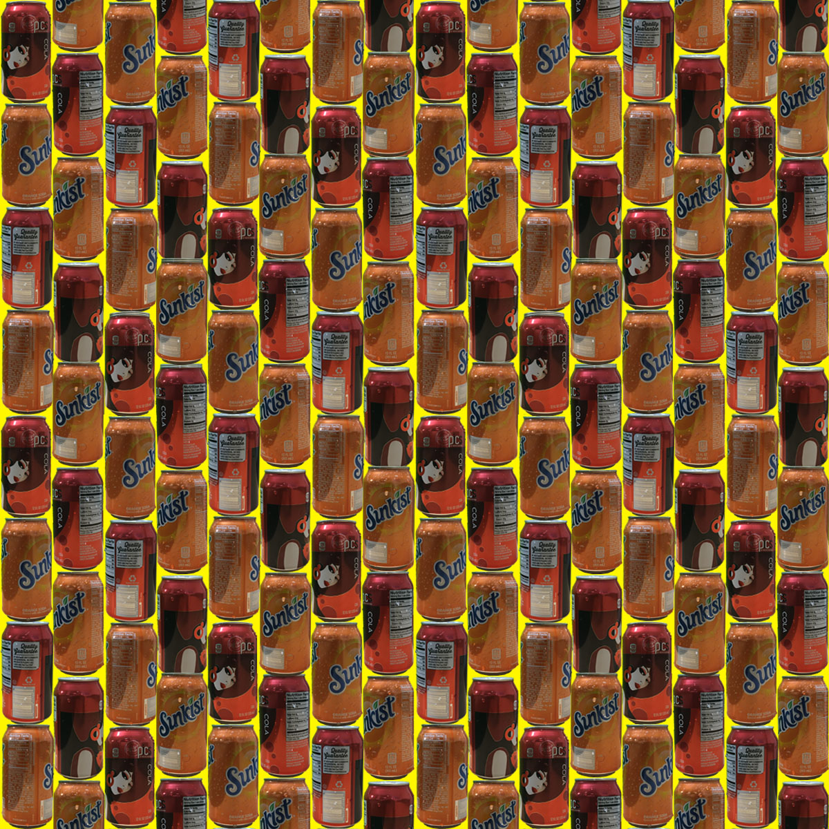

The rotation of the cans in your second pattern makes it a lot more interesting without breaking the pattern of red and orange.
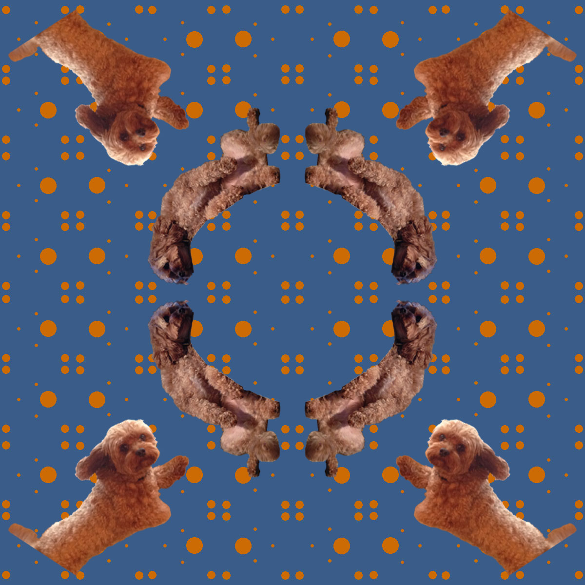
The color of the dogs in the first pattern go really nicely with the color of the background which makes it all seem good and flow as a pattern.
The cans in the second pattern are interesting to look at, both by themselves and the way they alternate and are staggered. The only problem I have with this design is the hard yellow background color, which washes out the shiny orange and red on the cans.
The background for the dog pattern is very interesting with all the different shapes that can be imagined between the orange dots.