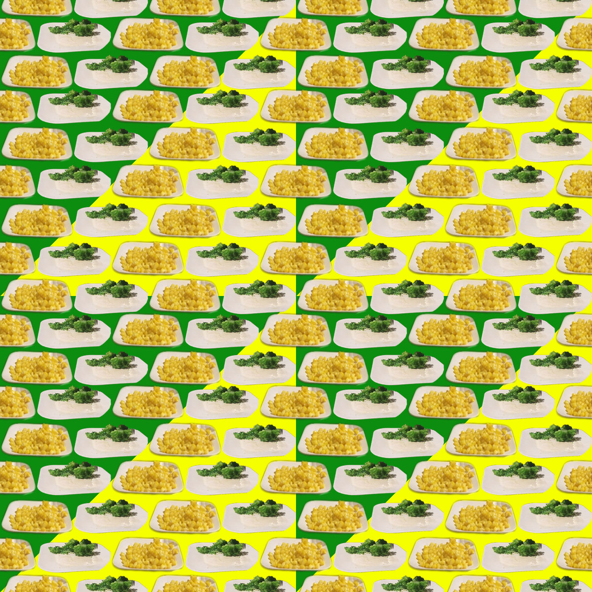
The colors in the second piece work well together with the opposing yellows and greens in the big stripes but also in the individual little designs, it helps to make the piece look nice.
In the first pattern, the large variety of colors makes the piece look more busy than it needs to be. I think that making the colors look more natural would help to keep the eye focus on the cats, rather than on the colors.
I like how in the second pattern you divided the background into the colors of the vegetable you were imaging. The piece is very vibrant with the bright yellows and greens but I think it works very well.
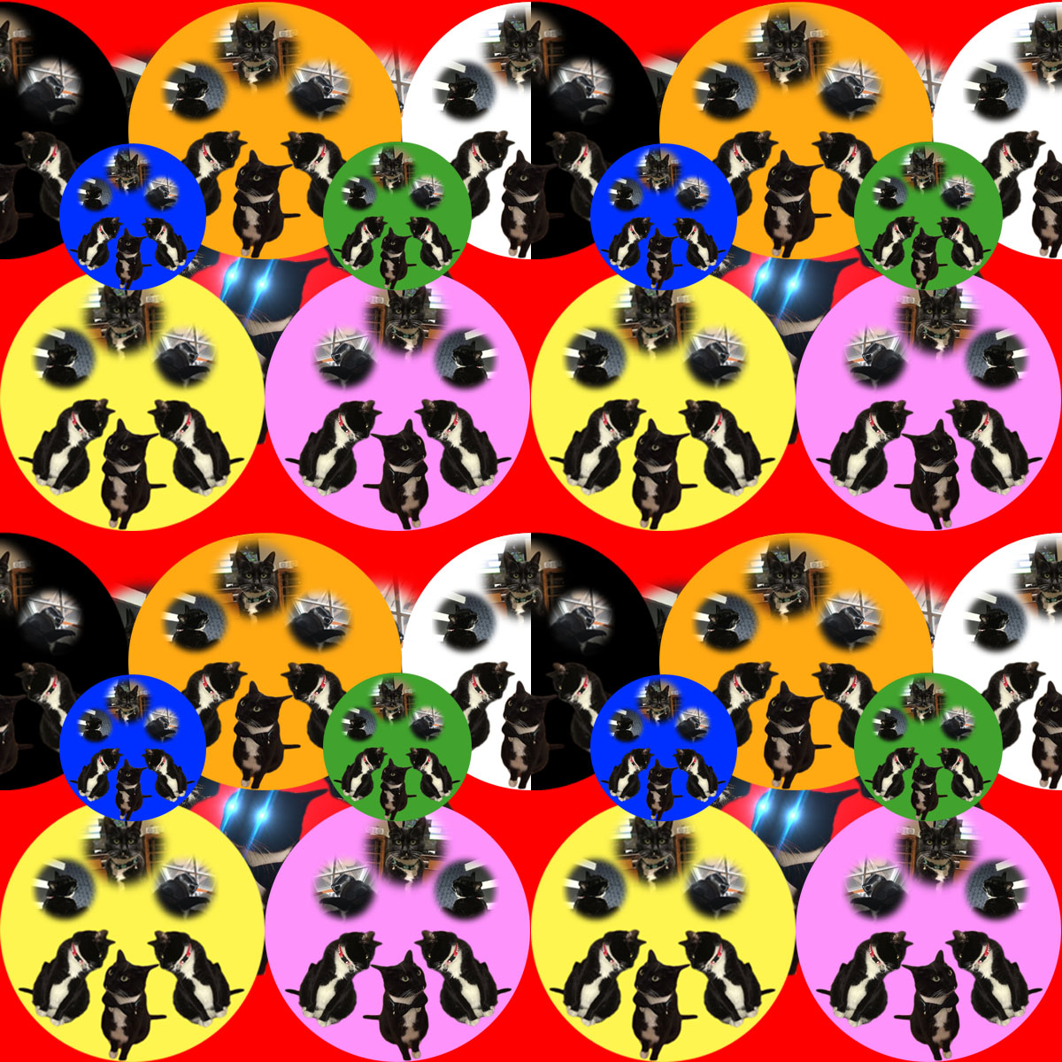

Though I love your use of cats, this seems very busy. Maybe you could use fewer cat circles in the future.
The colors in the second piece work well together with the opposing yellows and greens in the big stripes but also in the individual little designs, it helps to make the piece look nice.
In the first pattern, the large variety of colors makes the piece look more busy than it needs to be. I think that making the colors look more natural would help to keep the eye focus on the cats, rather than on the colors.
I like how in the second pattern you divided the background into the colors of the vegetable you were imaging. The piece is very vibrant with the bright yellows and greens but I think it works very well.