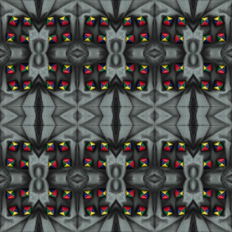
I like the interesting contrast between the grayscale and bright colors on your first pattern. The background element is a really neat design. What did it come from? It almost seems like a rug or carpet to me, based on the texture.
I can see you’re going for a Synthetic theme in the top one, and a natural one in the bottom. The small bits of color coming from the hackey sacks definitely draws the contrast between the greyscale shapes, especially the middle pattern. It’s quite geometric, considering the squarelike pattern of the shadows, the shape the hackey sacks make together, and the diamond shapes the middle triangles create. all in all, it looks like a traditional textile, and I think it’s pretty neat.
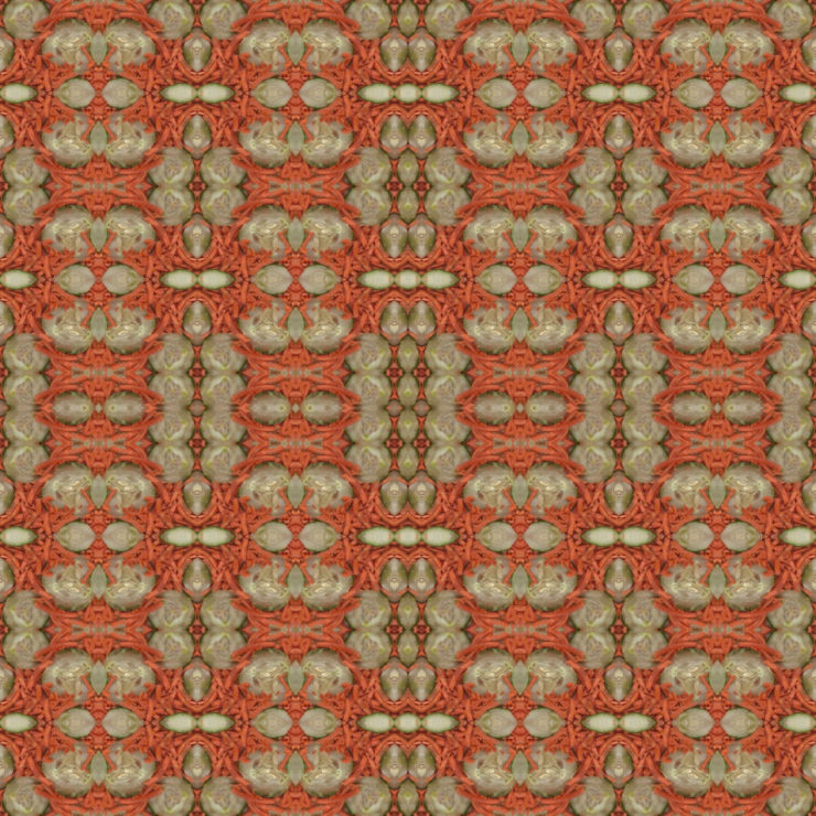
The carrot image is quite interesting to look at, especially considering the perpendicular breaks in the carrot piles. The kaleidoscoping pattern for this is a nice touch, though I think the colors of the carrots and the green background seem to be too close to one another in tone (they both have a similar warm scheme). I would suggest emphasizing the carrots more by highlighting their color against the background, or turning the green portions into a cooler version of the same color so the eye might see both clearer.

I like the interesting contrast between the grayscale and bright colors on your first pattern. The background element is a really neat design. What did it come from? It almost seems like a rug or carpet to me, based on the texture.
I can see you’re going for a Synthetic theme in the top one, and a natural one in the bottom. The small bits of color coming from the hackey sacks definitely draws the contrast between the greyscale shapes, especially the middle pattern. It’s quite geometric, considering the squarelike pattern of the shadows, the shape the hackey sacks make together, and the diamond shapes the middle triangles create. all in all, it looks like a traditional textile, and I think it’s pretty neat.
The carrot image is quite interesting to look at, especially considering the perpendicular breaks in the carrot piles. The kaleidoscoping pattern for this is a nice touch, though I think the colors of the carrots and the green background seem to be too close to one another in tone (they both have a similar warm scheme). I would suggest emphasizing the carrots more by highlighting their color against the background, or turning the green portions into a cooler version of the same color so the eye might see both clearer.