Self Portrait

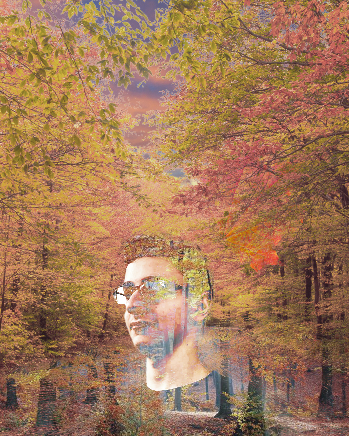
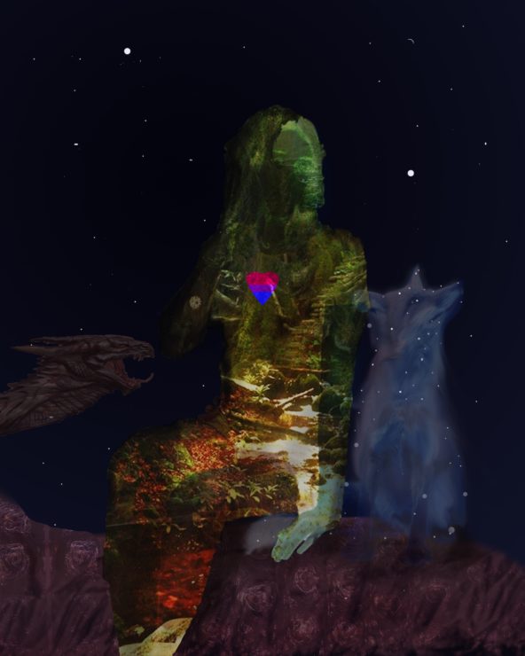
For my self portrait I took a picture of myself and used the double exposure techniques to overlay a fall background under me because I would much rather be in fall weather than in this cold winter. I then stitched  another fall scene on top of that to be top part of the picture and put a new sky into the picture along with a big leaf as a symbol of fall.

Sources for my images used are:

http://i1.wp.com/shannonranch.net/wp-content/uploads/2015/10/DSC_0298.jpg

http://nobacks.com/autumn-leaf-five

https://s-i.huffpost.com/gen/1365606/images/o-FIRST-DAY-OF-FALL-facebook.jpg

https://www.almanac.com/sites/default/files/users/Almanac%20Staff/autumnal-equinox-fall_full_width.jpg


Self Portrait

Hello,

For my midterm assignment I edited a portrait of myself looking rather dapper.  It took quite a while to decide how I was going to manipulate my photo, and I finally decided on some galaxy-replacement therapy. The only part of the image that is original is my face.

Photos used:

https://az616578.vo.msecnd.net/files/2016/10/15/6361209775984223581480794734_space111.jpg

https://newevolutiondesigns.com/images/freebies/space-wallpaper-17.jpg

https://cdn.wccftech.com/wp-content/uploads/2016/09/spacee.jpg

http://chicagopolicyreview.org/wp-content/uploads/2016/04/space-4.1-CPR.jpg

http://magazine.viterbi.usc.edu/wp-content/uploads/BSP_054.jpg

https://i.ytimg.com/vi/lt0WQ8JzLz4/maxresdefault.jpg


Self Portrait – Jordan Stahl


For my post I decided to use a silhouette of the two states I spend most of my time in outside of school, PA and ME. I decided to take a bunch of photos from memories to show who I am. The photos are not blended together at all because I wanted them to look like state lines.

  • https://www.google.com/search?q=pennsylvania+state+silhouette&rlz=1C5CHFA_enUS725US725&tbm=isch&source=iu&ictx=1&fir=lKtWDS9RvoxSeM%253A%252Cc6ffSQCAXRjwdM%252C_&usg=__5SVNVo7-QyhR3aVgGUzu0HDPVQI%3D&sa=X&ved=0ahUKEwiK4fyW0YPZAhVQj1kKHZ9lB0IQ9QEIKzAA#imgrc=FFVP1OBRnj8k7M:http://www.supercoloring.co-
  • m/silhouettes/maine-maphttp://www.car-brand-names.com/land-rover-logo/
  • http://www.car-brand-names.com/land-rover-logo/

Self Portrait Mosaic

For my self portrait, created a mosaic out of 144 photos of my favorite cars, myself fishing or golfing and my family. Each image is its own layer with its own layer mask. After arranging them all, I patterned them and placed on top of the main photo of my mom, dad and myself. I then overlaid the pattern on top of the photo adjusted the shadow and highlights to my liking.  Overall the Idea is that those 4 things are what make me… me and without my supportive parents none of it would be possible.

Self Portrait Collage

For my self portrait, I used an image of a magical-looking forest because I enjoy nature and taking photos of nature, and I enjoy making up fantasy settings and playing games like dungeons and dragons in fantasy settings. The heart uses the colors of the bisexual pride flag. I used a fox because they’re my favorite animal and I edited it to fit the fantasy theme. The dragon is also representive of my interest in dungeons and dragons. The poses of myself and the fox are supposed to look hopeful or like we’re daydreaming. The dragon also fits into this as I often daydream about flying around on a dragon. The background of the image is a starry night sky because I’m a night owl.

Source Images:

Dragon head: https://www.videogamesartwork.com/games/elder-scrolls-v-skyrim/dragon-head

Dragon scales: http://maxpixel.freegreatpicture.com/Crocodile-Texture-Dragon-Scaly-Close-Scale-2901544

Magic Forest: http://wallpaperweb.org/wallpaper/digital_art/fantasy-art-scenery_47812.htm

Fox: http://profitfox.co/animal-clipart-fox-2/

Self Portrait

For my self portrait, I decided to continue on with my crazy cat lady theme. I used a picture of me and Sammy right before I left for IQP last year (he looks thrilled, I know). I used a few photo editing tools to make it look better. I wanted to keep it relatively simple, so I used a mask to cover the background and created the mixed background using vectors and recolored it to match the color scheme better. I used both floral and geometric patterns because these are my two favorite types of patterns for clothes and things like that. When I asked a couple of my friends how I could add more pizzazz, one said flames and the other said glitter, so I made glittery flames using a glitter pattern I made. Using their advice also lended to the idea of this representing me, because my friends are very important to me.

Online Images:

https://secure.img2-ag.wfcdn.com/im/59814573/resize-h800%5Ecompr-r85/3184/31845542/Arrowhead+5.5m+L+x+52cm+W+Geometric+Roll+Wallpaper.jpg

http://www.lauraashley.com/content/ebiz/lauraashley/invt/3645816/3645816_resp_medium.jpg 


Collage Self Portrait

Collage Self Portrait:

I made my portrait black and white because it felt more bold, and appropriate to my personality. The piano pieces on my hand and on my shirt have been important and loved by me as a child, and I can even play them now! I originally had the background just as a wooden wall, but since I wanted to make it look more “creative,” I added a paisley pattern overlayed on it. The bubbles at the top left near my head represent my love for learning. The peace sign is representative of my ‘peace-keeper’ tendencies.


Stock Image credits:

Paisley: https://cdn.shopify.com/s/files/1/0978/5612/files/000paisley_large.jpg?16492529517391915127

Wood: http://texturelib.com/texture/path=/Textures/wood/planks%20new/wood_planks_new_0028

Hand music:

http://www.onlinesheetmusic.com/the-entertainer-p249669.aspx

Shirt music:

http://www.onlinesheetmusic.com/fur-elise-p284743.aspx

Self Portrait Collage

My self portrait is centered around the fundamental things that I am composed of. Most of the composition is shaped around a photo of me in my goalie equipment, which is where I feel I’m at home the most and best describes me. The background is a nice mountain/ice lake setting, an integral part of how I grew up either on the ice or exploring cold, remote areas of New England. I decided to have the mountain top in the ‘brain’ part of the image as I’m always thinking of where to explore next, while the hockey net is in the heart area as it’s what I love to do. I placed the title of my fraternity in my mouth as you can usually find me talking about it or to my brothers. I think that’s a pretty good explanation? Oh, and the wing was added because when I’m in my elements that are shown here, I feel as if I’m flying.

URL’s for the photos I used are here:

https://pngtree.com/freebackground/cool-blue-purple-gradient-banner_561188.html

http://www.qygjxz.com/hockey-wallpaper/5601830.html

https://www.mountainphotography.com/images/xl/20091106-Icy-Ice-Lakes-Sunrise.jpg

Font is Broken Glass via dafont.com